rolling_nav_bar
一个底部导航栏,布局受此设计启发,并具有高度可定制的动画、颜色和形状。
入门
要开始使用,请将您的 RollingNavBar 放在 Scaffold 的 bottomNavigationCar 插槽中,并将其包装在一个提供最大高度的小部件中。例如
或者,您也可以直接使用 Stack 来放置它
Scaffold(
  bottomNavigationBar: Container(
    height: 95,
    child: RollingNavBar(
      // nav items
    ),
  )
);
RollingNavBar 是高度可定制的,支持 3、4 或 5 个导航元素。
Scaffold(
  body: Stack(
    children: <Widget>[
      Positioned(
        bottom: 0,
        height: 95,
        width: MediaQuery.of(context).size.width,
        child: RollingNavBar(
          // nav items
        ),
      )
    ]
  )
);
自定义
每个元素也可以通过指定子导航元素的两种主要方式进行完全定制
第一种选择是传递 IconData 对象列表,以及可选的 Color 对象列表
第二种选择是传递小部件列表,但这种方法对活动状态的处理不如第一种自动
第一种选项是将 IconData 对象列表与可选的 Color 对象列表一起传递
第二种选项是将小部件列表传递,尽管在这种方法中对活动状态的处理不如第一种自动
RollingNavBar.iconData(
  iconData: <IconData>[
    Icons.home,
    Icons.people,
    Icons.settings,
  ],
  indicatorColors: <Color>[
    Colors.red,
    Colors.yellow,
    Colors.blue,
  ],
)
第二种选项是传递小部件列表,尽管在这种方法中对活动状态的处理不如第一种自动
第二种选项是传递小部件列表,尽管在这种方法中对活动状态的处理不如第一种自动
RollingNavBar.children(
  children: <Widget>[
    Text('1', style: TextStyle(color: Colors.grey)),
    Text('2', style: TextStyle(color: Colors.grey)),
    Text('3', style: TextStyle(color: Colors.grey)),
  ],
  indicatorColors: <Color>[
    Colors.red,
    Colors.yellow,
    Colors.blue,
  ],
)
动画类型
RollingNavBar 提供了四种活动指示器从一个标签到另一个标签过渡的动画效果
从标签到标签的过渡。
第一种动画类型是其同名动画:AnimationType.roll
RollingNavBar.iconData(
  animationCurve: Curves.easeOut,  // `easeOut` (the default) is recommended here
  animationType: AnimationType.roll,
  baseAnimationSpeed: 200, // milliseconds
  iconData: <IconData>[
    ...
  ],
)
注意:对于
roll动画类型,您提供的动画速度是一个乘数,它相对于指示器必须移动的距离来计算。这确保了无论用户点击何处,指示器都能以恒定的速度移动。
第二种动画类型是淡入淡出和重新出现的效果
RollingNavBar.iconData(
  animationCurve: Curves.linear, // `linear` is recommended for `shrinkOutIn`
  animationType: AnimationType.shrinkOutIn,
  baseAnimationSpeed: 500, // slower animations look nicer for `shrinkOutIn`
  iconData: <IconData>[
    ...
  ],
)
注意:对于
shinkOutIn动画类型,您的动画速度是恒定的,因为活动指示器永远不会移动中间距离。
第三种动画类型是淡入淡出和重新出现效果的旋转版本
RollingNavBar.iconData(
  animationCurve: Curves.linear, // `linear` is recommended for `spinOutIn`
  animationType: AnimationType.spinOutIn,
  baseAnimationSpeed: 500, // slower animations look nicer for `spinOutIn`
  iconData: <IconData>[
    ...
  ],
)
注意:与
shinkOutIn一样,对于spinOutIn动画类型,您的动画速度是恒定的,因为活动指示器永远不会移动中间距离。
最后的动画效果是无动画
RollingNavBar.iconData(
  // `animationCurve` and `baseAnimationSpeed` are ignored
  animationType: AnimationType.snap,
  iconData: <IconData>[
    ...
  ],
)
除了上述选项,还暴露了 animationCurve 和 baseAnimationSpeed 参数
也暴露了。
钩入动画
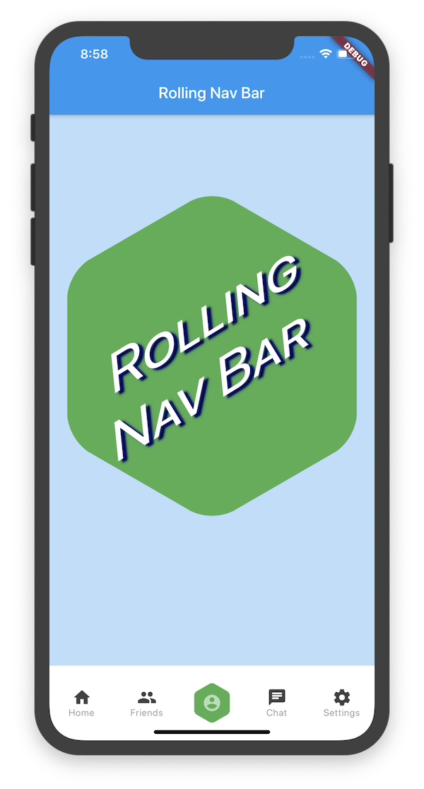
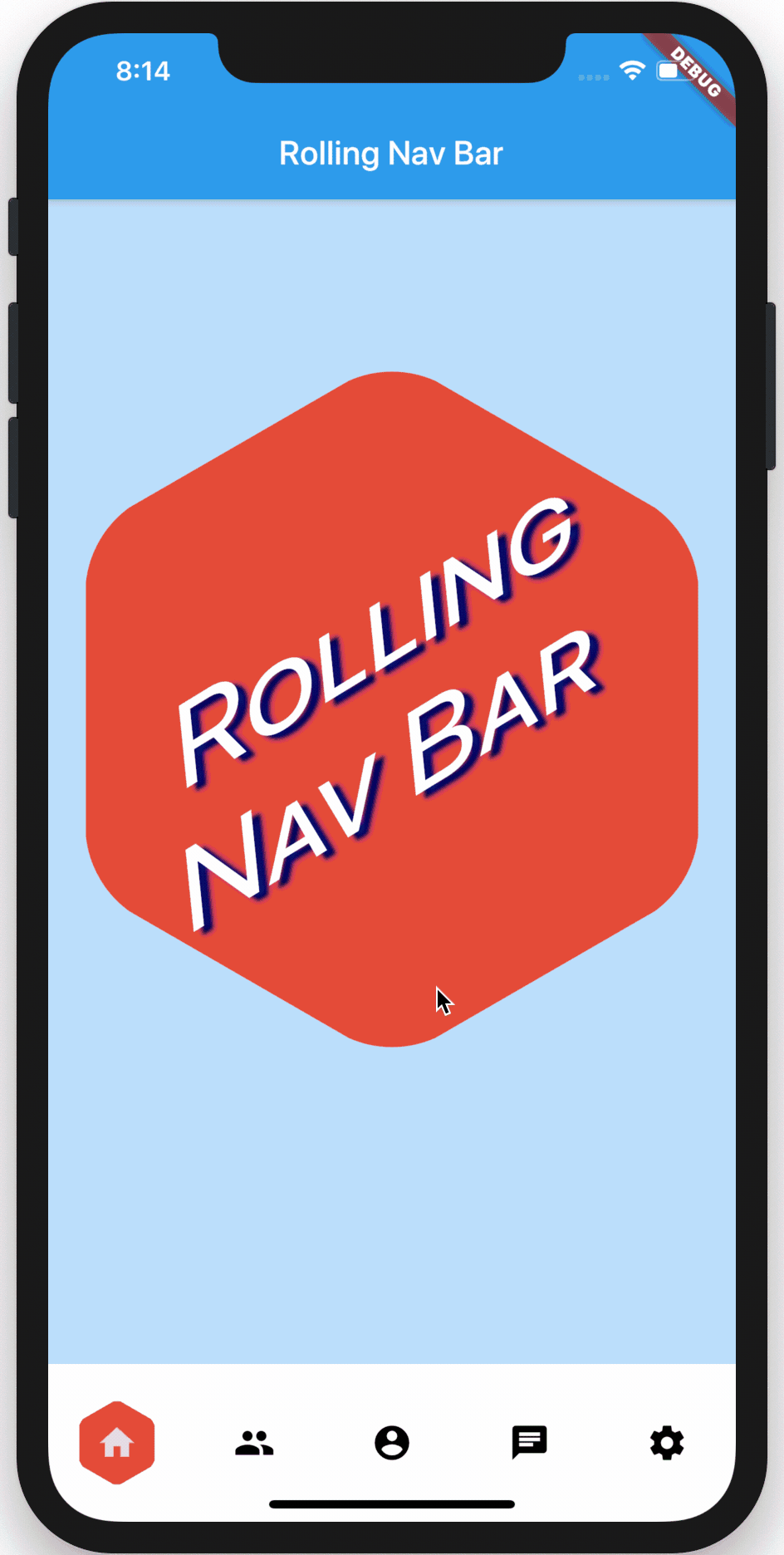
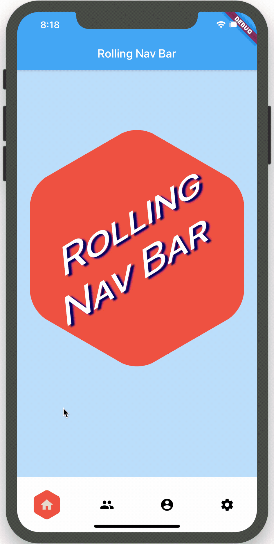
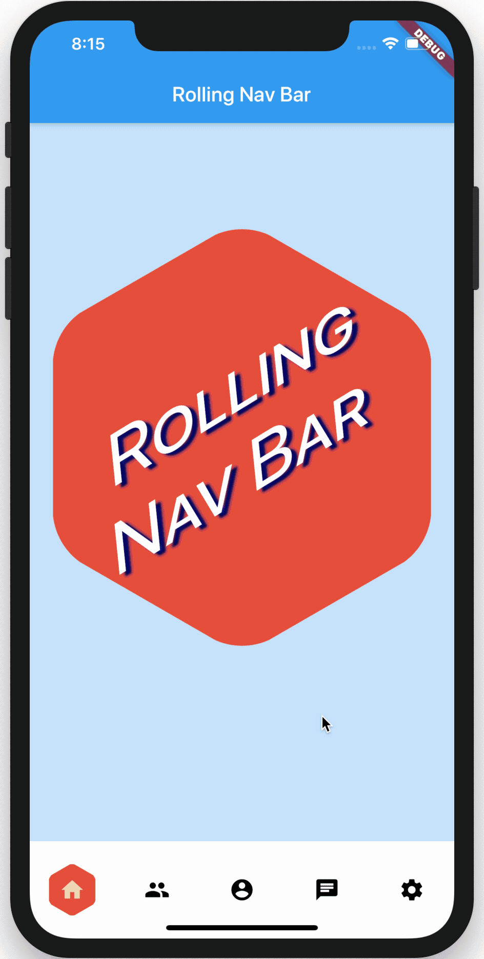
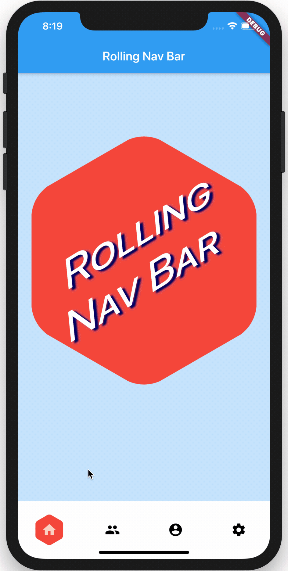
在演示中,较大六边形的背景与导航栏六边形的背景相匹配。
为了实现这个以及类似的效果,提供了两个回调函数:onTap 和 onAnimate。onAnimate 对于将您应用程序中的视觉效果与导航栏进度同步特别有用。
标签项文本
如果使用 iconData 构造函数,您还可以传递一个小部件列表
在不活动图标下方渲染为文本。
RollingNavBar.iconData(
  // A list of length one implies the same color for all icons
  iconColors: <Color>[
    Colors.grey[800],
  ],
  iconData: <IconData>[
    Icons.home,
    Icons.friends,
    Icons.settings,
  ],
  iconText: <Widget>[
    Text('Home', style: TextStyle(color: Colors.grey, fontSize: 12)),
    Text('Friends', style: TextStyle(color: Colors.grey, fontSize: 12)),
    Text('Settings', style: TextStyle(color: Colors.grey, fontSize: 12)),
  ]
)