
FSuper
FSuper 可以帮助开发者快速舒适地构建复杂的视图。
它支持富文本、圆角、边框、图片、小红点,并可同时设置两个子组件,并控制它们之间的相对位置。
✨ 特点
-
丰富的圆角效果
-
精致的边框装饰
-
自然支持精彩的富文本
-
渐变效果
-
更有空间感的阴影
-
不简单的红点
-
灵活强大的相对布局
指南
⚙️ 参数
? 基本参数
| 参数 | 类型 | 必需 | 默认值 | 描述 |
|---|---|---|---|---|
| width | 双精度 | 假 | 空 | width |
| 高度 | 双精度 | 假 | 空 | height. 不能为 double.infinity |
| maxWidth | 双精度 | 假 | 空 | maxWidth. 如果 width> maxWidth, width 会被覆盖。如果 width 为空,那么最大扩展宽度为 maxWidth |
| maxHeight | 双精度 | 假 | 空 | maxHeight. 如果 height> maxHeight, height 会被覆盖。如果 height 为空,那么最大扩展宽度为 maxHeight |
| backgroundColor | 颜色 | 假 | 空 | backgroundColor |
| backgroundImage | ImageProvider | 假 | 空 | 背景图。会覆盖 backgroundColor 和 gradient |
| gradient | 渐变 | 假 | 空 | Gradient. 会覆盖 backgroundColor |
| padding | EdgeInsetsGeometry | 假 | 空 | Text and margins on each side. This is very useful to reserve space for children in FSuper |
| margin | EdgeInsets | 假 | 空 | FSuper margins in parent container |
| corner | 圆角 | 假 | 空 | Corner size |
| cornerStyle | CornerStyle | 假 | CornerStyle.round | 圆角样式. 默认是圆角, 设置 CornerStyle.bevel 为切角 |
| text | 字符串 | 假 | 空 | Text content |
| textColor | 颜色 | 假 | 空 | 字体颜色 |
| textSize | 双精度 | 假 | 空 | 字体大小 |
| 文本样式 | FontStyle | 假 | 空 | Font style |
| textWeight | FontWeight | 假 | 空 | Font style |
| fontHeight | 双精度 | 假 | 空 | 一行文字的高度 = textSize * fontHeight |
| textAlign | TextAlign | 假 | TextAlign.center | 文本对齐方式 |
| spans | List<TextSpan> |
假 | 空 | 富文本. 接收 text 的时候, text 配置会默认继承. 可通过 TextStyle 单独设置 |
| onClick | GestureTapCallback | 假 | 空 | 设置 FSuper 点击事件监听 |
Child Widget Parameters
| 参数 | 类型 | 必需 | 默认值 | 描述 |
|---|---|---|---|---|
| child1 | Widget | 假 | 空 | 子控件 1 |
| child1Alignment | Alignment | 假 | 空 | 子控件 1 在 FSuper 中的相对位置 |
| child1Margin | EdgeInsets | 假 | 空 | 子控件 1 相对位置的偏移量 |
| onChild1Click | GestureTapCallback | 假 | 空 | 子控件 1 的点击事件监听 |
| child2 | Widget | 假 | 空 | 子控件 2 |
| child2Alignment | Alignment | 假 | 空 | 子控件 2 在 FSuper 中的相对位置 |
| child2Margin | EdgeInsets | 假 | 空 | 子控件 2 相对位置的偏移量 |
| onChi2d1Click | GestureTapCallback | 假 | 空 | 子控件 2 的点击事件监听 |
? 红点参数
| 参数 | 类型 | 必需 | 默认值 | 描述 |
|---|---|---|---|---|
| redPoint | 布尔值 | 假 | 假 | 是否显示红点 |
| redPointColor | 颜色 | 假 | Colors.redAccent | 红点颜色 |
| redPointSize | 双精度 | 假 | 20 | 红点大小 |
| redPointText | 字符串 | 假 | 空 | 红点上的文字 |
| redPointTextColor | 颜色 | 假 | 空 | 红点上文字的颜色 |
| redPointTextSize | 双精度 | 假 | 空 | 红点上文字的字号 |
| redPointOffset | 偏移量 | 假 | 空 | 红点向右上偏移. Offset (0,0) 的红点位于 FSuper 的右上角. 默认情况红点向右上偏移 1/4 |
? 描边参数
| 参数 | 类型 | 必需 | 默认值 | 描述 |
|---|---|---|---|---|
| strokeWidth | 双精度 | 假 | 空 | 描边宽度. > 0 的时候会显示描边 |
| strokeColor | 颜色 | 假 | 空 | 边框颜色 |
阴影参数
| 参数 | 类型 | 必需 | 默认值 | 描述 |
|---|---|---|---|---|
| shadowColor | 颜色 | 假 | 空 | Shadow color |
| shadowOffset | 偏移量 | 假 | 空 | 阴影偏移量 |
| shadowBlur | 双精度 | 假 | 空 | 值越大, 阴影越大 |
? 示例
? 基本用法
FSuper(
  margin: EdgeInsets.fromLTRB(12, 0, 12, 0),
  width: double.infinity,
  text: "This is FSuper!",
  backgroundColor: Color(0xffffc900),
),


FSuper(
  text: "En.. ",
  spans: [
    TextSpan(
        text: "FWidget",
        style: TextStyle(
          color: Color(0xffffc900),
          backgroundColor: Colors.black38,
          fontSize: 20,
        )),
  ...
  ],
),
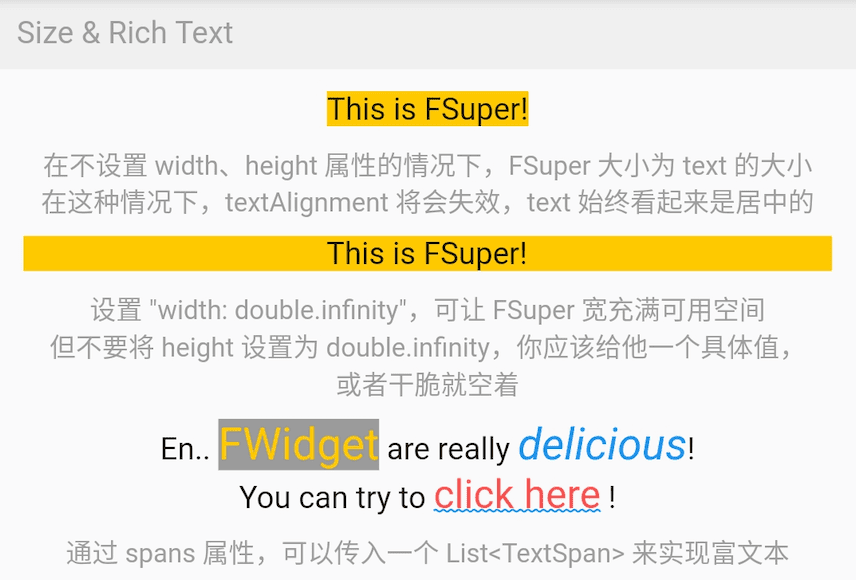
FSuper 文本的第一部分通过 `text` 属性设置, 相关的文本样式属性可以设置. 如果想实现富文本效果, 可以通过 spans 属性传递一个 TextSpan 数组.
当然, 默认情况下, 你没有为 TextSpan 设置的属性都会自动继承 FSuper 的文本样式配置.
默认情况, FSuper 能够自适应文本内容的大小.
但你仍然可以通过 `width`, `height` 属性指定具体的大小. 如果想让父容器充满组件, 可以将它们的值设置为 `double.infinity`.
⚠️ 你永远不应该在无边界的父容器中将 FSuper 的大小设置为 double.infinity, 因为它真的不知道应该有多大!
此外, FSuper 还提供了 `maxWidth` 和 `maxHeight` 来辅助布局, 在组件尺寸不确定的情况下非常有用. 你的组件永远不会超出它们的最大限制.
圆角 & 描边用法
FSuper(
  width: 130,
  padding: EdgeInsets.only(top: 16, bottom: 16)
  text: 'Corner FSuper',
  backgroundColor: Color(0xffFF7043),
  corner: Corner.all(12),
  cornerStyle: CornerStyle.bevel,
),

FSuper(
  text: '音乐类型:流行音乐',
  textColor: Color(0xffc2bfc2),
  padding: EdgeInsets.all(2),
  corner: Corner.all(3),
  strokeColor: Color(0xffc2bfc2),
  strokeWidth: 1,
),
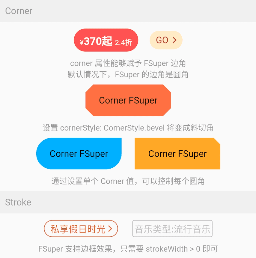
使用 FSuper 声明一个圆角和描边组件非常简单.
圆角仅通过 `corner` 属性就可以声明. 一个 Corner 对象将描述组件的圆角. 你可以单独控制每个圆角.
FSuper 支持两种圆角
-
CornerStyle.round: 圆角. 这是我们大部分时间需要的效果.
-
CornerStyle.bevel: 切角.
如果你想要一个描边, 只需将 FSuper 的 `strokeWidth > 0`. 此外, `strokeColor` 属性可以让你描述描边的颜色.
渐变 & 阴影用法
FSuper(
  width: 280,
  height: 45,
  text: 'Search Flight',
  textAlignment: Alignment.center,
  textSize: 16,
  textColor: Color(0xff333333),
  corner: Corner.all(23),
  gradient: LinearGradient(colors: [
    Color(0xfffed83a),
    Color(0xfffcad2c),
  ]),
),
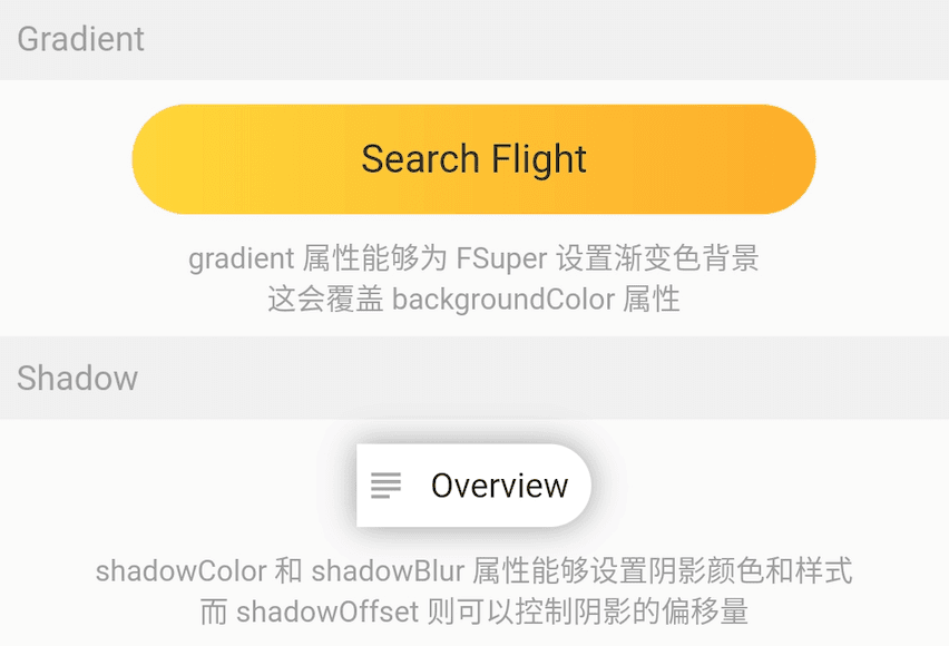
`gradient` 属性允许你使用一个 gradient 对象为 FSuper 声明一个渐变背景.
渐变背景将覆盖 backgroundColor 设置的纯色背景.
⚠️ 背景优先级: backgroundImage > gradient > backgroundColor.
FSuper(
  text: 'Overview',
  backgroundColor: Colors.white,
  padding: EdgeInsets.fromLTRB(6.0 + 18.0 + 6.0, 9, 9, 9),
  corner: Corner(rightTopCorner: 20, rightBottomCorner: 20),
  child1: Icon(
    Icons.subject,
    size: 18,
    color: Color(0xffa6a4a7),
  ),
  child1Alignment: Alignment.centerLeft,
  child1Margin: EdgeInsets.only(left: 3),
  shadowColor: Colors.black38,
  shadowBlur: 10,
  onClick: () {
    _showDialog(context, "Disco");
  },
),
如果你考虑为你的组件添加阴影效果, 使用 FSuper 是个不错的选择.
? 红点用法
FSuper(
  width: 60,
  height: 60,
  backgroundColor: Color(0xffeeeeee),
  corner: Corner.all(6),
  redPoint: true,
  redPointSize: 20,
  redPointText: "红包",
),
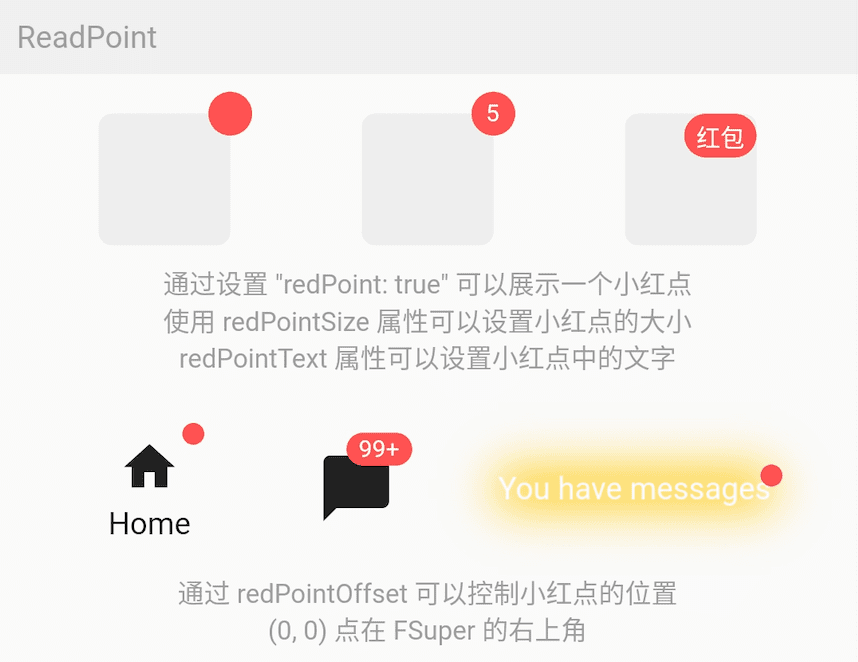
使用 FSuper 可以非常简单的实现常见的红点效果, 只需配置 `redPoint: true`.
此外, 你可以在红点上添加任意的文本内容 (这真的很方便), 并设置它的位置.
⚠️ 红点的 (0,0) 位置是 FSuper 的右上角.
一站式满足你的所有需求。
子控件
FSuper(
    width: double.infinity,
    padding: EdgeInsets.fromLTRB(
        (16.0 + 25.0 + 12), 8, (0.0 + 8.0), 8),
    margin: EdgeInsets.fromLTRB(10, 10, 10, 0),
    corner: Corner.all(6),
    backgroundColor: Color(0xfffff0e7),
    strokeColor: Color(0xfffee0cd),
    strokeWidth: 1,
    text: '警告提示的文案',
    textColor: Color(0xff7e7c7a),
    textAlignment: Alignment.centerLeft,
    textAlign: TextAlign.left,
    spans: [
      ...
    ],
    child1: Transform.rotate(
      angle: pi,
      child: Icon(
        Icons.info,
        size: 25,
        color: Color(0xfffd6721),
      ),
    ),
    child1Alignment: Alignment.centerLeft,
    child1Margin: EdgeInsets.fromLTRB(16, 0, 0, 0),
    child2: Icon(
      Icons.close,
      size: 15,
      color: Colors.black38,
    ),
    child2Alignment: Alignment.topRight,
    child2Margin: EdgeInsets.fromLTRB(0, 8, 12, 0),
    onChild2Click: () {
      _showDialog(context, "关闭警告⚠️");
    },
  ),
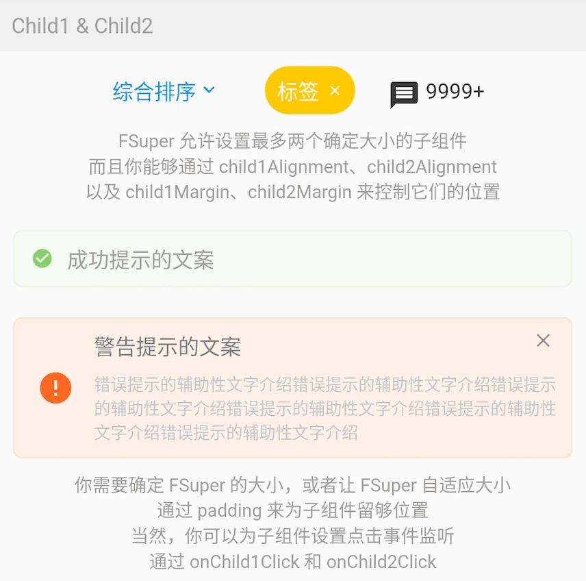
在 FSuper 中, 可以通过 `child1`, `child2` 声明两个子组件. 你可以指定它们的位置, 并声明点击事件.
这将在一些常用且复杂的布局中极大地提高开发速度. 特别是在一个组件尺寸较小且不确定, 另一个组件根据它的尺寸确定位置的情况下, FSuper 都能处理.
图中这些组件的效果, 都只需要一个 FSuper 组件即可完成.
更多用法
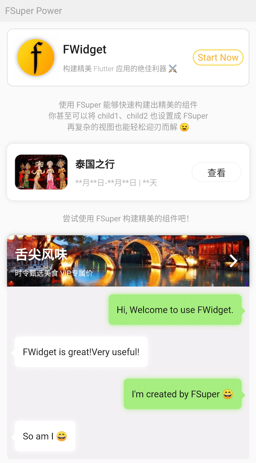
不要吃惊, 图中效果都是通过 FSuper 实现的.
子组件的设计, 让 FSuper 在灵活性上有了质的飞跃, 大部分复杂的视图都不在话下.
例如, 图中的气泡聊天框, 无需背景图, 只需使用 FSuper 即可实现. 这让类似的组件变得极其灵活, 并且易于修改.
FSuper(
  maxWidth: 220,
  textAlign: TextAlign.left,
  text: "I'm created by FSuper ?",
  padding: EdgeInsets.only(
      left: 12, right: 12, top: 15, bottom: 15),
  backgroundColor: Color(0xffa5ed7e),
  corner: Corner.all(6),
  child1: Transform.rotate(
    angle: pi / 4,
    child: FSuper(
      width: 10,
      height: 10,
      backgroundColor: Color(0xffa5ed7e),
      corner: Corner.all(1.5),
    ),
  ),
  child1Alignment: Alignment.topRight,
  child1Margin: EdgeInsets.only(right: -4, top: 20),
  shadowColor: Color(0xffa5ed7e),
  shadowBlur: 5,
),
? 如何使用?
在项目 `pubspec.yaml` 文件中添加依赖
pub 依赖
dependencies:
  fsuper: ^<version number>
⚠️ 注意, 请前往 pub 获取 FSuper 的最新版本号
git 依赖
dependencies:
  fsuper:
    git:
      url: '[email protected]:Fliggy-Android-Team/fsuper.git'
      ref: '<Branch number or tag number>'
⚠️ 注意, 分支号或者 tag, 请参考 FSuper 的官方项目


