动画登录


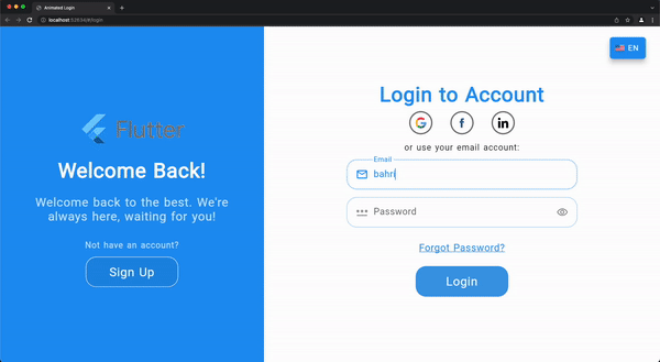
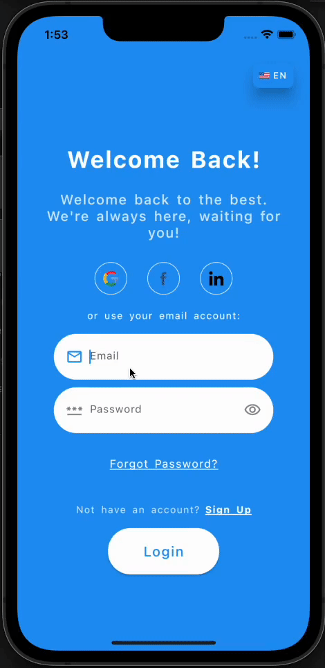
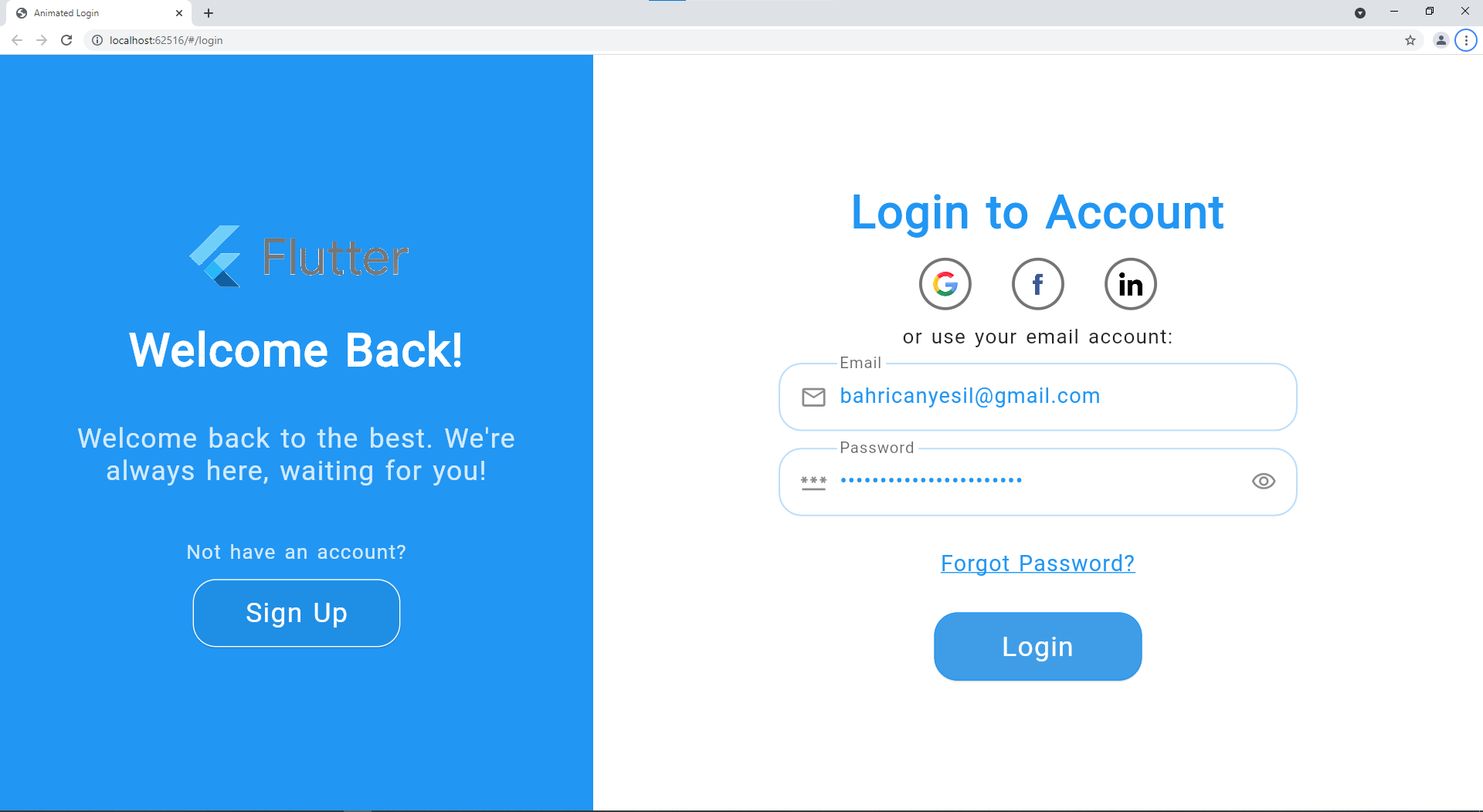
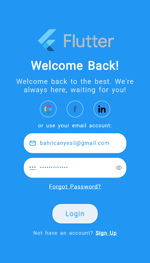
Flutter 的 `Animated Login` 是一个带有柔和而愉悦动画的现成登录/注册屏幕。
它完全响应式,可用于 Web 和移动应用程序。您可以使用这个精美的动画屏幕来欢迎您的用户,它同时提供了登录和注册的功能。
Web 视图示例视频
移动视图示例视频
安装
您可以在 此处 按照说明进行安装。
参考
| 属性 |
类型 |
描述 |
| onSignup |
SignupCallback |
注册按钮按下后调用的注册回调。 |
| onLogin |
LoginCallback |
登录按钮按下后调用的登录回调。 |
| socialLogins |
List<SocialLogin> |
将提供的社交登录选项列表。 |
| loginTexts |
LoginTexts |
确定屏幕上的所有文本。 |
| loginTheme |
LoginTheme |
确定屏幕上所有与主题相关的变量。 |
| onForgotPassword |
ForgotPasswordCallback |
点击“忘记密码”文本后调用的回调。通常会将用户导航到一个重置密码的屏幕。 |
| animationCurve |
Curve |
将用于动画的自定义动画曲线。 |
| formWidthRatio |
双精度 |
表单宽度与屏幕宽度的比例。 |
| animationDuration |
持续时间 |
动画的时长。 |
| formKey |
GlobalKey<FormState> |
可选的自定义表单密钥,如果未提供,则将在本地创建。 |
| formElementsSpacing |
双精度 |
表单元素之间的间距。 |
| socialLoginsSpacing |
双精度 |
社交登录选项之间的间距。 |
| checkError |
布尔值 |
指示登录屏幕是否应处理错误,并在对话框中显示从回调返回的错误消息。 |
| showForgotPassword |
布尔值 |
指示是否启用“忘记密码”选项。 |
| showChangeActionTitle |
布尔值 |
指示是否应显示切换操作标题。 |
| showPasswordVisibility |
布尔值 |
指示用户是否可以在不隐藏的情况下显示密码文本。 |
| nameController |
TextEditingController |
姓名输入字段的可选 TextEditingController。 |
| emailController |
TextEditingController |
电子邮件输入字段的可选 TextEditingController。 |
| passwordController |
TextEditingController |
密码输入字段的可选 TextEditingController。 |
| confirmPasswordController |
TextEditingController |
确认密码输入字段的可选 TextEditingController。 |
| actionButtonStyle |
ButtonStyle |
操作按钮(登录/注册)的自定义按钮样式。 |
| changeActionButtonStyle |
ButtonStyle |
用于切换身份验证模式的更改操作按钮的自定义按钮样式。 |
| welcomePadding |
EdgeInsets |
欢迎部分小部件的内边距。 |
| formPadding |
EdgeInsets |
表单部分小部件的内边距。 |
| backgroundImage |
字符串 |
欢迎部分背景的完整资源图片路径。 |
| logo |
字符串 |
徽标的完整资源图片路径。 |
| logoSize |
Size |
欢迎部分徽标的大小。 |
| signUpMode |
SignUpModes |
枚举,用于确定除电子邮件和密码字段外,应显示哪些文本表单字段:姓名 / 确认密码 / 两者。 |
LoginTexts
| 属性 |
类型 |
描述 |
| welcome |
字符串 |
注册模式下欢迎部分的欢迎标题。 |
| welcomeDescription |
字符串 |
注册模式下欢迎部分的欢迎描述。 |
| signUp |
字符串 |
注册模式下的操作按钮文本。 |
| signUpFormTitle |
字符串 |
注册模式下的表单标题。 |
| signUpUseEmail |
字符串 |
注册模式下的使用电子邮件 CTA。 |
| welcomeBack |
字符串 |
登录模式下欢迎部分的欢迎标题。 |
| welcomeBackDescription |
字符串 |
登录模式下欢迎部分的欢迎描述。 |
| login |
字符串 |
登录模式下的操作按钮文本。 |
| loginFormTitle |
字符串 |
登录模式下的表单标题。 |
| loginUseEmail |
字符串 |
登录模式下的使用电子邮件 CTA。 |
| forgotPassword |
字符串 |
登录模式下的“忘记密码”文本。 |
| notHaveAnAccount |
字符串 |
注册按钮上方的文本,用于引导没有账户的用户。 |
| alreadyHaveAnAccount |
字符串 |
登录按钮上方的文本,用于引导已有账户的用户。 |
| nameHint |
字符串 |
姓名 [TextFormField] 的提示文本。 |
| emailHint |
字符串 |
电子邮件 [TextFormField] 的提示文本。 |
| passwordHint |
字符串 |
密码 [TextFormField] 的提示文本。 |
| confirmPasswordHint |
字符串 |
确认密码 [TextFormField] 的提示文本。 |
| passwordMatchingError |
字符串 |
密码和确认密码输入不匹配的错误文本。 |
| dialogButtonText |
字符串 |
错误对话框的按钮文本。 |
LoginTheme
| 属性 |
类型 |
描述 |
| formTitleStyle |
TextStyle |
表单部分标题的文本样式。 |
| welcomeTitleStyle |
TextStyle |
欢迎部分标题的文本样式。 |
| welcomeDescriptionStyle |
TextStyle |
欢迎部分描述的文本样式。 |
| changeActionStyle |
TextStyle |
欢迎部分更改操作 CTA 的文本样式。 |
| useEmailStyle |
TextStyle |
表单部分使用电子邮件文本的样式。 |
| forgotPasswordStyle |
TextStyle |
表单部分“忘记密码”CTA 的文本样式。 |
| hintTextStyle |
TextStyle |
文本字段中提示文本的样式。 |
| errorTextStyle |
TextStyle |
文本字段中错误文本的样式。 |
| textFormStyle |
TextStyle |
文本字段中输入文本的样式。 |
| actionTextStyle |
TextStyle |
表单部分操作按钮文本的样式。 |
| changeActionTextStyle |
TextStyle |
欢迎部分更改操作按钮文本的样式。 |
| textFormFieldDeco |
InputDecoration |
文本字段的输入装饰。 |
| nameIcon |
Widget |
姓名文本字段的 prefix 小部件。 |
| emailIcon |
Widget |
电子邮件文本字段的 prefix 小部件。 |
| passwordIcon |
Widget |
密码文本字段的 prefix 小部件。 |
| formFieldElevation |
双精度 |
文本字段的阴影。 |
| formFieldBackgroundColor |
颜色 |
文本字段的背景颜色。 |
| formFieldShadowColor |
颜色 |
文本字段的阴影颜色。 |
| formFieldBorderRadius |
BorderRadius |
文本字段的边框半径。 |
| formFieldSize |
Size |
文本字段的大小。 |
| formFieldHoverColor |
颜色 |
文本字段的悬停颜色。 |
| backgroundColor |
颜色 |
登录屏幕的背景颜色。 |
| errorBorderColor |
颜色 |
文本字段的错误边框颜色。 |
| focusedErrorBorderColor |
颜色 |
文本字段的聚焦错误边框颜色。 |
| focusedBorderColor |
颜色 |
文本字段的聚焦边框颜色。 |
| enabledBorderColor |
颜色 |
文本字段的可用边框颜色。 |
| enabledBorder |
InputBorder |
文本字段的可用边框。 |
| errorBorder |
InputBorder |
文本字段的错误边框。 |
| focusedErrorBorder |
InputBorder |
文本字段的聚焦错误边框。 |
| focusedBorder |
InputBorder |
文本字段的聚焦边框。 |
| showFormFieldErrors |
布尔值 |
指示是否应在文本字段下方显示错误消息。 |
| showLabelTexts |
布尔值 |
指示是否应在文本字段上方显示标签。 |
| socialLoginHoverColor |
颜色 |
社交登录小部件的悬停颜色。 |
| socialLoginBorder |
BorderSide |
社交登录小部件的边框。 |
SocialLogin
| 属性 |
类型 |
描述 |
| iconPath |
字符串 |
社交平台徽标的完整资源路径。 |
| callback |
SocialLoginCallback |
点击社交平台徽标时调用的回调。 |
LoginData
| 属性 |
类型 |
描述 |
| email |
字符串 |
用户在电子邮件 [TextFormField] 中输入的电子邮件文本。 |
| password |
字符串 |
用户在密码 [TextFormField] 中输入的密码文本。 |
SignUpData
| 属性 |
类型 |
描述 |
| 名称 |
字符串 |
用户在姓名 [TextFormField] 中输入的姓名文本。 |
| email |
字符串 |
用户在电子邮件 [TextFormField] 中输入的电子邮件文本。 |
| password |
字符串 |
用户在密码 [TextFormField] 中输入的密码文本。 |
| confirmPassword |
字符串 |
用户在确认密码 [TextFormField] 中输入的确认密码文本。 |
SignUpModes
| Enum |
描述 |
| 名称 |
仅显示姓名文本表单字段,不显示确认密码。 |
| confirmPassword |
仅显示确认密码表单字段,不显示姓名。 |
| both |
显示姓名和确认密码文本表单字段。 |
注册模式,用于确定应显示哪些文本表单字段。
完整示例
您可以在示例项目中的 example 文件夹中查看 完整示例。示例项目的视频录制如上所示(GIF 格式)。
基本示例
import 'package:flutter/material.dart';
import 'package:animated_login/animated_login.dart';
class LoginScreen extends StatelessWidget {
  const LoginScreen({Key? key}) : super(key: key);

  /// Simulates the multilanguage, you will implement your own logic.
  /// According to the current language, you can display a text message
  /// with the help of [LoginTexts] class.
  final String langCode = 'en';

  @override
  Widget build(BuildContext context) {
    return AnimatedLogin(
      onLogin: onLogin,
      onSignup: onSignup,
      onForgotPassword: onForgotPassword,
      formWidthRatio: 60,
      logo: 'images/logo.gif',
      // backgroundImage: 'images/background_image.jpg',
      signUpMode: SignUpModes.both,
      loginTheme: _loginTheme,
      loginTexts: _loginTexts,
    );
  }

  /// You can adjust the colors, text styles, button styles, borders
  /// according to your design preferences.
  /// You can also set some additional display options such as [showLabelTexts].
  LoginTheme get _loginTheme => LoginTheme(
        // showLabelTexts: false,
        backgroundColor: Colors.blue, // const Color(0xFF6666FF),
        formFieldBackgroundColor: Colors.white,
        changeActionTextStyle: const TextStyle(color: Colors.white),
      );

  LoginTexts get _loginTexts => LoginTexts(
        nameHint: _username,
        login: _login,
        signUp: _signup,
      );

  /// You can adjust the texts in the screen according to the current language
  /// With the help of [LoginTexts], you can create a multilanguage scren.
  String get _username => langCode == 'tr' ? 'Kullanıcı Adı' : 'Username';
  String get _login => langCode == 'tr' ? 'Giriş Yap' : 'Login';
  String get _signup => langCode == 'tr' ? 'Kayıt Ol' : 'Sign Up';

  /// Login action that will be performed on click to action button in login mode.
  Future<String?> onLogin(LoginData loginData) async {
    await Future.delayed(const Duration(seconds: 2));
    print('Successfully logged in.');
    return null;
  }

  /// Sign up action that will be performed on click to action button in sign up mode.
  Future<String?> onSignup(SignUpData loginData) async {
    await Future.delayed(const Duration(seconds: 2));
    print('Successfully signed up.');
    return null;
  }

  /// Action that will be performed on click to "Forgot Password?" text/CTA.
  /// Probably you will navigate user to a page to create a new password after the verification.
  Future<String?> onForgotPassword(String email) async {
    await Future.delayed(const Duration(seconds: 2));
    print('Successfully navigated.');
    return null;
  }
}
带社交登录选项和数据检查的基本示例
import 'package:flutter/material.dart';
import 'package:animated_login/animated_login.dart';

class LoginScreen extends StatelessWidget {
  const LoginScreen({Key? key}) : super(key: key);

  /// Simulates the multilanguage, you will implement your own logic.
  /// According to the current language, you can display a text message
  /// with the help of [LoginTexts] class.
  final String langCode = 'en';

  @override
  Widget build(BuildContext context) {
    return AnimatedLogin(
      onLogin: onLogin,
      onSignup: onSignup,
      onForgotPassword: onForgotPassword,
      formWidthRatio: 60,
      logo: 'images/logo.gif',
      // backgroundImage: 'images/background_image.jpg',
      signUpMode: SignUpModes.both,
      socialLogins: _socialLogins,
      loginTheme: _loginTheme,
      loginTexts: _loginTexts,
    );
  }

  /// You can adjust the colors, text styles, button styles, borders
  /// according to your design preferences.
  /// You can also set some additional display options such as [showLabelTexts].
  LoginTheme get _loginTheme => LoginTheme(
        // showLabelTexts: false,
        backgroundColor: Colors.blue, // const Color(0xFF6666FF),
        formFieldBackgroundColor: Colors.white,
        changeActionTextStyle: const TextStyle(color: Colors.white),
      );

  LoginTexts get _loginTexts => LoginTexts(
        nameHint: _username,
        login: _login,
        signUp: _signup,
      );

  /// You can adjust the texts in the screen according to the current language
  /// With the help of [LoginTexts], you can create a multilanguage scren.
  String get _username => langCode == 'tr' ? 'Kullanıcı Adı' : 'Username';
  String get _login => langCode == 'tr' ? 'Giriş Yap' : 'Login';
  String get _signup => langCode == 'tr' ? 'Kayıt Ol' : 'Sign Up';

  /// Social login options, you should provide callback function and icon path.
  /// Icon paths should be the full path in the assets
  /// Don't forget to also add the icon folder to the "pubspec.yaml" file.
  List<SocialLogin> get _socialLogins => <SocialLogin>[
        SocialLogin(
            callback: () async => socialLogin('Google'),
            iconPath: 'images/google.png'),
        SocialLogin(
            callback: () async => socialLogin('Facebook'),
            iconPath: 'images/facebook.png'),
        SocialLogin(
            callback: () async => socialLogin('Linkedin'),
            iconPath: 'images/linkedin.png'),
      ];

  /// Login action that will be performed on click to action button in login mode.
  Future<String?> onLogin(LoginData loginData) async {
    await Future.delayed(const Duration(seconds: 2));
    print("""
    Successfully logged in.\n
    Email: ${loginData.email}\n
    Password: ${loginData.password}""");
    return null;
  }

  /// Sign up action that will be performed on click to action button in sign up mode.
  Future<String?> onSignup(SignUpData signupData) async {
    await Future.delayed(const Duration(seconds: 2));
    print("""
    Successfully signed up.\n
    Username: ${signupData.name}\n
    Email: ${signupData.email}\n
    Password: ${signupData.password}\n
    Confirm Password: ${signupData.confirmPassword}""");
    return null;
  }

  /// Action that will be performed on click to "Forgot Password?" text/CTA.
  /// Probably you will navigate user to a page to create a new password after the verification.
  Future<String?> onForgotPassword(String email) async {
    await Future.delayed(const Duration(seconds: 2));
    print('Successfully navigated. Email is $email');
    return null;
  }

  /// Social login callback example.
  Future<String?> socialLogin(String type) async {
    await Future.delayed(const Duration(seconds: 2));
    print('Successfully logged in with $type.');
    return null;
  }
}
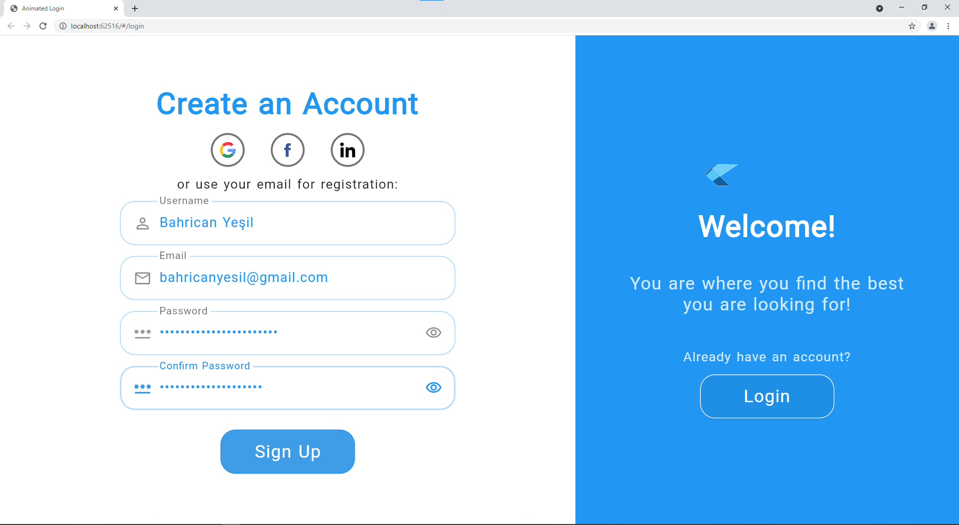
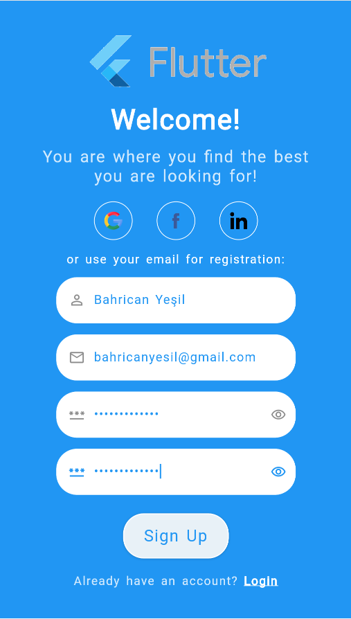
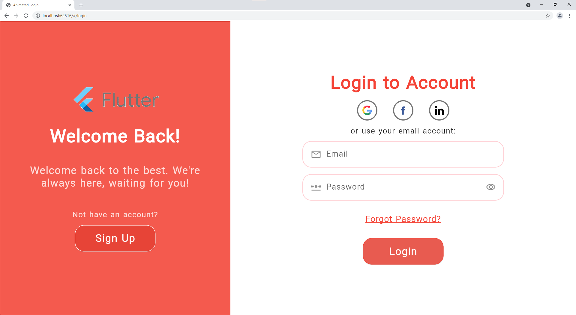
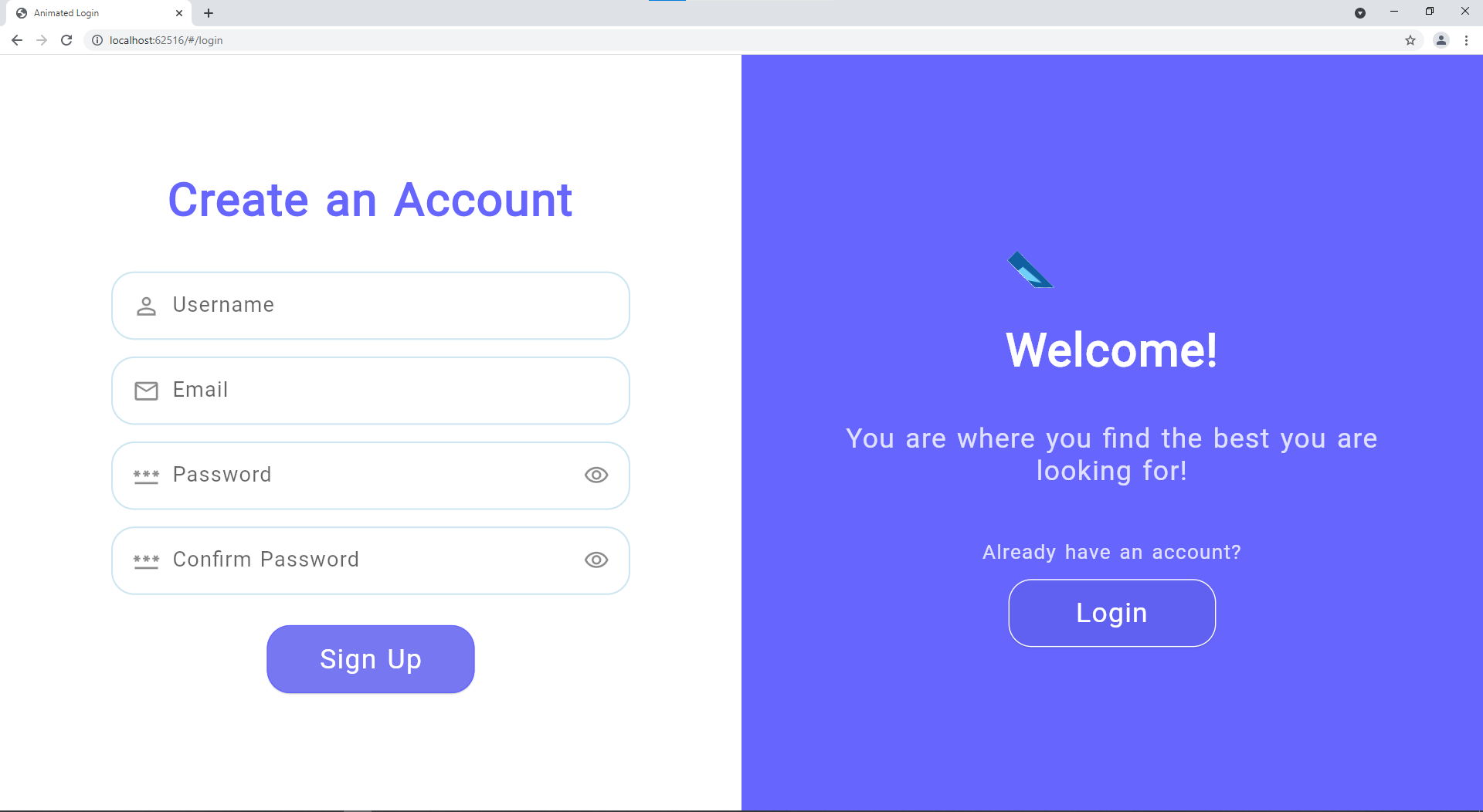
更多截图
| Web 登录 |
Mobile 登录 |
 |
 |
| Web 注册 |
Mobile 注册 |
 |
 |
| 颜色更改 |
无社交登录 |
 |
 |
| 错误示例 |
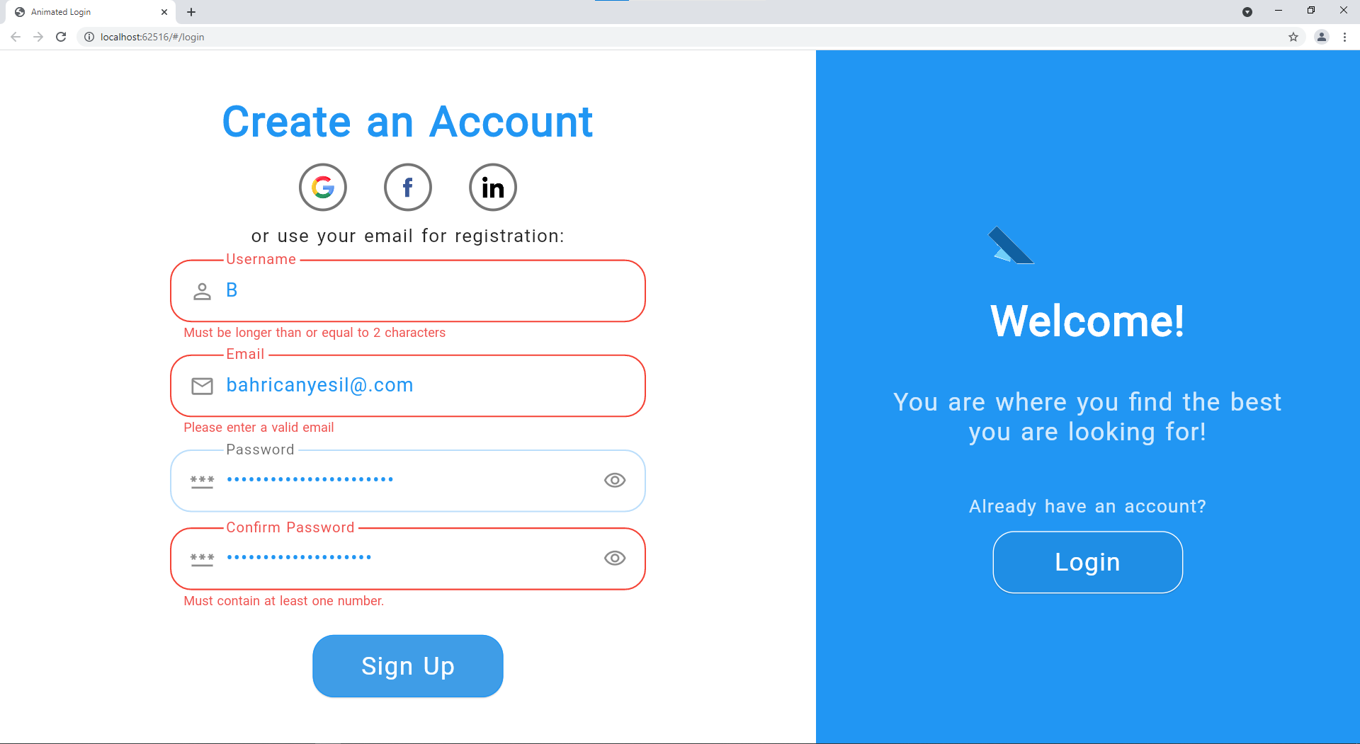 |
贡献
贡献对我以及希望使用此包的人来说都非常重要。如果您能抽出时间来推动该包的发展,我将不胜感激。
所有帮助都受欢迎,但如果您有任何疑问、bug 报告、问题、功能请求、pull requests 等,请首先参考 贡献指南。
如果您喜欢并受益于此包,请在 GitHub 上给我们一个 Star,并在 pub.dev 上点赞以提供帮助!
许可证
GitHub
查看 Github


