
Flutter DropdownButton2
简介
Flutter 的核心下拉按钮小部件,具有稳定的下拉菜单和许多可自定义的选项
以满足您的需求。
功能
- 下拉菜单始终显示在按钮下方,您可以使用 offset 参数编辑其位置
参数。 - 通过将 showAboveButton 设置为 true,可以使菜单显示在按钮上方。
- 您可以根据需要编辑(按钮、菜单和菜单项)的高度、宽度和装饰。
- 您可以对提示或值进行对齐和自定义。
- 您可以编辑滚动条的半径、粗细和是否始终显示。
- 您可以为下拉菜单指定最大高度,如果项目过多,它将变为可滚动。
项目。 - 如果您将 Null 传递给 dropdownMaxHeight 参数或未使用它,则下拉菜单将获得最大
可能的高度,并且如果项目过多,它将变为可滚动。 - 如果您有一个长滚动列表,下拉菜单将自动滚动到最后选定的项目并
如果可能,在菜单中间显示它。 - 使用 DropdownButtonHideUnderline 包裹 DropdownButton2 以隐藏下划线。
- 下面的 DropdownButton2 自定义小部件使其更具可重用性。您可以对其进行自定义
以满足您的需求,并像示例中所示那样轻松地在您的应用程序中到处使用。 - 您可以使用 DropdownButton2 作为弹出菜单按钮,方法是使用 customButton 参数。您可以
传入图标、图像或任何您想要的东西,并按照示例中的方式进行自定义。 - 您可以通过将 openWithLongPress 设置为 true,使弹出菜单在长按时打开,而不是在点击时打开。
参数为 true。 - 您可以向弹出菜单添加分隔线,并使用不同的高度,方法是将分隔线索引传递给
customItemsIndexes,并将高度传递给 customItemsHeight。 - 您也可以以同样的方式使用 DropdownButtonFormField2,并使用上述所有选项。
- 使用 DropdownButtonFormField2 的 decoration 参数添加 labelText、fillColor 等。
- 您可以通过将 DropdownButtonFormField2 包裹在 SizedBox 中并为其提供
所需的宽度来定制其宽度。
安装
在 pubspec.yaml 中添加此行
dependencies:

  dropdown_button2: ^1.0.0
导入包
import 'package:dropdown_button2/dropdown_button2.dart';
用法和示例
- 简单的 DropdownButton2,没有太多规格

String? selectedValue;
List<String> items = [
  'Item1',
  'Item2',
  'Item3',
  'Item4',
];

@override
Widget build(BuildContext context) {
  return Scaffold(
    body: Center(
      child: DropdownButtonHideUnderline(
        child: DropdownButton2(
          hint: Text(
            'Select Item',
            style: TextStyle(
              fontSize: 14,
              color: Theme
                  .of(context)
                  .hintColor,
            ),
          ),
          items: items
              .map((item) =>
              DropdownMenuItem<String>(
                value: item,
                child: Text(
                  item,
                  style: const TextStyle(
                    fontSize: 14,
                  ),
                ),
              ))
              .toList(),
          value: selectedValue,
          onChanged: (value) {
            setState(() {
              selectedValue = value as String;
            });
          },
          buttonHeight: 40,
          buttonWidth: 140,
          itemHeight: 40,
          itemWidth: 140,
        ),
      ),
    ),
  );
}
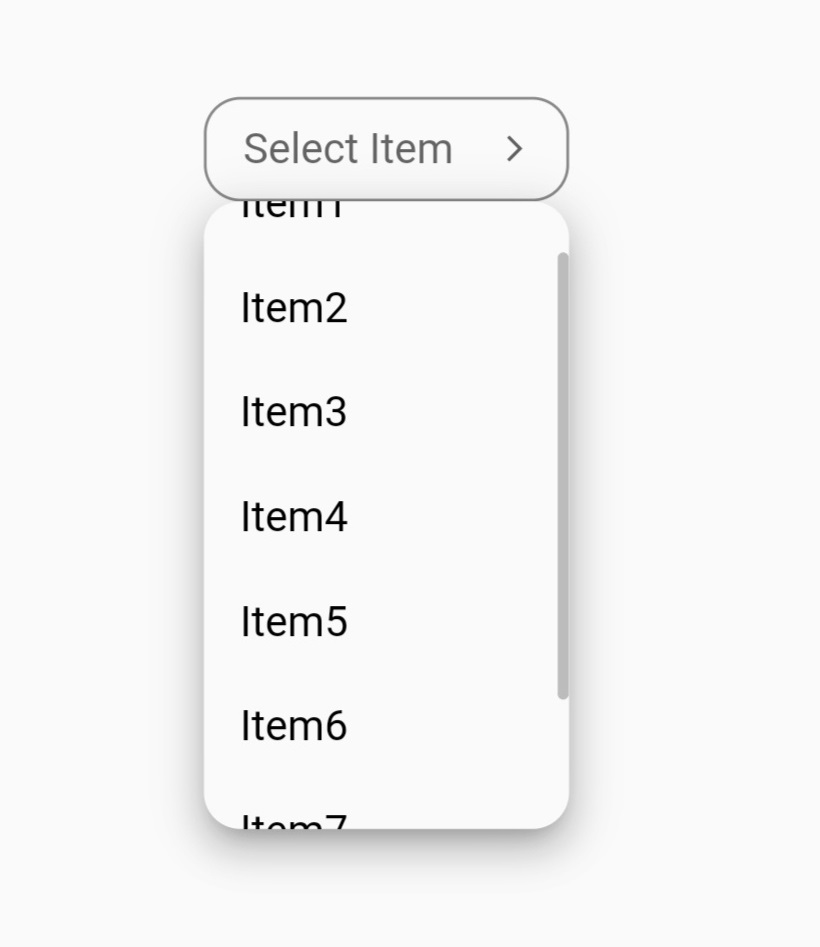
- 使用 DropdownButton2 直接进行更多自定义的 DropdownButton2

 String? selectedValue;
List<String> items = [
  'Item1',
  'Item2',
  'Item3',
  'Item4',
  'Item5',
  'Item6',
  'Item7',
  'Item8',
];

@override
Widget build(BuildContext context) {
  return Scaffold(
    body: Center(
      child: DropdownButtonHideUnderline(
        child: DropdownButton2(
          isExpanded: true,
          hint: Row(
            children: const [
              Icon(
                Icons.list,
                size: 16,
                color: Colors.yellow,
              ),
              SizedBox(
                width: 4,
              ),
              Expanded(
                child: Text(
                  'Select Item',
                  style: TextStyle(
                    fontSize: 14,
                    fontWeight: FontWeight.bold,
                    color: Colors.yellow,
                  ),
                  overflow: TextOverflow.ellipsis,
                ),
              ),
            ],
          ),
          items: items
              .map((item) =>
              DropdownMenuItem<String>(
                value: item,
                child: Text(
                  item,
                  style: const TextStyle(
                    fontSize: 14,
                    fontWeight: FontWeight.bold,
                    color: Colors.white,
                  ),
                  overflow: TextOverflow.ellipsis,
                ),
              ))
              .toList(),
          value: selectedValue,
          onChanged: (value) {
            setState(() {
              selectedValue = value as String;
            });
          },
          icon: const Icon(
            Icons.arrow_forward_ios_outlined,
          ),
          iconSize: 14,
          iconEnabledColor: Colors.yellow,
          iconDisabledColor: Colors.grey,
          buttonHeight: 50,
          buttonWidth: 160,
          buttonPadding: const EdgeInsets.only(left: 14, right: 14),
          buttonDecoration: BoxDecoration(
            borderRadius: BorderRadius.circular(14),
            border: Border.all(
              color: Colors.black26,
            ),
            color: Colors.redAccent,
          ).copyWith(
            boxShadow: kElevationToShadow[2],
          ),
          itemHeight: 40,
          itemWidth: 200,
          itemPadding: const EdgeInsets.only(left: 14, right: 14),
          dropdownMaxHeight: 200,
          dropdownPadding: null,
          dropdownBorderRadius: BorderRadius.circular(14),
          dropdownBorder: null,
          dropdownColor: Colors.redAccent,
          elevation: 8,
          scrollbarRadius: const Radius.circular(40),
          scrollbarThickness: 6,
          scrollbarAlwaysShow: true,
          offset: const Offset(-20, 0),
        ),
      ),
    ),
  );
}
- 使用下面附带的可重用自定义小部件进行更多自定义的 DropdownButton2
String? selectedValue;
List<String> items = [
  'Item1',
  'Item2',
  'Item3',
  'Item4',
  'Item5',
  'Item6',
  'Item7',
  'Item8',
];

@override
Widget build(BuildContext context) {
  return Scaffold(
    body: Center(
      child: CustomDropdownButton2(
        hint: 'Select Item',
        dropdownItems: items,
        value: selectedValue,
        onChanged: (value) {
          setState(() {
            selectedValue = value;
          });
        },
      ),
    ),
  );
}
- DropdownButton2 作为弹出菜单按钮,使用 customButton 参数并添加具有
不同高度(如分隔线)的自定义项目
示例 1:使用图标

class CustomButtonTest extends StatefulWidget {
  const CustomButtonTest({Key? key}) : super(key: key);

  @override
  State<CustomButtonTest> createState() => _CustomButtonTestState();
}

class _CustomButtonTestState extends State<CustomButtonTest> {
  @override
  Widget build(BuildContext context) {
    return Scaffold(
      body: Center(
        child: DropdownButtonHideUnderline(
          child: DropdownButton2(
            customButton: const Icon(
              Icons.list,
              size: 46,
              color: Colors.red,
            ),
            customItemsIndexes: const [3],
            customItemsHeight: 8,
            items: [
              ...MenuItems.firstItems.map(
                    (item) =>
                    DropdownMenuItem<MenuItem>(
                      value: item,
                      child: MenuItems.buildItem(item),
                    ),
              ),
              const DropdownMenuItem<Divider>(enabled: false, child: Divider()),
              ...MenuItems.secondItems.map(
                    (item) =>
                    DropdownMenuItem<MenuItem>(
                      value: item,
                      child: MenuItems.buildItem(item),
                    ),
              ),
            ],
            onChanged: (value) {
              MenuItems.onChanged(context, value as MenuItem);
            },
            itemHeight: 48,
            itemWidth: 160,
            itemPadding: const EdgeInsets.only(left: 16, right: 16),
            dropdownPadding: const EdgeInsets.symmetric(vertical: 6),
            dropdownBorderRadius: BorderRadius.circular(4),
            dropdownBorder: null,
            dropdownColor: Colors.redAccent,
            elevation: 8,
            offset: const Offset(0, 8),
          ),
        ),
      ),
    );
  }
}

class MenuItem {
  final String text;
  final IconData icon;

  const MenuItem({
    required this.text,
    required this.icon,
  });
}

class MenuItems {
  static const List<MenuItem> firstItems = [home, share, settings];
  static const List<MenuItem> secondItems = [logout];

  static const home = MenuItem(text: 'Home', icon: Icons.home);
  static const share = MenuItem(text: 'Share', icon: Icons.share);
  static const settings = MenuItem(text: 'Settings', icon: Icons.settings);
  static const logout = MenuItem(text: 'Log Out', icon: Icons.logout);

  static Widget buildItem(MenuItem item) {
    return Row(
      children: [
        Icon(
            item.icon,
            color: Colors.white,
            size: 22
        ),
        const SizedBox(
          width: 10,
        ),
        Text(
          item.text,
          style: const TextStyle(
            color: Colors.white,
          ),
        ),
      ],
    );
  }

  static onChanged(BuildContext context, MenuItem item) {
    switch (item) {
      case MenuItems.home:
      //Do something
        break;
      case MenuItems.settings:
      //Do something
        break;
      case MenuItems.share:
      //Do something
        break;
      case MenuItems.logout:
      //Do something
        break;
    }
  }
}
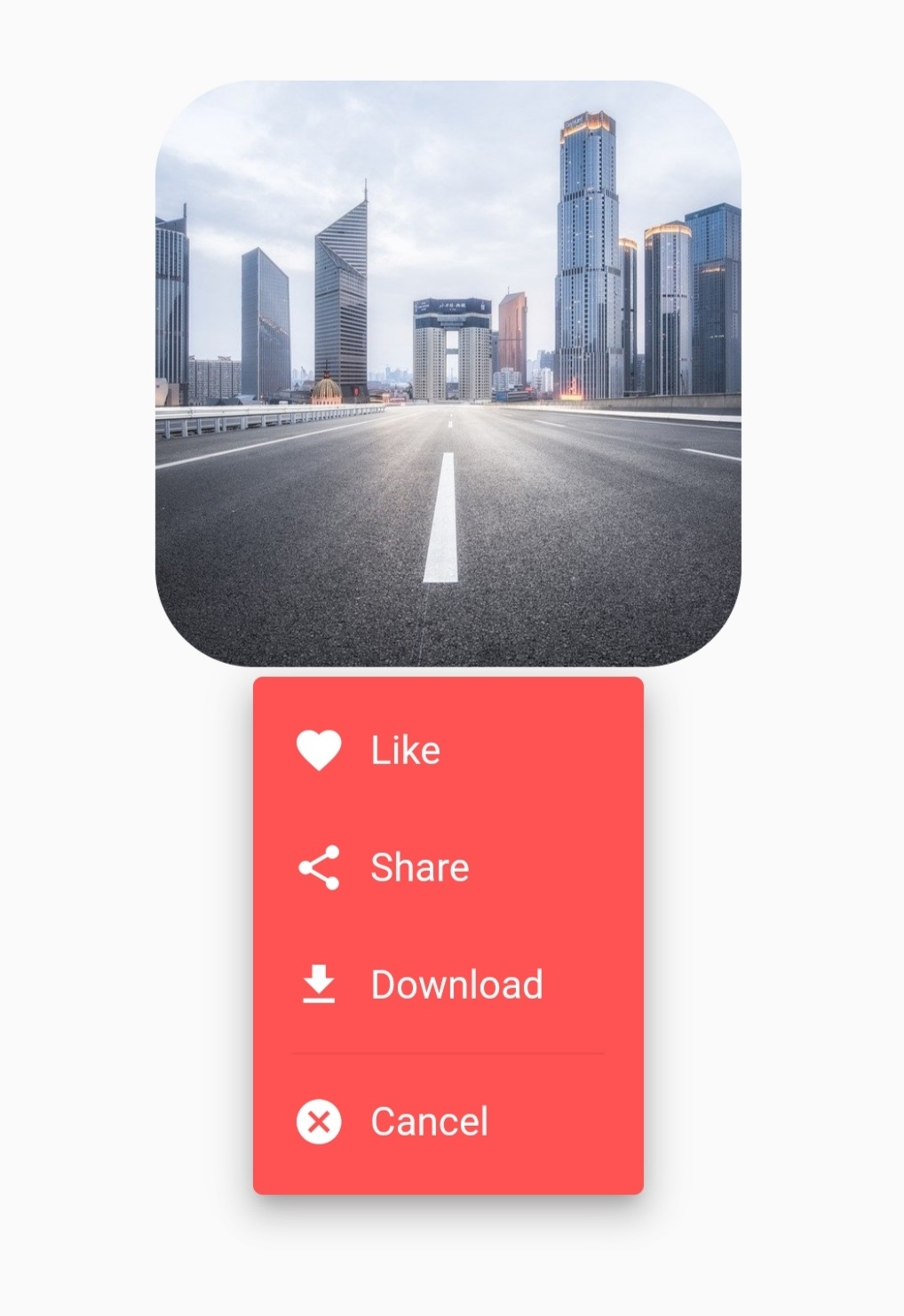
示例 2:使用图像和 openWithLongPress 参数
class CustomButtonTest extends StatefulWidget {
  const CustomButtonTest({Key? key}) : super(key: key);

  @override
  State<CustomButtonTest> createState() => _CustomButtonTestState();
}

class _CustomButtonTestState extends State<CustomButtonTest> {
  @override
  Widget build(BuildContext context) {
    return Scaffold(
      body: Center(
        child: DropdownButtonHideUnderline(
          child: DropdownButton2(
            customButton: Container(
              height: 240,
              width: 240,
              decoration: BoxDecoration(
                borderRadius: BorderRadius.circular(40),
                image: const DecorationImage(
                  image: NetworkImage(
                    'https://cdn.pixabay.com/photo/2020/05/11/06/20/city-5156636_960_720.jpg',
                  ),
                  fit: BoxFit.cover,
                ),
              ),
            ),
            openWithLongPress: true,
            customItemsIndexes: const [3],
            customItemsHeight: 8,
            items: [
              ...MenuItems.firstItems.map(
                        (item) =>
                        DropdownMenuItem<MenuItem>(
                          value: item,
                          child: MenuItems.buildItem(item),
                        ),
              ),
              const DropdownMenuItem<Divider>(enabled: false, child: Divider()),
              ...MenuItems.secondItems.map(
                        (item) =>
                        DropdownMenuItem<MenuItem>(
                          value: item,
                          child: MenuItems.buildItem(item),
                        ),
              ),
            ],
            onChanged: (value) {
              MenuItems.onChanged(context, value as MenuItem);
            },
            itemHeight: 48,
            itemWidth: 160,
            itemPadding: const EdgeInsets.only(left: 16, right: 16),
            dropdownPadding: const EdgeInsets.symmetric(vertical: 6),
            dropdownBorderRadius: BorderRadius.circular(4),
            dropdownBorder: null,
            dropdownColor: Colors.redAccent,
            elevation: 8,
            offset: const Offset(40, -4),
          ),
        ),
      ),
    );
  }
}

class MenuItem {
  final String text;
  final IconData icon;

  const MenuItem({
    required this.text,
    required this.icon,
  });
}

class MenuItems {
  static const List<MenuItem> firstItems = [like, share, download];
  static const List<MenuItem> secondItems = [cancel];

  static const like = MenuItem(text: 'Like', icon: Icons.favorite);
  static const share = MenuItem(text: 'Share', icon: Icons.share);
  static const download = MenuItem(text: 'Download', icon: Icons.download);
  static const cancel = MenuItem(text: 'Cancel', icon: Icons.cancel);

  static Widget buildItem(MenuItem item) {
    return Row(
      children: [
        Icon(
          item.icon,
          color: Colors.white,
          size: 22,
        ),
        const SizedBox(
          width: 10,
        ),
        Text(
          item.text,
          style: const TextStyle(
            color: Colors.white,
          ),
        ),
      ],
    );
  }

  static onChanged(BuildContext context, MenuItem item) {
    switch (item) {
      case MenuItems.like:
      //Do something
        break;
      case MenuItems.share:
      //Do something
        break;
      case MenuItems.download:
      //Do something
        break;
      case MenuItems.cancel:
      //Do something
        break;
    }
  }
}
自定义 DropdownButton2 小部件
class CustomDropdownButton2 extends StatelessWidget {
  final String hint;
  final String? value;
  final List<String> dropdownItems;
  final ValueChanged<String?>? onChanged;
  final Alignment? hintAlignment;
  final Alignment? valueAlignment;
  final double? buttonHeight, buttonWidth;
  final EdgeInsetsGeometry? buttonPadding;
  final Decoration? buttonDecoration;
  final int? buttonElevation;
  final Widget? icon;
  final double? iconSize;
  final Color? iconEnabledColor;
  final Color? iconDisabledColor;
  final double? itemHeight, itemWidth;
  final EdgeInsetsGeometry? itemPadding;
  final double? dropdownHeight;
  final EdgeInsetsGeometry? dropdownPadding;
  final BorderRadius? dropdownBorderRadius;
  final BoxBorder? dropdownBorder;
  final int? dropdownElevation;
  final Color? dropdownColor;
  final Radius? scrollbarRadius;
  final double? scrollbarThickness;
  final bool? scrollbarAlwaysShow;
  final Offset? offset;

  const CustomDropdownButton2({
    required this.hint,
    required this.value,
    required this.dropdownItems,
    required this.onChanged,
    this.hintAlignment,
    this.valueAlignment,
    this.buttonHeight,
    this.buttonWidth,
    this.buttonPadding,
    this.buttonDecoration,
    this.buttonElevation,
    this.icon,
    this.iconSize,
    this.iconEnabledColor,
    this.iconDisabledColor,
    this.itemHeight,
    this.itemWidth,
    this.itemPadding,
    this.dropdownHeight,
    this.dropdownPadding,
    this.dropdownBorderRadius,
    this.dropdownBorder,
    this.dropdownElevation,
    this.dropdownColor,
    this.scrollbarRadius,
    this.scrollbarThickness,
    this.scrollbarAlwaysShow,
    this.offset,
    Key? key,
  }) : super(key: key);

  @override
  Widget build(BuildContext context) {
    return DropdownButtonHideUnderline(
      child: DropdownButton2(
        isExpanded: true,
        //To avoid long text overflowing.
        hint: Container(
          alignment: hintAlignment,
          child: Text(
            hint,
            overflow: TextOverflow.ellipsis,
            maxLines: 1,
            style: TextStyle(
              fontSize: 14,
              color: Theme
                      .of(context)
                      .hintColor,
            ),
          ),
        ),
        value: value,
        items: dropdownItems
                .map((item) =>
                DropdownMenuItem<String>(
                  value: item,
                  child: Container(
                    alignment: valueAlignment,
                    child: Text(
                      item,
                      overflow: TextOverflow.ellipsis,
                      maxLines: 1,
                      style: const TextStyle(
                        fontSize: 14,
                      ),
                    ),
                  ),
                ))
                .toList(),
        onChanged: onChanged,
        icon: icon ?? const Icon(Icons.arrow_forward_ios_outlined),
        iconSize: iconSize ?? 12,
        iconEnabledColor: iconEnabledColor,
        iconDisabledColor: iconDisabledColor,
        buttonHeight: buttonHeight ?? 40,
        buttonWidth: buttonWidth ?? 140,
        buttonPadding:
        buttonPadding ?? const EdgeInsets.only(left: 14, right: 14),
        buttonDecoration: buttonDecoration ??
                BoxDecoration(
                  borderRadius: BorderRadius.circular(14),
                  border: Border.all(
                    color: Colors.black45,
                  ),
                  color: Theme
                          .of(context)
                          .canvasColor,
                ).copyWith(
                  boxShadow: kElevationToShadow[buttonElevation ?? 0],
                ),
        itemHeight: itemHeight ?? 40,
        itemWidth: itemWidth ?? 140,
        itemPadding: itemPadding ?? const EdgeInsets.only(left: 14, right: 14),
        dropdownMaxHeight: dropdownHeight ?? 240,
        //Max height for the dropdown menu & becoming scrollable if there are more items. If you pass Null it will take max height possible for the items.
        dropdownPadding: dropdownPadding,
        dropdownBorderRadius: dropdownBorderRadius ?? BorderRadius.circular(14),
        dropdownBorder: dropdownBorder,
        //Default has no border.
        dropdownColor: dropdownColor ?? Theme
                .of(context)
                .canvasColor,
        elevation: dropdownElevation ?? 8,
        scrollbarRadius: scrollbarRadius ?? const Radius.circular(40),
        scrollbarThickness: scrollbarThickness,
        scrollbarAlwaysShow: scrollbarAlwaysShow,
        offset: offset,
        //Null or Offset(0, 0) will open just under the button. You can edit as you want.
        showAboveButton: false, //Default is false to show menu below button
      ),
    );
  }
}
感谢
如果有遗漏或您想添加功能,请随时打开一个 ticket 或贡献!


