
SmartSelect
SmartSelect 可让您轻松地将普通的表单选择或下拉列表转换为动态页面、弹出对话框或滑动底部工作表,其中包含各种选择输入,例如单选按钮、复选框、开关、标签或自定义输入。支持单选和多选。灵感来自 Framework7 的 Smart Select 组件。
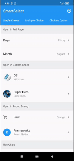
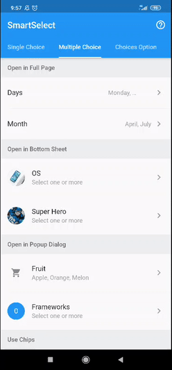
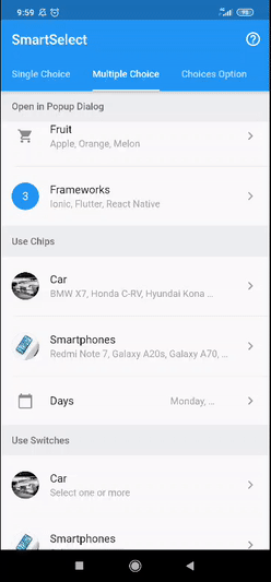
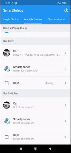
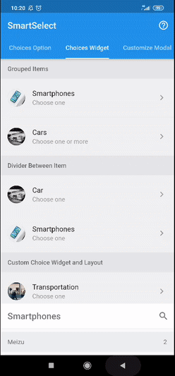
预览
| 单选 | 多选 | |
|---|---|---|
| 模态框类型 |
|
|
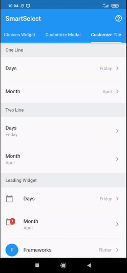
| 标签小部件 |

|
|
| 开关小部件 | 无 |
|
| 自定义标题 |
|
|
| 模态框过滤器 |
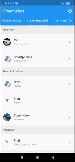
|
|
| 模态框确认 |
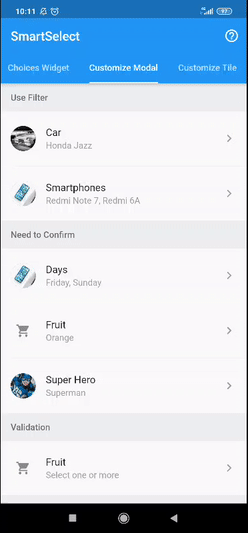
|
|
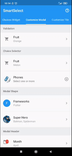
| 模态框验证 |
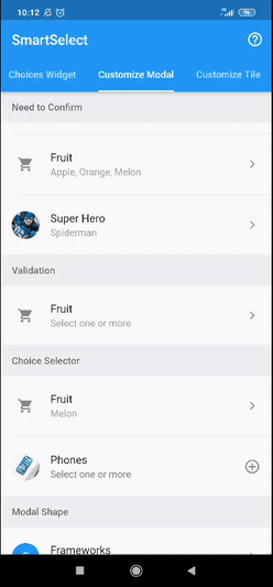
|
|
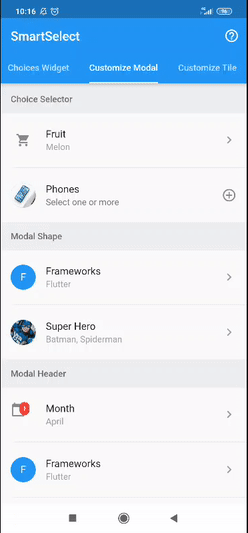
| 模态框选择器 |
|
|
| 模态框形状 |
|
|
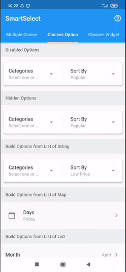
| 选项项目 |
|
|
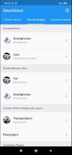
| 选项分组 |
|
|
| 选项构建器 |
|
|
| 下载 APK |

|
|
特点
- 选择单选或多选
- 在整页、底部工作表或弹出对话框中打开选项模态框
- 各种选项输入(单选按钮、复选框、开关、标签或自定义小部件)
- 各种选项布局(列表、包裹或网格)
- 分组选项,轻松支持粘性标题
- 可搜索选项,突出显示结果
- 禁用或隐藏选项
- 可自定义的触发器/标题小部件
- 可自定义的模态框样式
- 可自定义的模态框标题样式
- 可自定义的模态框页脚
- 可自定义的选项样式
- 从任何
列表构建选项项目 - 轻松加载异步选项项目
- 还有更多
用法
有关完整用法,请参阅示例。
要详细了解 smart_select 使用的类和其他引用,请参阅API 参考。
单选
// available configuration for single choice
SmartSelect<T>.single({

  // The primary content of the widget.
  // Used in trigger widget and header option
  String title,

  // The text displayed when the value is null
  String placeholder = 'Select one',

  // The current value of the single choice widget.
  @required T value,

  // Called when single choice value changed
  @required ValueChanged<S2SingleState<T>> onChange,

  // choice item list
  List<S2Choice<T>> choiceItems,

  // other available configuration
  // explained below
  ...,
  ...,

})
// simple usage

String value = 'flutter';
List<S2Choice<String>> options = [
  S2Choice<String>(value: 'ion', title: 'Ionic'),
  S2Choice<String>(value: 'flu', title: 'Flutter'),
  S2Choice<String>(value: 'rea', title: 'React Native'),
];

@override
Widget build(BuildContext context) {
  return SmartSelect<String>.single(
    title: 'Frameworks',
    value: value,
    choiceItems: options,
    onChange: (state) => setState(() => value = state.value)
  );
}
多选
// available configuration for multiple choice
SmartSelect<T>.multiple({

  // The primary content of the widget.
  // Used in trigger widget and header option
  String title,

  // The text displayed when the value is null
  String placeholder = 'Select one',

  // The current value of the single choice widget.
  @required List<T> value,

  // Called when single choice value changed
  @required ValueChanged<S2MultiState<T>> onChange,

  // choice item list
  List<S2Choice<T>> choiceItems,

  // other available configuration
  // explained below
  ...,
  ...,

})
// a simple usage

List<int> value = [2];
List<S2Choice<int>> frameworks = [
  S2Choice<int>(value: 1, title: 'Ionic'),
  S2Choice<int>(value: 2, title: 'Flutter'),
  S2Choice<int>(value: 3, title: 'React Native'),
];

@override
Widget build(BuildContext context) {
  return SmartSelect<int>.multiple(
    title: 'Frameworks',
    value: value,
    choiceItems: options,
    onChange: (state) => setState(() => value = state.value),
  );
}
选项
// configuration
SmartSelect<T>.[single|multiple]({

  // other configuration
  ...,
  ...,

  // choice item list
  List<S2Choice<T>> choiceItems,

  // other configuration
  ...,
  ...,

});
choiceItems 可以直接输入,如下面的示例所示。有关 S2Choice 的更多信息,请参阅API 参考。
SmartSelect<T>.[single|multiple](
  ...,
  ...,
  choiceItems: <S2Choice<T>>[
    S2Choice<T>(value: 1, title: 'Ionic'),
    S2Choice<T>(value: 2, title: 'Flutter'),
    S2Choice<T>(value: 3, title: 'React Native'),
  ],
);
choiceItems 也可以使用此包提供的助手从任何列表中创建,如下面的示例所示。
List<Map<String, String>> days = [
  { 'value': 'mon', 'title': 'Monday' },
  { 'value': 'tue', 'title': 'Tuesday' },
  { 'value': 'wed', 'title': 'Wednesday' },
  { 'value': 'thu', 'title': 'Thursday' },
  { 'value': 'fri', 'title': 'Friday' },
  { 'value': 'sat', 'title': 'Saturday' },
  { 'value': 'sun', 'title': 'Sunday' },
];

SmartSelect<String>.[single|multiple](
  ...,
  ...,
  choiceItems: S2Choice.listFrom<String, Map<String, String>>(
    source: days,
    value: (index, item) => item['value'],
    title: (index, item) => item['title'],
  ),
);
异步加载选项项目
请遵循这些示例。
模态框配置
有关 S2ModalConfig 的更多信息,请参阅API 参考。
// available configuration
SmartSelect<T>.[single|multiple]({

  // other configuration
  ...,
  ...,

  // Modal validation of single choice widget
  ValidationCallback<T> modalValidation,

  // Modal configuration
  S2ModalConfig modalConfig,

  // Configure modal style
  // shortcut to [modalConfig.style]
  S2ModalStyle modalStyle,

  // Configure modal header style
  // shortcut to [modalConfig.headerStyle]
  S2ModalHeaderStyle modalHeaderStyle,

  // Modal type to display choices
  // shortcut to [modalConfig.type]
  S2ModalType modalType,

  // Use different title with the trigger widget title
  // shortcut to [modalConfig.title]
  String modalTitle,

  // Whether the option list need to confirm
  // to return the changed value
  // shortcut to [modalConfig.useConfirm]
  bool modalConfirm,

  // Whether the options list modal use header or not
  // shortcut to [modalConfig.useHeader]
  bool modalHeader,

  // Whether the option list is filterable or not
  // shortcut to [modalConfig.useFilter]
  bool modalFilter,

  // Whether the filter is autocomplete or need confirmation
  // shortcut to [modalConfig.filterAuto]
  bool modalFilterAuto,

  // Custom searchbar hint
  // shortcut to [modalConfig.filterHint]
  String modalFilterHint,

  // other configuration
  ...,
  ...,

});
模态框类型
默认情况下,SmartSelect 将在整页中打开选项模态框。您可以通过更改此值来更改它。
// Available option
enum S2ModalType {

  // open in full page
  fullPage,

  // open in popup dialog
  popupDialog,

  // open in sliding bottom sheet
  bottomSheet,

}
模态框样式
// Available option to configure modal style
S2ModalStyle({

  // Modal border shape
  // used in popup dialog and bottom sheet
  ShapeBorder shape,

  // Modal elevation
  // used in popup dialog and bottom sheet
  double elevation,

  // Modal background color
  Color backgroundColor,

  // Modal clip behavior
  Clip clipBehavior,

})
模态框标题样式
// Available option to configure modal header style
S2ModalHeaderStyle({

  // Header border shape
  ShapeBorder shape,

  // Header elevation
  double elevation,

  // Header background color
  Color backgroundColor,

  // Header brightness
  Brightness brightness,

  // Whether the header title is centered
  bool centerTitle,

  // Whether the header use automaticallyImplyLeading or not
  bool useLeading,

  // Header text style
  // used by title and search field
  TextStyle textStyle,

  // Header icon theme
  IconThemeData iconTheme,

  // Header actions icon theme
  IconThemeData actionsIconTheme,

})
选项配置
有关 S2ChoiceConfig 的更多信息,请参阅API 参考。
// Available option to configure choices
SmartSelect<T>.[single|multiple]({

  // other configuration
  ...,
  ...,

  // choice configuration
  S2ChoiceConfig choiceConfig,

  // configure choice style
  // shortcut to [choiceConfig.style]
  S2ChoiceStyle choiceStyle,

  // configure choices group header style
  // shortcut to [choiceConfig.headerStyle]
  S2ChoiceHeaderStyle choiceHeaderStyle,

  // choice widget type
  // shortcut to [choiceConfig.type]
  S2ChoiceType choiceType,

  // choice layout to display items
  // shortcut to [choiceConfig.layout]
  S2ChoiceLayout choiceLayout,

  // choice list scroll direction
  // currently only support when
  // [layout] is [S2ChoiceLayout.wrap]
  // shortcut to [choiceConfig.direction]
  Axis choiceDirection,

  // Whether the choices list is grouped
  // shortcut to [choiceConfig.isGrouped]
  bool choiceGrouped,

  // Whether the choices item use divider or not
  // shortcut to [choiceConfig.useDivider]
  bool choiceDivider,

  // For grid choice layout
  // shortcut to [choiceConfig.gridDelegate]
  SliverGridDelegate choiceGrid,

  // other configuration
  ...,
  ...,

});
选项类型
默认情况下,SmartSelect 将为单选使用 radios,为多选使用 checkboxes,但可以通过更改此值来更改。
// Type of choice input
enum S2ChoiceType {

  // use radio widget
  // for single choice
  radios,

  // use checkbox widget
  // for multiple choice
  checkboxes,

  // use switch widget
  // for multiple choice
  switches,

  // use chip widget
  // for single and multiple choice
  chips,

}
选项布局
默认情况下,SmartSelect 将使用 list,但可以通过更改此值来更改。
// Layout of choice item
enum S2ChoiceLayout {

  // use list view widget
  list,

  // use wrap view widget
  wrap,

  // use grid view widget
  grid,

}
选项样式
// Available option to configure choice style
S2ChoiceStyle({

  // How much space to place between children in a run in the main axis.
  // When use [SmartSelectChoiceType.chips] or [useWrap] is [true]
  double spacing,

  // How much space to place between the runs themselves in the cross axis.
  // When use [SmartSelectChoiceType.chips] or [useWrap] is [true]
  double runSpacing,

  // choices wrapper padding
  EdgeInsetsGeometry wrapperPadding,

  // Choices item padding
  EdgeInsetsGeometry padding,

  // choices item title style
  TextStyle titleStyle,

  // choices item subtitle style
  TextStyle subtitleStyle,

  // whether the chips use checkmark or not
  bool showCheckmark,

  // Where to place the control in widgets that use
  // [ListTile] to position a control next to a label.
  S2ChoiceControl control,

  // Highlight color
  Color highlightColor,

  // Primary color of selected choice item
  Color activeColor,

  // Primary color of unselected choice item
  Color color,

  // Secondary color of selected choice item
  Color activeAccentColor,

  // Secondary color of unselected choice item
  Color accentColor,

  // Brightness for selected Chip
  Brightness activeBrightness,

  // Brightness for unselected Chip
  Brightness brightness,

  // Opacity for selected Chip border, only effect when
  // [activeBrightness] is [Brightness.light]
  double activeBorderOpacity,

  // Opacity for unselected chip border, only effect when
  // [brightness] is [Brightness.light]
  double borderOpacity,

  // Shape clip behavior
  Clip clipBehavior,

})
选项标题样式
// Available option to configure choices group header widget style
S2ChoiceHeaderStyle({

  // Group header background color
  Color backgroundColor,

  // Highlight color
  Color highlightColor,

  // Group header text style
  TextStyle textStyle,

  // Group header padding
  EdgeInsetsGeometry padding,

  // Group header height
  double height,

})
构建器小部件
单选构建器
// available builder configuration
// for single choice
SmartSelect<T>.single({

  // other configuration
  ...,
  ...,

  // Builder collection of single choice widget
  S2SingleBuilder<T> builder,

  // Builder for custom tile widget
  // shortcut to [builder.tile]
  S2WidgetBuilder<S2SingleState<T>> tileBuilder,

  // Builder for custom modal widget
  // shortcut to [builder.modal]
  S2WidgetBuilder<S2SingleState<T>> modalBuilder,

  // Builder for custom modal header widget
  // shortcut to [builder.modalHeader]
  S2WidgetBuilder<S2SingleState<T>> modalHeaderBuilder,

  // Builder for custom modal actions widget
  // shortcut to [builder.modalActions]
  S2ListWidgetBuilder<S2SingleState<T>> modalActionsBuilder,

  // Builder for custom modal confirm action widget
  // shortcut to [builder.modalConfirm]
  S2WidgetBuilder<S2SingleState<T>> modalConfirmBuilder,

  // Builder for divider widget between header, body, and footer modal
  // shortcut to [builder.modalDivider]
  S2WidgetBuilder<S2SingleState<T>> modalDividerBuilder,

  // Builder for custom footer widget
  // shortcut to [builder.modalFooter]
  S2WidgetBuilder<S2SingleState<T>> modalFooterBuilder,

  // other configuration
  ...,
  ...,

});
多选构建器
// available builder configuration
// for multiple choice
SmartSelect<T>.multiple({

  // other configuration
  ...,
  ...,

  // Builder collection of single choice widget
  S2MultiBuilder<T> builder,

  // Builder for custom tile widget
  // shortcut to [builder.tile]
  S2WidgetBuilder<S2MultiState<T>> tileBuilder,

  // Builder for custom modal widget
  // shortcut to [builder.modal]
  S2WidgetBuilder<S2MultiState<T>> modalBuilder,

  // Builder for custom modal header widget
  // shortcut to [builder.modalHeader]
  S2WidgetBuilder<S2MultiState<T>> modalHeaderBuilder,

  // Builder for custom modal actions widget
  // shortcut to [builder.modalActions]
  S2ListWidgetBuilder<S2MultiState<T>> modalActionsBuilder,

  // Builder for custom modal confirm action widget
  // shortcut to [builder.modalConfirm]
  S2WidgetBuilder<S2MultiState<T>> modalConfirmBuilder,

  // Builder for divider widget between header, body, and footer modal
  // shortcut to [builder.modalDivider]
  S2WidgetBuilder<S2MultiState<T>> modalDividerBuilder,

  // Builder for custom footer widget
  // shortcut to [builder.modalFooter]
  S2WidgetBuilder<S2MultiState<T>> modalFooterBuilder,

  // other configuration
  ...,
  ...,

});
其他构建器
// another builder configuration
SmartSelect<T>.[single|multiple]({

  // other configuration
  ...,
  ...,

  // Builder for modal filter widget
  // shortcut to [builder.modalFilter]
  S2WidgetBuilder<S2Filter> modalFilterBuilder,

  // Builder for modal filter toggle widget
  // shortcut to [builder.modalFilterToggle]
  S2WidgetBuilder<S2Filter> modalFilterToggleBuilder,

  // Builder for each custom choices item widget
  // shortcut to [builder.choice]
  S2ChoiceBuilder<T> choiceBuilder,

  // Builder for each custom choices item title widget
  // shortcut to [builder.choiceTitle]
  S2ChoiceBuilder<T> choiceTitleBuilder,

  // Builder for each custom choices item subtitle widget
  // shortcut to [builder.choiceSubtitle]
  S2ChoiceBuilder<T> choiceSubtitleBuilder,

  // Builder for each custom choices item secondary widget
  // shortcut to [builder.choiceSecondary]
  S2ChoiceBuilder<T> choiceSecondaryBuilder,

  /// Builder for custom divider widget between choices item
  // shortcut to [builder.choiceDivider]
  IndexedWidgetBuilder choiceDividerBuilder,

  // Builder for custom empty display
  // shortcut to [builder.choiceEmpty]
  S2WidgetBuilder<String> choiceEmptyBuilder,

  // A widget builder for custom choices group
  // shortcut to [builder.choiceGroup]
  S2ChoiceGroupBuilder choiceGroupBuilder,

  // A widget builder for custom header choices group
  // shortcut to [builder.choiceHeader]
  S2ChoiceHeaderBuilder choiceHeaderBuilder,

  // other configuration
  ...,
  ...,

});
标题小部件
默认标题
// Default tile/trigger widget
S2Tile<T>({

  // The value of the selected option.
  String value,

  // The primary content of the list tile.
  Widget title,

  // A widget to display before the title.
  // Typically an [Icon] or a [CircleAvatar] widget.
  Widget leading,

  // A widget to display after the title.
  // Typically an [Icon] widget.
  Widget trailing,

  // Whether this list tile is intended to display loading stats.
  bool isLoading,

  // String text used as loading text
  String loadingText,

  // Whether this list tile is intended to display two lines of text.
  bool isTwoLine,

  // Whether this list tile is interactive.
  bool enabled,

  // If this tile is also [enabled] then icons and text are rendered with the same color.
  bool selected,

  // Whether this list tile is part of a vertically dense list.
  bool dense,

  // Whether the [value] is displayed or not
  bool hideValue,

  // The tile's internal padding.
  EdgeInsetsGeometry padding,

  // Called when the user taps this list tile.
  GestureTapCallback onTap,

  // widget to display below the tile
  // usually used to display chips with S2TileChips
  Widget body,

})
// usage example
SmartSelect<T>.single(
  ...,
  ...,
  tileBuilder: (context, state) {
    return S2Tile(
      title: state.titleWidget,
      value: state.valueDisplay,
      onTap: state.showModal,
      isLoading: true,
    );
  },
);

// usage example from state
SmartSelect<T>.multiple(
  ...,
  ...,
  tileBuilder: (context, state) {
    return S2Tile.fromState(
      state,
      isLoading: true,
    );
  },
);
带标签的标题
// Chips tile/trigger widget
S2TileChips({

  // List of value of the selected choices.
  int chipLength,

  // Widget builder for chip label item
  IndexedWidgetBuilder chipLabelBuilder,

  // Widget builder for chip avatar item
  IndexedWidgetBuilder chipAvatarBuilder,

  // Widget builder for chip item
  IndexedWidgetBuilder chipBuilder,

  // Called when the user delete the chip item.
  ValueChanged<int> chipOnDelete,

  // Chip color
  Color chipColor,

  // Chip border opacity
  double chipBorderOpacity,

  // Chip brightness
  Brightness chipBrightness,

  // Chip delete button color
  Color chipDeleteColor,

  // Chip delete button icon
  Icon chipDeleteIcon,

  // Chip spacing
  double chipSpacing,

  // Chip run spacing
  double chipRunSpacing,

  // Chip shape border
  ShapeBorder chipShape,

  // The [Widget] displayed when the [values] is null
  Widget placeholder,

  // Whether the chip list is scrollable or not
  bool scrollable,

  // Chip list padding
  EdgeInsetsGeometry padding,

})
/// usage example
SmartSelect<String>.multiple(
  ...,
  ...,
  value: users,
  tileBuilder: (context, state) {
    return S2Tile.fromState(
      state,
      hideValue: true,
      body: S2TileChips(
        chipLength: state.valueObject.length,
        chipLabelBuilder: (context, i) {
          return Text(state.valueObject[i].title);
        },
        chipAvatarBuilder: (context, i) {
          return CircleAvatar(
            backgroundImage: NetworkImage(state.valueObject[i].meta['picture']['thumbnail'])
          );
        },
        chipOnDelete: (i) {
          setState(() => users.remove(state.valueObject[i].value));
        },
        chipColor: Colors.blue,
        chipBrightness: Brightness.dark,
        chipBorderOpacity: .5,
      ),
    );
  },
);


