
Flutter_轮播图
一个简单的轮播小部件,具有多种配置选项。
...
dependencies:
 ...
 flutter_multi_carousel: ^1.0.0
...
并在您的项目文件夹中运行 flutter packages get 进行安装。之后,只需导入模块并使用它
import 'package:flutter/material.dart';
import 'package:flutter_multi_carousel/carousel.dart';

void main() => runApp(MyApp());

class MyApp extends StatelessWidget {
  // This widget is the root of your application.
  @override
  Widget build(BuildContext context) {
    return MaterialApp(
      title: 'Flutter Demo',
      home: CarouselExample(),
    );
  }
}

class CarouselExample extends StatelessWidget {
  @override
  Widget build(BuildContext context) {
    return Scaffold(
      body: Center(
        child: Carousel(
            height: 350.0,
            width: 350,
            type: "slideswiper",
            indicatorType: "bubble",
            arrowColor: Colors.white,
            axis: Axis.horizontal,
            showArrow: true,
            children: List.generate(
                7,
                (i) => Center(
                      child: Container(color: Colors.red),
                    ))),
      ),
    );
  }
}
有关详细演示,请参阅此 GitHub 链接
https://github.com/jaiswalshubham84/Flutter-Carousel
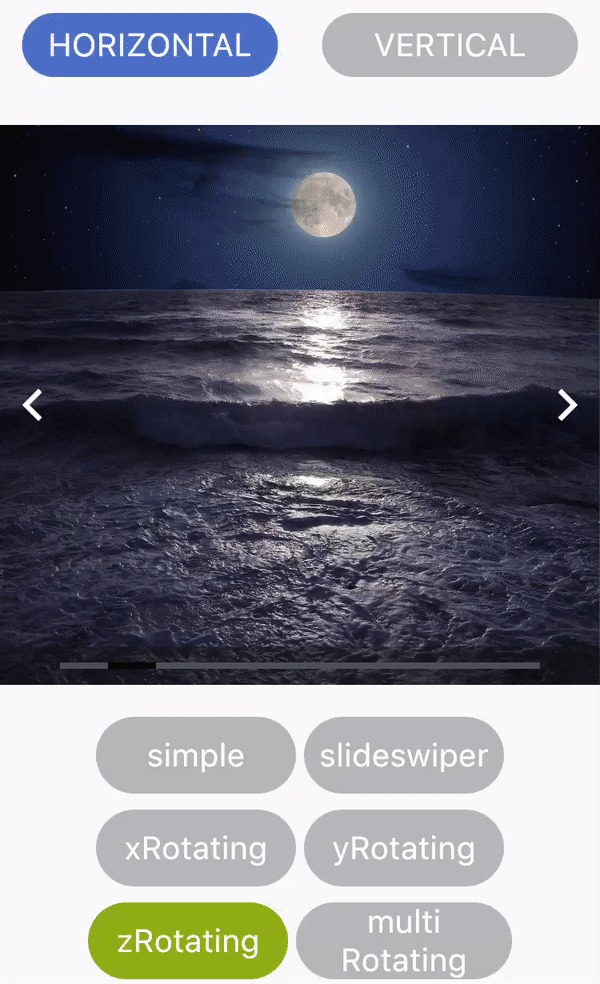
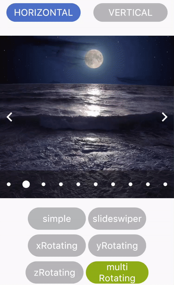
入门滑动
| 属性 | 类型 | 默认值 | 描述 |
|---|---|---|---|
| 高度 | Double(双精度浮点数) | 空 | 定义轮播图的高度。此字段是必需的 |
| width | Double(双精度浮点数) | 空 | 定义轮播图的宽度。此字段是必需的 |
| 轴 | Axis | Axis.horizontal | 定义轮播图的轴。 |
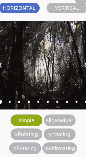
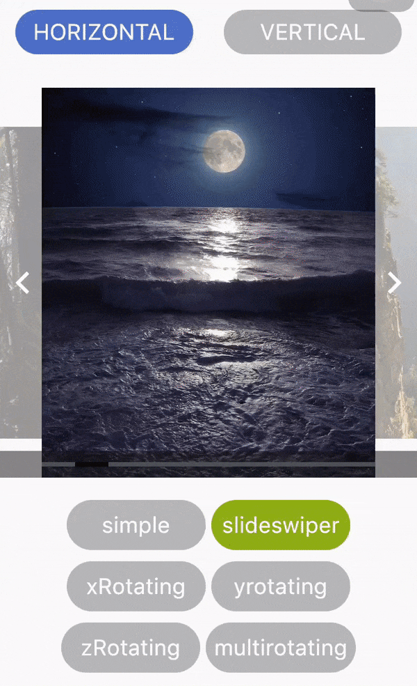
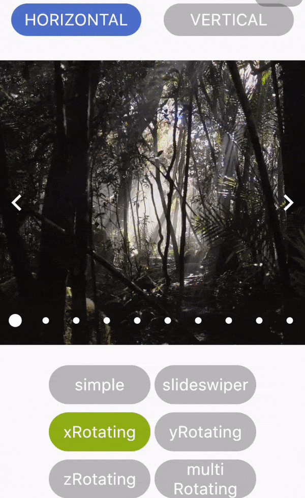
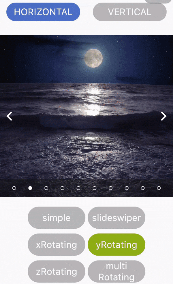
| 类型 | 字符串 | "simple" | 定义轮播图的类型。 可用的轮播图类型有:“simple”、“slideswiper”、“xrotating”、“yrotating”、“zrotating”、“multirotating” |
| showArrow | 布尔值 | 真 | 选择是否在轮播图中显示箭头 |
| arrowColor | 颜色 | Colors.white | 定义箭头的颜色 |
| showIndicator | 布尔值 | 真 | 选择是否在轮播图中显示指示器 |
| indicatorType | 字符串 | bar | 定义指示器的类型。 可用的指示器类型有:“bar”、“dot”、“bubble” |
| activeIndicatorColor | 颜色 | Colors.white | 定义活动指示器的颜色 |
| unActiveIndicatorColor | 颜色 | Colors.black | 定义非活动指示器的颜色 |
| indicatorBackgroundColor | 颜色 | Color(0xff121212) | 定义指示器的背景颜色 |
| indicatorBackgroundOpacity | Double(双精度浮点数) | 0.5 | 定义指示器背景的透明度 |
 |
 |
 |
|---|---|---|
 |
 |
 |


