
flutter_custom_dialog
全局对话框函数封装,以语义化的方式填充对话框内容,当前提供该功能。
- 支持几种语义组件方法来填充对话框内的组件内容
- 支持自定义语义组件,方便开发者自由填充对话框内的组件内容
- 支持设置对话框背景色、前景颜色、位置、动画、点击外部消失等功能,详情见下
安装
1、安装
dependencies:
  flutter_custom_dialog: ^1.0.1
2、导入
import 'package:flutter_custom_dialog/flutter_custom_dialog.dart';
示例
dialog_demo
divider ✅ |
body ✅ |
head&body ✅ |
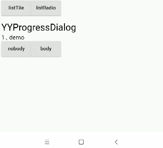
listTile ✅ |
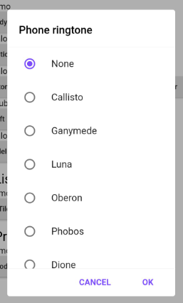
ListRadio ✅ |
dialog_gravity
bottom ✅ |
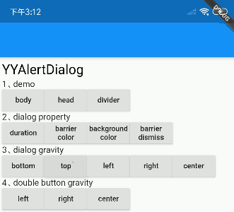
top ✅ |
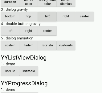
left ✅ |
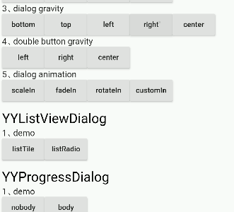
right ✅ |
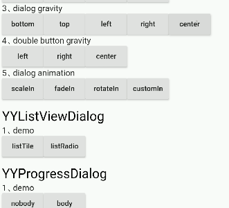
center ✅ |
dialog_animation
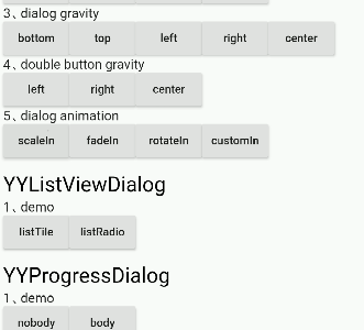
scaleIn ✅ |
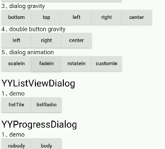
fadeIn ✅ |

rotateIn ✅ |
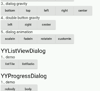
customIn ✅ 支持自定义动画 |
⚡ 对话框属性
对话框属性设置可以通过成员变量的方法调用,具体内容如下表所示
YYDialog YYDialogDemo(BuildContext context) {
  return YYDialog().build(context)
    ..width = 220
    ..height = 500
    ..barrierColor = Colors.black.withOpacity(.3)
    ..animatedFunc = (child, animation) {
      return ScaleTransition(
        child: child,
        scale: Tween(begin: 0.0, end: 1.0).animate(animation),
      );
    }
    ..borderRadius = 4.0
    ..show();
}
支持的属性
| 属性 | 描述 | 默认值 |
|---|---|---|
| width | 对话框宽度 | 0 |
| 高度 | 对话框高度 | 自适应组件高度 |
| duration | 对话框动画时长 | 250 毫秒 |
| gravity | 对话框出现的位置 | center |
| barrierColor | Dialog barrierColor | 30% 的黑色 |
| backgroundColor | Dialog backgroundColor | 白色 |
| borderRadius | Dialog borderRadius | 0.0 |
| constraints | 对话框的约束 | 最小宽度和高度不小于10% |
| animatedFunc | 对话框的动画 | 从中间弹出 |
| barrierDismissible | 点击外部是否消失 | 真 |
支持的方法
| method | 描述 |
|---|---|
| show | 展示对话框 |
| dismiss | 隐藏对话框 |
| isShowing | 对话框是否显示 |
⚡ 语义化 Widget
对话框内的组件内容通过语义化函数提前封装好,方便快速构建对话框,具体内容如下表所示
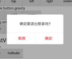
YYDialog YYAlertDialogWithDivider(BuildContext context) {
  return YYDialog().build(context)
    ..width = 220
    ..borderRadius = 4.0
    ..text(
      padding: EdgeInsets.all(25.0),
      alignment: Alignment.center,
      text: "确定要退出登录吗?",
      color: Colors.black,
      fontSize: 14.0,
      fontWeight: FontWeight.w500,
    )
    ..divider()
    ..doubleButton(
      padding: EdgeInsets.only(top: 10.0),
      gravity: Gravity.center,
      withDivider: true,
      text1: "取消",
      color1: Colors.redAccent,
      fontSize1: 14.0,
      fontWeight1: FontWeight.bold,
      onTap1: () {
        print("取消");
      },
      text2: "确定",
      color2: Colors.redAccent,
      fontSize2: 14.0,
      fontWeight2: FontWeight.bold,
      onTap2: () {
        print("确定");
      },
    )
    ..show();
}
支持的语义化组件
| method | 描述 |
|---|---|
| text | 文本 Widget |
| doubleButton | 双按钮 Widget |
| listViewOfListTile | listTile Widget |
| listViewOfRadioButton | listRadio Widget |
| divider | divider widget |
| widget | 自定义语义化 Widget |
⚡ 自定义 Widget
自定义对话框内部组件内容
- 由于现有的语义化组件仅用于辅助快速 UI 构建,远不能满足实际项目开发的需要
- 因此提供了将自定义语义化组件插入到对话框的能力
通过'widget()'将组件插入到对话框中
YYDialog YYDialogDemo(BuildContext context) {
  return YYDialog().build(context)
    ..width = 220
    ..height = 500
    ..widget(
      Padding(
        padding: EdgeInsets.all(0.0),
        child: Align(
          alignment: Alignment.centerLeft,
          child: Text(
            "",
            style: TextStyle(
              color: Colors.black,
              fontSize: 14.0,
              fontWeight: FontWeight.w100,
            ),
          ),
        ),
      ),
    )
    ..show();
}
Bug/请求
- 如果您的应用出现问题,请将您的代码和效果提交到 Issue。
- Pull request 也欢迎。


