
Flushbar
一个灵活的用户通知小部件。自定义文本、按钮、持续时间、动画等等。对于 Android 开发者来说,它是用来取代 Snackbars 和 Toasts 的。
如果您在通知用户时需要更多自定义,请使用此包。对于 Android 开发者来说,它是用来替代 toasts 和 snackbars 的。iOS 开发者,我不知道你们在那里用什么,但你们会喜欢它的。
查看安装说明。
这是一个受 Flashbar 启发的 Flutter 小部件。Flushbar 和 Flashbar 的开发是完全独立的。
快速参考
由于自定义需要大量的属性,这里有一个快速备忘单
| 属性 | 它做什么 |
|---|---|
| title | 显示给用户的标题 |
| message | 显示给用户的消息。 |
| titleText | 替换 [title]。虽然这接受一个 [widget],**但它是为了接收 [Text] 或 [RichText]** |
| messageText | 替换 [message]。虽然这接受一个 [widget],**但它是为了接收 [Text] 或 [RichText]** |
| icon | 您可以在此处使用任何小部件,但我建议使用 [Icon] 或 [Image] 来指示您显示的消息类型。其他小部件可能会破坏布局 |
| shouldIconPulse | 一个为图标(如果存在)添加动画的选项。默认为 true。 |
| aroundPadding | 为 Flushbar 添加自定义填充。 |
| borderRadius | 为 Flushbar 的所有角添加半径。最好与 [aroundPadding] 结合使用。我不建议将其与 [showProgressIndicator] 或 [leftBarIndicatorColor] 一起使用 |
| backgroundColor | Flushbar 背景颜色。如果 [backgroundGradient] 不为空,则将被忽略。 |
| leftBarIndicatorColor | 如果不为空,会显示一个左侧垂直条,以更好地指示通知的“幽默感”。无法将其与 [Form] 一起使用,我也不建议将其与 [LinearProgressIndicator] 一起使用。 |
| boxShadows | Flushbar 生成的阴影。如果您不想要阴影,请将其留空。如果您觉得有必要,可以使用多个。请参阅此示例 |
| backgroundGradient | Flushbar 背景渐变。使 [backgroundColor] 被忽略。 |
| mainButton | 如果您需要用户进行操作,可以使用 [FlatButton] 小部件。 |
| onTap | 一个回调函数,用于注册用户的任何点击。是 [mainButton] 的替代方案 |
| duration | Flushbar 隐藏(关闭)之前的时间。 |
| isDismissible | 确定用户是否可以通过滑动来关闭条形。如果 [isDismissible] 为 false,建议您设置一个 [duration]。如果用户滑动关闭它,将不会返回任何值。 |
| dismissDirection | 默认为 [FlushbarDismissDirection.VERTICAL]。也可以是 [FlushbarDismissDirection.HORIZONTAL],在这种情况下,允许左右滑动关闭。 |
| flushbarPosition | Flushbar 可以位于屏幕的 [FlushbarPosition.TOP] 或 [FlushbarPosition.BOTTOM] 上。默认为 [FlushbarPosition.BOTTOM]。 |
| flushbarStyle | Flushbar 可以是浮动的,也可以固定在屏幕边缘。如果是固定的,我不建议使用 [aroundPadding] 或 [borderRadius]。默认为 [FlushbarStyle.FLOATING] |
| forwardAnimationCurve | 调用 show() 时使用的 [Curve] 动画。默认为 [Curves.easeOut]。 |
| reverseAnimationCurve | 调用 dismiss() 时使用的 [Curve] 动画。默认为 [Curves.fastOutSlowIn]。 |
| animationDuration | 使用它来加速或减慢动画持续时间 |
| showProgressIndicator | 如果您想显示 [LinearProgressIndicator],则为 true。 |
| progressIndicatorController | 一个可选的 [AnimationController],当您想控制 [LinearProgressIndicator] 的进度时使用。 |
| progressIndicatorBackgroundColor | 一个 [LinearProgressIndicator] 配置参数。 |
| progressIndicatorValueColor | 一个 [LinearProgressIndicator] 配置参数。 |
| overlayBlur | 默认为 0.0。如果大于 0.0,则会创建一个模糊的叠加层,以阻止用户与屏幕进行交互。值越大,模糊度越高。 |
| overlayColor | 默认为 [Colors.transparent]。仅当 [overlayBlur] > 0.0 时生效。请确保您使用的是带有透明度的颜色,例如 Colors.grey[600].withOpacity(0.2)。 |
| userInputForm | 一个 [TextFormField],以防您需要简单的用户输入。如果此项不为空,则忽略所有其他小部件。 |
| onStatusChanged | 一个回调函数,供您监听不同的 Flushbar 状态 |
我们在 YouTube 上!
在学习 Flutter 时,我偶然发现了两个关于如何使用 Flushbar 的精彩教程。
请确保您给那些伙计一些支持。
入门
下面的示例已更新至 1.3.0 版本。可能已进行了更改。如果任何示例未能
反映 Flushbar 的当前状态,请查看更改日志。
可能性
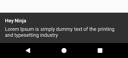
一个基础的 Flushbar
最基础的 Flushbar 只使用一个消息。如果在调用 show() 之前未能提供消息,将导致运行时错误。
如果未提供 Duration,它将创建一个无限期的 Flushbar,只能通过代码、后退按钮点击或拖动(在 isDismissible 设置为 true 的情况下)来关闭。
- 请注意,只有
message是必需参数。所有其他参数都是可选的
class YourAwesomeApp extends StatelessWidget {

  @override
  Widget build(BuildContext context) {
    return MaterialApp(
      title: 'YourAwesomeApp',
      home: Scaffold(
        Container(
          child: Center(
            child: MaterialButton(
              onPressed: (){
                Flushbar(
                  title:  "Hey Ninja",
                  message:  "Lorem Ipsum is simply dummy text of the printing and typesetting industry",
                  duration:  Duration(seconds: 3),
                )..show(context);
              },
            ),
          ),
        ),
      ),
    );
  }
}
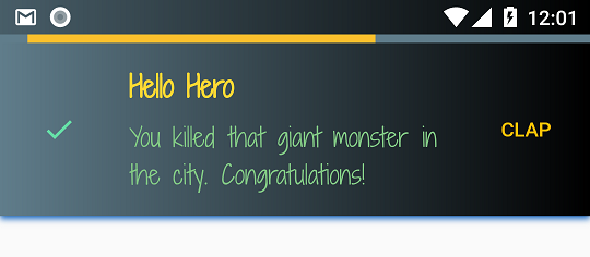
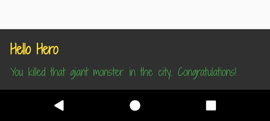
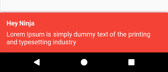
让我们疯狂起来 Flushbar
自定义可以达到这种程度。
Flushbar(
      title: "Hey Ninja",
      message: "Lorem Ipsum is simply dummy text of the printing and typesetting industry",
      flushbarPosition: FlushbarPosition.TOP,
      flushbarStyle: FlushbarStyle.FLOATING,
      reverseAnimationCurve: Curves.decelerate,
      forwardAnimationCurve: Curves.elasticOut,
      backgroundColor: Colors.red,
      boxShadows: [BoxShadow(color: Colors.blue[800], offset: Offset(0.0, 2.0), blurRadius: 3.0)],
      backgroundGradient: LinearGradient(colors: [Colors.blueGrey, Colors.black]),
      isDismissible: false,
      duration: Duration(seconds: 4),
      icon: Icon(
        Icons.check,
        color: Colors.greenAccent,
      ),
      mainButton: FlatButton(
        onPressed: () {},
        child: Text(
          "CLAP",
          style: TextStyle(color: Colors.amber),
        ),
      ),
      showProgressIndicator: true,
      progressIndicatorBackgroundColor: Colors.blueGrey,
      titleText: Text(
        "Hello Hero",
        style: TextStyle(
            fontWeight: FontWeight.bold, fontSize: 20.0, color: Colors.yellow[600], fontFamily: "ShadowsIntoLightTwo"),
      ),
      messageText: Text(
        "You killed that giant monster in the city. Congratulations!",
        style: TextStyle(fontSize: 18.0, color: Colors.green, fontFamily: "ShadowsIntoLightTwo"),
      ),
    );
- 别忘了调用
show(),否则条形将保持隐藏状态。 - 要禁用其中任何一项属性,请将其传递
null。
样式
Flushbar 可以是浮动的,也可以固定在屏幕边缘。
如果您选择了 FlushbarStyle.GROUNDED 风格,我不建议使用 aroundPadding 或 borderRadius。
Flushbar(flushbarStyle: FlushbarStyle.FLOATING)
或者
Flushbar(flushbarStyle: FlushbarStyle.GROUNDED)
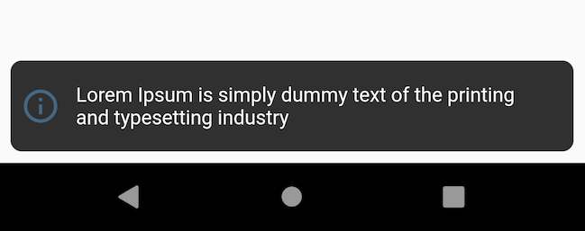
| 浮动风格 | 固定风格 |
|---|---|
 |
 |
填充和边框半径
您可以为其添加一些填充和边框半径。最适合与 FlushbarStyle.FLOATING 一起使用
Flushbar(
  aroundPadding: EdgeInsets.all(8),
  borderRadius: 8,
);
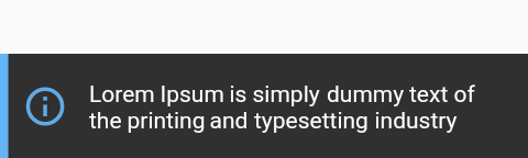
左侧指示器条
Flushbar 有一个侧边栏,可以更好地传达通知的“幽默感”。要使用它,只需为 leftBarIndicatorColor 赋予颜色即可。
Flushbar(
  message: "Lorem Ipsum is simply dummy text of the printing and typesetting industry",
  icon: Icon(
    Icons.info_outline,
    size: 28.0,
    color: Colors.blue[300],
    ),
  duration: Duration(seconds: 3),
  leftBarIndicatorColor: Colors.blue[300],
)..show(context);
自定义您的文本
如果您需要更花哨的文本,可以使用 Text 或 RichText
并将其传递给 titleText 或 messageText 变量。
- 请注意,如果
titleText不为空,则title将被忽略 - 请注意,如果
messageText不为空,则message将被忽略
Flushbar(
  title: "Hey Ninja", //ignored since titleText != null
  message: "Lorem Ipsum is simply dummy text of the printing and typesetting industry", //ignored since messageText != null
  titleText: Text("Hello Hero", style: TextStyle(fontWeight: FontWeight.bold, fontSize: 20.0 color: Colors.yellow[600], fontFamily:"ShadowsIntoLightTwo"),),
  messageText: Text("You killed that giant monster in the city. Congratulations!", style: TextStyle(fontSize: 16.0, color: Colors.green[fontFamily: "ShadowsIntoLightTwo"),),
)..show(context);
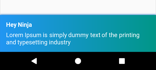
自定义背景和阴影
您可以用任何您想要的颜色来绘制背景。您可以使用任何您想要的阴影。
只需为其提供 backgroundColor 和 boxShadows。
Flushbar(
  title: "Hey Ninja",
  message: "Lorem Ipsum is simply dummy text of the printing and typesetting industry",
  backgroundColor: Colors.red,
  boxShadows: [BoxShadow(color: Colors.red[800], offset: Offset(0.0, 2.0), blurRadius: 3.0,)],
)..show(context);
想要背景渐变?没问题。
- 请注意,当
backgroundGradient不为空时,backgroundColor将被忽略
Flushbar(
  title: "Hey Ninja",
  message: "Lorem Ipsum is simply dummy text of the printing and typesetting industry",
  backgroundGradient: LinearGradient(colors: [Colors.Colors.teal],),
  backgroundColor: Colors.red,
  boxShadows: [BoxShadow(color: Colors.blue[800], offset: Offset(0.0, 2.0), blurRadius: 3.0,)],
)..show(context);
图标和按钮操作
让我们添加一个具有 PulseAnimation 的图标。图标默认具有此动画,目前无法更改。
此外,让我们添加一个按钮。您是否注意到 show() 返回一个 Future?
当您调用 dismiss([T result]) 时,此 Future 将返回一个值。
我建议您指定 result 泛型类型,如果您打算收集用户输入。
Flushbar flush;
bool _wasButtonClicked;
@override
  Widget build(BuildContext context) {
    return Container(
      child: Center(
        child: MaterialButton(
          onPressed: () {
            flush = Flushbar<bool>(
              title: "Hey Ninja",
              message: "Lorem Ipsum is simply dummy text of the printing and typesetting industry",
              icon: Icon(
                       Icons.info_outline,
                       color: Colors.blue,),
              mainButton: FlatButton(
                             onPressed: () {
                                 flush.dismiss(true); // result = true
                               },
                             child: Text(
                               "ADD",
                               style: TextStyle(color: Colors.amber),
                             ),
                           ),) // <bool> is the type of the result passed to dismiss() and collected by show().then((result){})
              ..show(context).then((result) {
                setState(() { // setState() is optional here
                  _wasButtonClicked = result;
                });
              });
          },
        ),
      ),
    );
  }
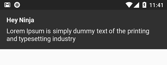
Flushbar 位置
Flushbar 可以位于 FlushbarPosition.BOTTOM 或 FlushbarPosition.TOP。
Flushbar(
  flushbarPosition: FlushbarPosition.TOP,
  title: "Hey Ninja",
  message: "Lorem Ipsum is simply dummy text of the printing and typesetting industry",)..show(context);
持续时间和关闭策略
默认情况下,Flushbar 是无限期的。要设置持续时间,请使用 duration 属性。
默认情况下,Flushbar 可由用户关闭。向右或向左滑动即可关闭它。
将 isDismissible 设置为 false 以更改此行为。
Flushbar(
  title: "Hey Ninja",
  message: "Lorem Ipsum is simply dummy text of the printing and typesetting industry",
  duration: Duration(seconds: 3),
  isDismissible: false,
)..show(context);
进度指示器
如果您正在加载某些内容,请使用 LinearProgressIndicator
如果您想要一个不确定的进度指示器,请不要设置 progressIndicatorController。
如果您想要一个确定的进度指示器,您现在可以完全控制进度,因为您拥有 AnimationController
- 无需为您的控制器添加监听器来调用
setState(){}。一旦您传入您的控制器,Flushbar将自动执行此操作。只需确保您调用_controller.forward()
AnimationController _controller = AnimationController(
      vsync: this,
      duration: Duration(seconds: 3),
    );

Flushbar(
  title: "Hey Ninja",
  message: "Lorem Ipsum is simply dummy text of the printing and typesetting industry",
  showProgressIndicator: true,
  progressIndicatorController: _controller,
  progressIndicatorBackgroundColor: Colors.grey[800],
)..show(context);
显示和关闭动画曲线
您可以使用 forwardAnimationCurve 和 reverseAnimationCurve 设置自定义动画曲线。
Flushbar(
  forwardAnimationCurve: Curves.decelerate,
  reverseAnimationCurve: Curves.easeOut,
  title: "Hey Ninja",
  message: "Lorem Ipsum is simply dummy text of the printing and typesetting industry",
)..show(context);
监听状态更新
您可以使用 onStatusChanged 属性监听状态更新。
- 请注意,当您使用
onStatusChanged传递新的监听器时,它会立即激活一次,以便您可以检查 Flushbar 所处的状态。
Flushbar flushbar = Flushbar(title: "Hey Ninja", message: "Lorem Ipsum is simply dummy text of the printing and typesetting industry");

  flushbar
    ..onStatusChanged = (FlushbarStatus status) {
      switch (status) {
        case FlushbarStatus.SHOWING:
          {
            doSomething();
            break;
          }
        case FlushbarStatus.IS_APPEARING:
          {
            doSomethingElse();
            break;
          }
        case FlushbarStatus.IS_HIDING:
          {
            doSomethingElse();
            break;
          }
        case FlushbarStatus.DISMISSED:
          {
            doSomethingElse();
            break;
          }
      }
    }
    ..show(context);
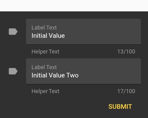
输入文本
有时我们只需要一个简单的用户输入。请使用 userInputForm 属性。
- 请注意,如果
userInputForm != null,则按钮、消息和图标将被忽略 dismiss(result)将返回 result。dismiss()将返回 null。
Flushbar<List<String>> flush;
final GlobalKey<FormState> _formKey = GlobalKey<FormState>();
TextFormField getFormField(String text) {
    return TextFormField(
      initialValue: text,
      style: TextStyle(color: Colors.white),
      maxLength: 100,
      maxLines: 1,
      maxLengthEnforced: true,
      decoration: InputDecoration(
          fillColor: Colors.white10,
          filled: true,
          icon: Icon(
            Icons.label,
            color: Colors.grey[500],
          ),
          border: UnderlineInputBorder(),
          helperText: "Helper Text",
          helperStyle: TextStyle(color: Colors.grey),
          labelText: "Label Text",
          labelStyle: TextStyle(color: Colors.grey)),
    );
  }

flush = Flushbar<List<String>>(
  userInputForm = Form(
          key: _formKey,
          child: Column(
            mainAxisSize: MainAxisSize.min,
            children: [
              getTextFormField("Initial Value"),
              getTextFormField("Initial Value Two"),
            ]
            Align(
              alignment: Alignment.bottomRight,
              child: Padding(
                padding: const EdgeInsets.only(top: 8.0),
                child: MaterialButton(
                  textColor: Colors.amberAccent,
                  child: Text("SUBMIT"),
                  onPressed: () {
                    flush.dismiss([_controller1.value.text, _controller2.value.text]);
                  },
                ),
              ),
            )
          ],),),
)..show(context).then((result) {
        if (result != null) {
          String userInput1 = result[0];
          String userInput2 = result[1];
        }
      });
此示例试图模仿 Material Design 风格指南
Flushbar 助手
我创建了一个辅助类来方便创建最常见的 Flushbar。
FlushbarHelper.createSuccess({message, title, duration});
FlushbarHelper.createInformation({message, title, duration});
FlushbarHelper.createError({message, title, duration});
FlushbarHelper.createAction({message, title, duration flatButton});
FlushbarHelper.createLoading({message,linearProgressIndicator, title, duration, progressIndicatorController, progressIndicatorBackgroundColor});
FlushbarHelper.createInputFlushbar({textForm});


