pin_code_text_field
这是一个用于输入密码的 Flutter 小部件。适用于登录和 OTP 等用例。
用法
将此包用作库
- 依赖它
将此添加到您的 package 的 pubspec.yaml 文件中
dependencies:
  pin_code_text_field: ^1.2.1
- 安装它
您可以从命令行安装包
使用 Flutter
$ flutter packages get
或者,您的编辑器可能支持 flutter packages get。请查看您编辑器的文档了解更多信息。
- 导入它
现在,在您的 Dart 代码中,您可以使用
import 'package:pin_code_text_field/pin_code_text_field.dart';
API
| 名称 | 类型 | 默认值 | 描述 |
|---|---|---|---|
| maxLength | 整数 | 4 | 密码长度与密码框的数量。 |
| hideCharacter | 布尔值 | 假 | 显示或隐藏密码。 |
| highlight | 布尔值 | 假 | 高亮显示焦点所在的密码框。 |
| highlightColor | 颜色 | Colors.black | 设置焦点密码框的颜色。 |
| pinBoxDecoration | BoxDecoration | ProvidedPinBoxDecoration._defaultPinBoxDecoration | 对单个密码框进行自定义。有关可用选项,请参阅 ProvidedPinBoxDecoration。 |
| pinTextStyle | TextStyle | 用于设置密码字符样式的 TextStyle。 | |
| maskCharacter | 字符串 | "\u25CF" | 用于遮盖密码的特殊字符。仅当 hideCharacter 设置为 true 时才有效。 |
| pinBoxHeight | 双精度 | 70.0 | 密码框的高度。 |
| pinBoxWidth | 双精度 | 70.0 | 密码框的宽度。 |
| onDone | void Function(String) | 达到最大密码长度时的回调。 | |
| hasTextBorderColor | 颜色 | Colors.black | 设置包含文本的密码框的颜色。 |
| pinTextAnimatedSwitcherTransition | Function(Widget child, Animation |
文本出现/消失的动画,您可以编写自己的动画,也可以使用一些预设:1. PinCodeTextField.awesomeTransition 2. PinCodeTextField.defaultScalingTransition 3. PinCodeTextField.defaultRotateTransition | |
| pinTextAnimatedSwitcherDuration | 持续时间 | const Duration() | pinTextAnimatedSwitcherTransition 的持续时间。有关可用选项,请参阅 ProvidedPinBoxTextAnimation。 |
| errorBorderColor | 颜色 | Colors.red | 如果 hasError 设置为 true,则将所有文本框高亮显示为该颜色。 |
| onTextChange | Function(String) | 返回输入文本的回调。 | |
| hasError | 布尔值 | 假 | 将所有边框颜色设置为 errorBorderColor。 |
| autofocus | 布尔值 | 假 | 进入视图时自动聚焦。 |
| wrapAlignment | WrapAlignment | WrapAlignment.start | 包裹式密码框行的对齐方式。 |
| pinCodeTextFieldLayoutType | PinCodeTextFieldLayoutType | PinCodeTextFieldLayoutType.NORMAL | 使用 PinCodeTextFieldLayoutType.AUTO_ADJUST_WIDTH 自动调整宽度,使用 PinCodeTextFieldLayoutType.WRAP 包裹密码框行。 |
示例
class MyHomePageState extends State<MyHomePage> {
TextEditingController controller = TextEditingController();
String thisText = "";
int pinLength = 4;
bool hasError = false;
String errorMessage;
@override
Widget build(BuildContext context) {
return Scaffold(
appBar: AppBar(
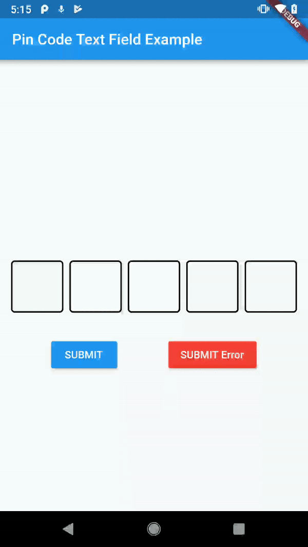
title: Text("Pin Code Text Field Example"),
),
body: Container(
child: SingleChildScrollView(
child: Column(
mainAxisAlignment: MainAxisAlignment.center,
crossAxisAlignment: CrossAxisAlignment.center,
children: <Widget>[
Padding(
padding: const EdgeInsets.only(bottom: 60.0),
child: Text(thisText, style: Theme.of(context).textTheme.title),
),
PinCodeTextField(
autofocus: false,
controller: controller,
hideCharacter: true,
highlight: true,
highlightColor: Colors.blue,
defaultBorderColor: Colors.black,
hasTextBorderColor: Colors.green,
maxLength: pinLength,
hasError: hasError,
maskCharacter: "?",
onTextChanged: (text) {
setState(() {
hasError = false;
});
},
onDone: (text){
print("DONE $text");
},
pinCodeTextFieldLayoutType: PinCodeTextFieldLayoutType.AUTO_ADJUST_WIDTH,
wrapAlignment: WrapAlignment.start,
pinBoxDecoration: ProvidedPinBoxDecoration.underlinedPinBoxDecoration,
pinTextStyle: TextStyle(fontSize: 30.0),
pinTextAnimatedSwitcherTransition: ProvidedPinBoxTextAnimation.scalingTransition,
pinTextAnimatedSwitcherDuration: Duration(milliseconds: 300),
),
Visibility(
child: Text(
"Wrong PIN!",
style: TextStyle(color: Colors.red),
),
visible: hasError,
),
Padding(
padding: const EdgeInsets.only(top: 32.0),
child: Row(
mainAxisAlignment: MainAxisAlignment.spaceEvenly,
children: <Widget>[
MaterialButton(
color: Colors.blue,
textColor: Colors.white,
child: Text("+"),
onPressed: () {
setState(() {
this.pinLength++;
});
},
),
MaterialButton(
color: Colors.blue,
textColor: Colors.white,
child: Text("-"),
onPressed: () {
setState(() {
this.pinLength--;
});
},
),
MaterialButton(
color: Colors.blue,
textColor: Colors.white,
child: Text("SUBMIT"),
onPressed: () {
setState(() {
this.thisText = controller.text;
});
},
),
MaterialButton(
color: Colors.red,
textColor: Colors.white,
child: Text("SUBMIT Error"),
onPressed: () {
setState(() {
this.hasError = true;
});
},
),
],
),
)
],
),
),
),
);
}
}
心愿单
本地化(从左到右,从右到左)- 高亮动画
- 密码框动画