
csc_picker
一个 Flutter 包,用于显示国家、州和城市。此外,它还可以根据选择项选择国家、州和城市列表,还可以搜索世界各地的国家、州和城市。
 |
 |
如何使用
要使用此软件包,请将 csc_picker 添加到您的 pubspec.yaml 文件中的 依赖项。
      	CSCPicker(
              onCountryChanged: (value) {
      			setState(() {
      					countryValue = value;
      				});
                  },
                  onStateChanged:(value) {
                      setState(() {
      					stateValue = value;
      				});
                  },
                  onCityChanged:(value) {
                  setState(() {
                      cityValue = value;
      			});
      		},
          ),
您将在 onChanged 函数中获得反馈
参数
| 参数 | 类型 | 描述 |
| flagState | CountryFlag | 启用(显示国家名称和国旗)/ 禁用(不显示国旗)/ 仅在下拉列表中显示(仅在下拉列表中显示国旗) |
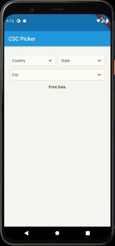
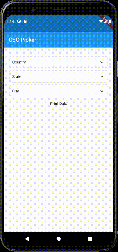
| layout | 布局 | 切换下拉菜单布局(横向 / 纵向) |
| showStates | Boolean(布尔值) | 启用/禁用州下拉菜单(true / false) |
| showCities | Boolean(布尔值) | 启用/禁用城市下拉菜单(true / false) |
| dropdownDecoration | BoxDecoration | 下拉菜单框装饰,用于样式化您的下拉菜单选择器 [可选参数](与 disabledDropdownDecoration 一起使用) |
| disabledDropdownDecoration | BoxDecoration | 禁用的下拉菜单框装饰,用于样式化您的下拉菜单选择器 [可选参数](与禁用的下拉菜单装饰一起使用) |
| selectedItemStyle | TextStyle | 更改选定项目的样式 |
| dropdownHeadingStyle | TextStyle | 更改下拉菜单对话框标题样式 |
| dropdownItemStyle | TextStyle | 更改下拉菜单对话框项目样式 |
| dropdownDialogRadius | 双精度 | 更改下拉菜单对话框的圆角 |
| searchBarRadius | 双精度 | 更改搜索栏的圆角 |
| defaultCountry | 默认国家 | 选择默认国家 |
| disableCountry | 禁用国家 | 禁用国家下拉菜单(注意:请与默认国家一起使用) |
| countrySearchPlaceholder | 字符串 | 国家搜索字段的占位符 |
| stateSearchPlaceholder | 字符串 | 州搜索字段的占位符 |
| citySearchPlaceholder | 字符串 | 城市搜索字段的占位符 |
| countryDropdownLabel | 字符串 | 国家下拉菜单的标签/标题 |
| countryDropdownLabel | 字符串 | 州下拉菜单的标签/标题 |
| countryDropdownLabel | 字符串 | 城市下拉菜单的标签/标题 |
示例
import 'package:csc_picker/csc_picker.dart';
import 'package:flutter/material.dart';

/// This is a implementation of the Country State City Picker.
void main() {
  runApp(MyApp());
}

class MyApp extends StatelessWidget {
  @override
  Widget build(BuildContext context) {
    return MaterialApp(
      title: 'CSC Picker',
      theme: ThemeData(
        primarySwatch: Colors.blue,
        visualDensity: VisualDensity.adaptivePlatformDensity,
      ),
      home: MyHomePage(title: 'CSC Picker'),
    );
  }
}

class MyHomePage extends StatefulWidget {
  MyHomePage({Key key, this.title}) : super(key: key);

  final String title;

  @override
  _MyHomePageState createState() => _MyHomePageState();
}

class _MyHomePageState extends State<MyHomePage> {
  /// Variables to store country state city data in onChanged method.
  String countryValue = "";
  String stateValue = "";
  String cityValue = "";
  String address = "";

  @override
  Widget build(BuildContext context) {

    GlobalKey<CSCPickerState> _cscPickerKey = GlobalKey();

    return Scaffold(
      appBar: AppBar(
        title: Text(widget.title),
      ),
      body: Center(
        child: Container(
            padding: EdgeInsets.symmetric(horizontal: 20),
            height: 600,
            child: Column(
              children: [
                ///Adding CSC Picker Widget in app
                CSCPicker(
                  ///Enable disable state dropdown [OPTIONAL PARAMETER]
                  showStates: true,

                  /// Enable disable city drop down [OPTIONAL PARAMETER]
                  showCities: true,

                  ///Enable (get flag with country name) / Disable (Disable flag) / ShowInDropdownOnly (display flag in dropdown only) [OPTIONAL PARAMETER]
                  flagState: CountryFlag.DISABLE,

                  ///Dropdown box decoration to style your dropdown selector [OPTIONAL PARAMETER] (USE with disabledDropdownDecoration)
                  dropdownDecoration: BoxDecoration(
                      borderRadius: BorderRadius.all(Radius.circular(10)),
                      color: Colors.white,
                      border:
                      Border.all(color: Colors.grey.shade300, width: 1)),

                  ///Disabled Dropdown box decoration to style your dropdown selector [OPTIONAL PARAMETER]  (USE with disabled dropdownDecoration)
                  disabledDropdownDecoration: BoxDecoration(
                      borderRadius: BorderRadius.all(Radius.circular(10)),
                      color: Colors.grey.shade300,
                      border:
                      Border.all(color: Colors.grey.shade300, width: 1)),

                  ///placeholders for dropdown search field
                  countrySearchPlaceholder: "Country",
                  stateSearchPlaceholder: "State",
                  citySearchPlaceholder: "City",

                  ///labels for dropdown
                  countryDropdownLabel: "*Country",
                  stateDropdownLabel: "*State",
                  cityDropdownLabel: "*City",

                  ///Default Country
                  //defaultCountry: DefaultCountry.India,

                  ///Disable country dropdown (Note: use it with default country)
                  //disableCountry: true,

                  ///selected item style [OPTIONAL PARAMETER]
                  selectedItemStyle: TextStyle(
                    color: Colors.black,
                    fontSize: 14,
                  ),

                  ///DropdownDialog Heading style [OPTIONAL PARAMETER]
                  dropdownHeadingStyle: TextStyle(
                      color: Colors.black,
                      fontSize: 17,
                      fontWeight: FontWeight.bold),

                  ///DropdownDialog Item style [OPTIONAL PARAMETER]
                  dropdownItemStyle: TextStyle(
                    color: Colors.black,
                    fontSize: 14,
                  ),

                  ///Dialog box radius [OPTIONAL PARAMETER]
                  dropdownDialogRadius: 10.0,

                  ///Search bar radius [OPTIONAL PARAMETER]
                  searchBarRadius: 10.0,

                  ///triggers once country selected in dropdown
                  onCountryChanged: (value) {
                    setState(() {
                      ///store value in country variable
                      countryValue = value;
                    });
                  },

                  ///triggers once state selected in dropdown
                  onStateChanged: (value) {
                    setState(() {
                      ///store value in state variable
                      stateValue = value;
                    });
                  },

                  ///triggers once city selected in dropdown
                  onCityChanged: (value) {
                    setState(() {
                      ///store value in city variable
                      cityValue = value;
                    });
                  },
                ),

                ///print newly selected country state and city in Text Widget
                TextButton(
                    onPressed: () {
                      setState(() {
                        address = "$cityValue, $stateValue, $countryValue";
                      });
                    },
                    child: Text("Print Data")),
                Text(address)
              ],
            )),
      ),
    );
  }
}


