
Flutter Pinput 来自
Flutter Pinput 是一个提供易于使用且可定制的 PIN 码输入字段的包。它提供了多种功能,例如动画装饰切换、表单验证、短信自动填充、自定义光标、从剪贴板复制等。它还提供了精美的示例供您选择。
如果您使用的是 Flutter 版本 <3.7.0,则必须使用 Pinput 版本 2.2.21
功能
- 动画装饰切换
- 表单验证
- iOS 上的短信自动填充
- Android 上的短信自动填充
- 标准光标
- 自定义光标
- 光标动画
- 从剪贴板复制
- 准备自定义键盘
- 标准粘贴选项
- 隐藏字符
- 隐藏小部件
- 触觉反馈
- 完成后关闭键盘
- 精美的 示例
支持
欢迎提交 PR
Discord 频道
GitHub 上的 示例 应用提供了多种模板可供选择
别忘了给它点个星 ⭐
演示
| 实时演示 | 带阴影的圆形 | 带光标的圆形 |
|---|---|---|
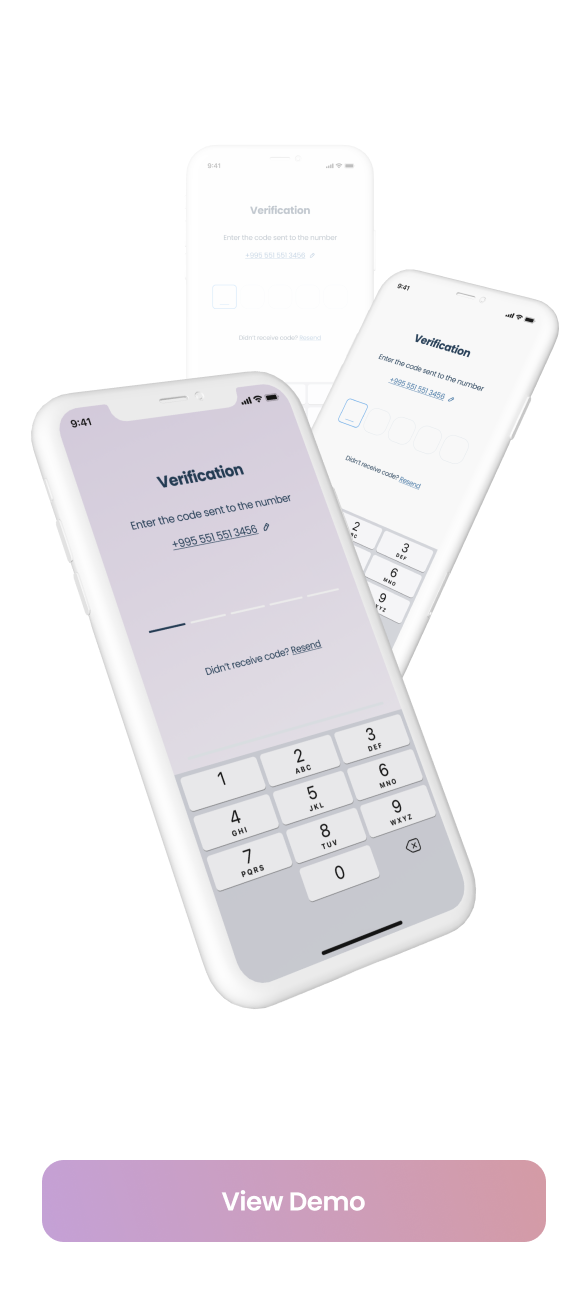 |
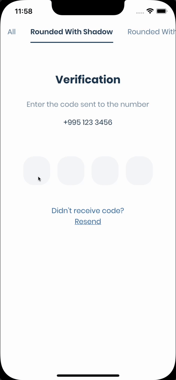 |
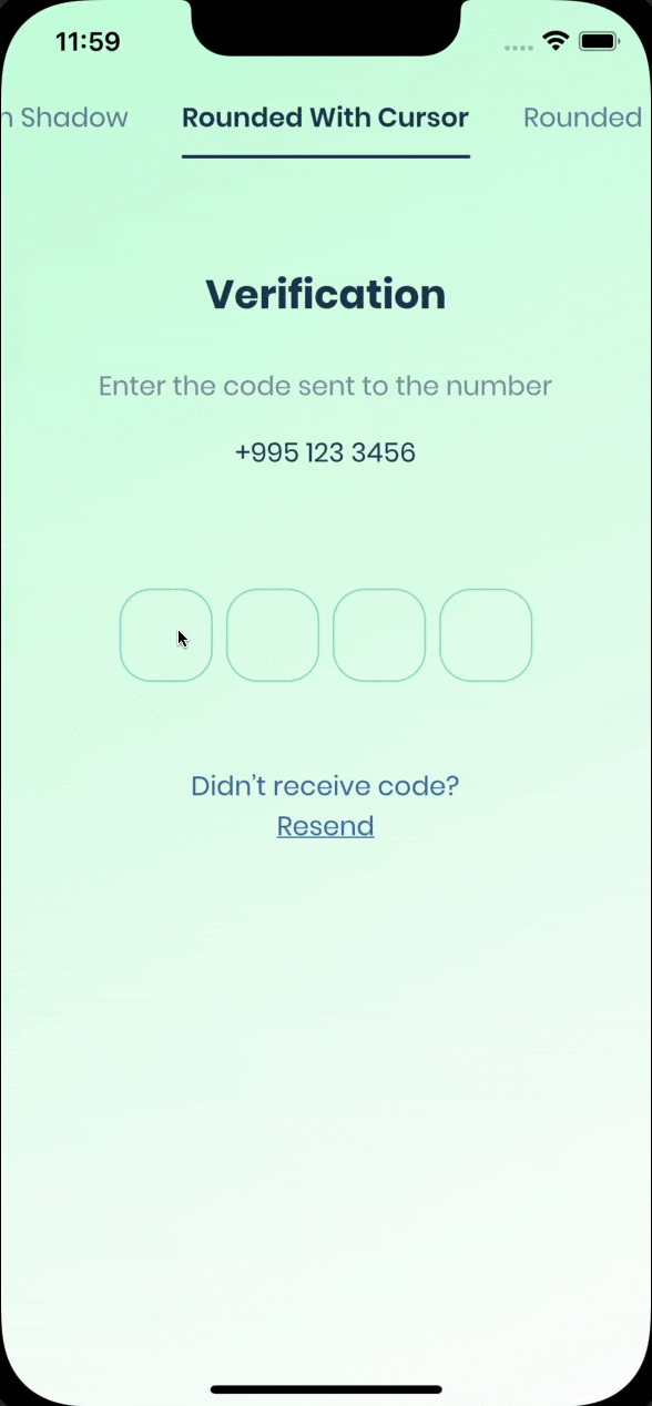 |
| 填充的圆形 | 底部带光标 | 填充 |
|---|---|---|
 |
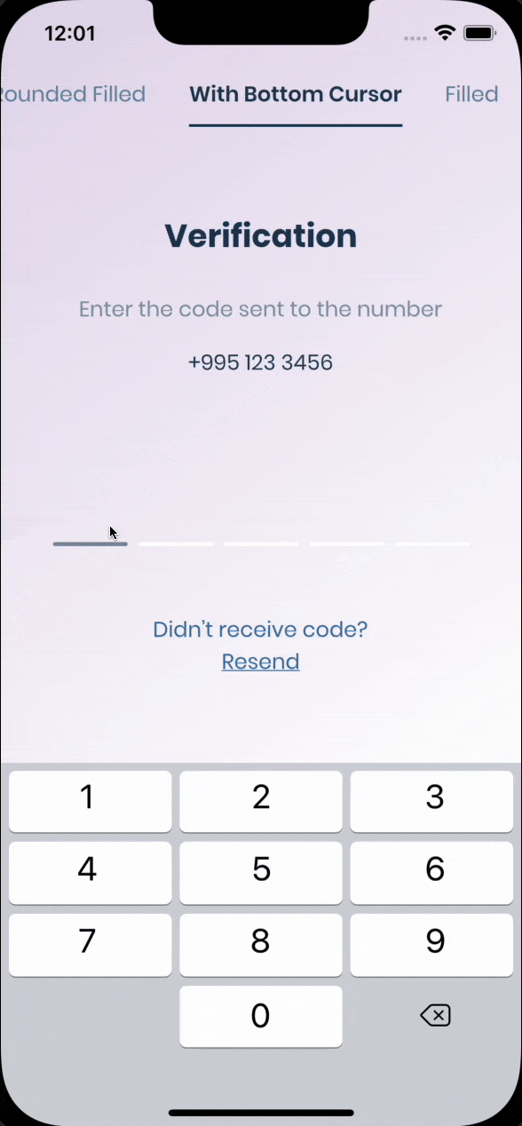 |
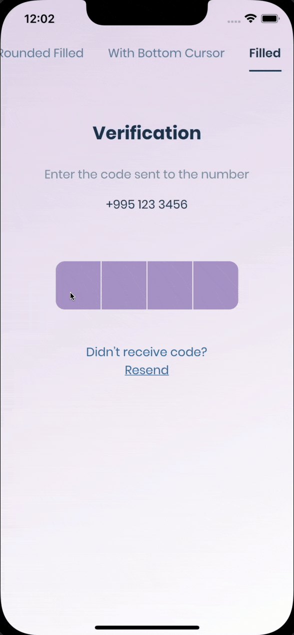 |
入门
PIN 有 6 种状态:默认、聚焦、已提交、跟随、已禁用、错误。您可以自定义每种状态,方法是指定 theme 参数。PIN 会自动在一种状态平滑地过渡到另一种状态。PinTheme 类
| 属性 | 默认/类型 |
|---|---|
| width | 56.0 |
| 高度 | 60.0 |
| 文本样式 | TextStyle() |
| margin | EdgeInsetsGeometry |
| padding | EdgeInsetsGeometry |
| 约束 | BoxConstraints |
您可以使用标准的 Pinput,如下所示
Widget buildPinPut() {
  return Pinput(
    onCompleted: (pin) => print(pin),
  );
}
如果您想自定义它,请先创建 defaultPinTheme。
final defaultPinTheme = PinTheme(
  width: 56,
  height: 56,
  textStyle: TextStyle(fontSize: 20, color: Color.fromRGBO(30, 60, 87, 1), fontWeight: FontWeight.w600),
  decoration: BoxDecoration(
    border: Border.all(color: Color.fromRGBO(234, 239, 243, 1)),
    borderRadius: BorderRadius.circular(20),
  ),
);
如果您希望所有 PIN 都相同,请不要传递其他主题参数。否则,请从 defaultPinTheme 创建 focusedPinTheme、submittedPinTheme、followingPinTheme、errorPinTheme。
final focusedPinTheme = defaultPinTheme.copyDecorationWith(
  border: Border.all(color: Color.fromRGBO(114, 178, 238, 1)),
  borderRadius: BorderRadius.circular(8),
);

final submittedPinTheme = defaultPinTheme.copyWith(
  decoration: defaultPinTheme.decoration.copyWith(
    color: Color.fromRGBO(234, 239, 243, 1),
  ),
);
将所有内容放在一起
final defaultPinTheme = PinTheme(
  width: 56,
  height: 56,
  textStyle: TextStyle(fontSize: 20, color: Color.fromRGBO(30, 60, 87, 1), fontWeight: FontWeight.w600),
  decoration: BoxDecoration(
    border: Border.all(color: Color.fromRGBO(234, 239, 243, 1)),
    borderRadius: BorderRadius.circular(20),
  ),
);

final focusedPinTheme = defaultPinTheme.copyDecorationWith(
  border: Border.all(color: Color.fromRGBO(114, 178, 238, 1)),
  borderRadius: BorderRadius.circular(8),
);

final submittedPinTheme = defaultPinTheme.copyWith(
  decoration: defaultPinTheme.decoration.copyWith(
    color: Color.fromRGBO(234, 239, 243, 1),
  ),
);

return Pinput(
  defaultPinTheme: defaultPinTheme,
  focusedPinTheme: focusedPinTheme,
  submittedPinTheme: submittedPinTheme,
  validator: (s) {
    return s == '2222' ? null : 'Pin is incorrect';
  },
  pinputAutovalidateMode: PinputAutovalidateMode.onSubmit,
  showCursor: true,
  onCompleted: (pin) => print(pin),
);
短信自动填充
iOS
开箱即用,只需点击键盘上方的代码即可。
Android
如果您使用的是 firebase_auth,则必须将 androidSmsAutofillMethod 设置为 AndroidSmsAutofillMethod.none,并在 verificationCompleted 回调中设置 controller 的值。以下是示例代码。
    Pinput(
      androidSmsAutofillMethod: AndroidSmsAutofillMethod.none,
      controller: pinController,
    );
并在 verificationCompleted 回调中设置 pinController 的值
    await FirebaseAuth.instance.verifyPhoneNumber(
      verificationCompleted: (PhoneAuthCredential credential) {
        pinController.setText(credential.smsCode);
      },
      verificationFailed: (FirebaseAuthException e) {},
      codeSent: (String verificationId, int? resendToken) {},
      codeAutoRetrievalTimeout: (String verificationId) {},
    );
以及 短信用户同意 API,
SmartAuth 是 Flutter 的这些 API 的包装器包,它支持 Pinput 的自动填充功能。
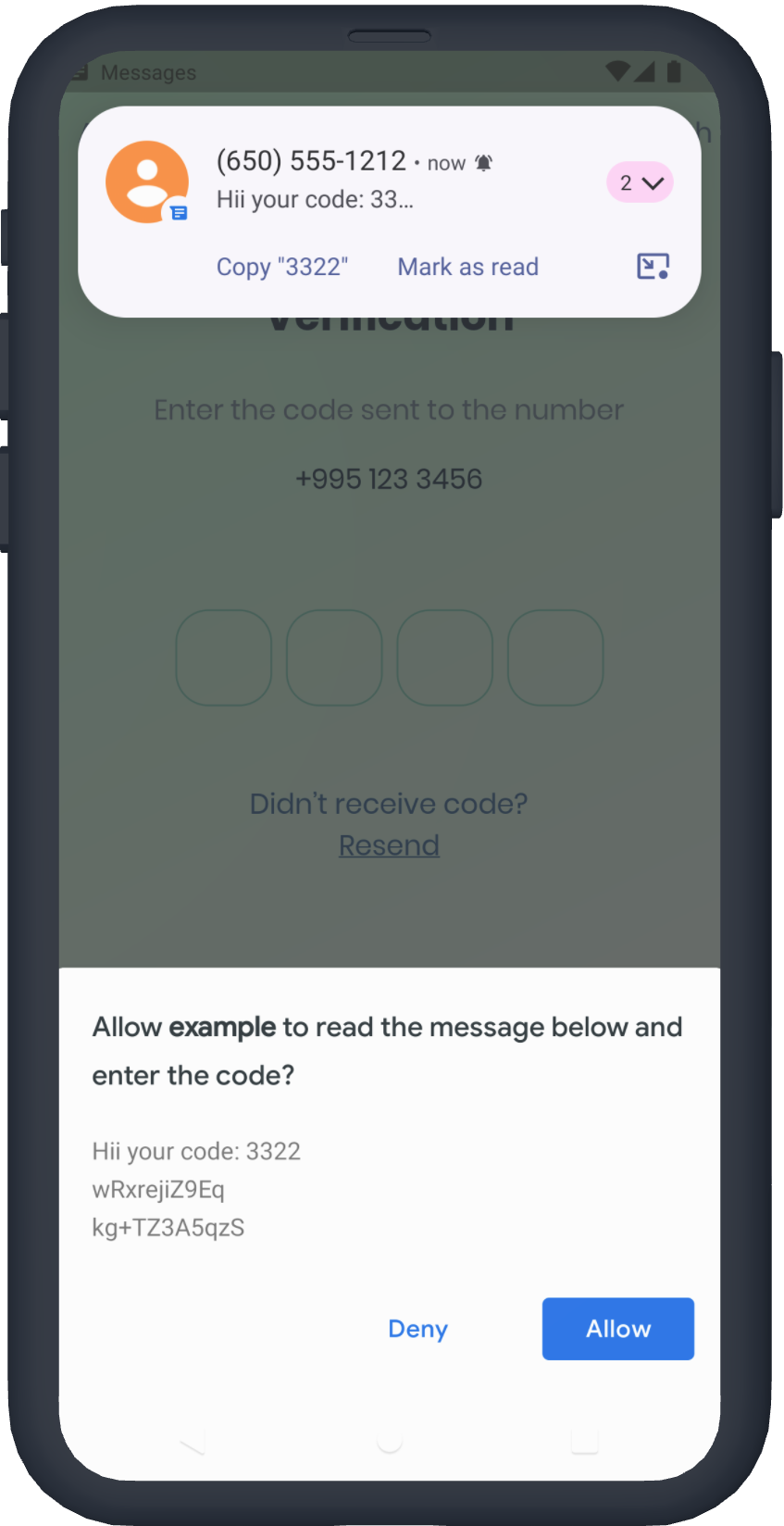
短信检索器 API
要使用检索器 API,您需要应用程序的 签名,Pinput 会为您计算哈希值并在控制台中打印。短信代码将自动应用,无需用户交互。
请注意,应用程序签名在调试和发布模式下可能不同
return Pinput(
  androidSmsAutofillMethod:  AndroidSmsAutofillMethod.smsRetrieverApi,
);
打印签名的示例 Pinput: SMS Retriever API 的应用程序签名是:kg+TZ3A5qzS
短信用户同意 API
您不需要应用程序签名,系统将提示用户确认读取消息。
return Pinput(
  androidSmsAutofillMethod:  AndroidSmsAutofillMethod.smsUserConsentApi,
);
SmartAuth
如果自动填充支持不满足您的需求,您可以使用 SmartAuth 来实现自动填充。此外,您还可以通过显示原生 Android 对话框来建议电话号码。
无需添加 SmartAuth 依赖项,它已包含在内。
请参阅示例应用以获取更多 模板
技巧
-
控制器
/// Create Controller
final pinController = TextEditingController();

/// Set text programmatically
pinController.setText('1222');

/// Append typed character, useful if you are using custom keyboard
pinController.append('1', 4);

/// Delete last character
pinController.delete();

/// Don't call setText, append, delete in build method, this is just illustration.

return Pinput(
  controller: pinController,
);
-
焦点
/// Create FocusNode
final pinputFocusNode = FocusNode();

/// Focus pinput
pinputFocusNode.requestFocus();

/// UnFocus pinput
pinputFocusNode.unfocus();

/// Don't call requestFocus, unfocus in build method, this is just illustration.

return Pinput(
  focusNode: pinputFocusNode,
);
-
验证
/// Create key
final formKey = GlobalKey<FormState>();

/// Validate manually
/// Don't call validate in build method, this is just illustration.
formKey.currentState!.validate();

return Form(
  key: formKey,
  child: Pinput(
    // Without Validator
    // If true error state will be applied no matter what validator returns
    forceErrorState: true,
    // Text will be displayed under the Pinput
    errorText: 'Error',

    /// ------------
    /// With Validator
    /// Auto validate after user tap on keyboard done button, or completes Pinput
    pinputAutovalidateMode: PinputAutovalidateMode.onSubmit,
    validator: (pin) {
      if (pin == '2224') return null;

      /// Text will be displayed under the Pinput
      return 'Pin is incorrect';
    },
  ),
);
属性
class Pinput extends StatefulWidget {
  const Pinput({
    this.length = PinputConstants._defaultLength,
    this.defaultPinTheme,
    this.focusedPinTheme,
    this.submittedPinTheme,
    this.followingPinTheme,
    this.disabledPinTheme,
    this.errorPinTheme,
    this.onChanged,
    this.onCompleted,
    this.onSubmitted,
    this.onTap,
    this.onLongPress,
    this.controller,
    this.focusNode,
    this.preFilledWidget,
    this.separatorPositions,
    this.separator = PinputConstants._defaultSeparator,
    this.smsCodeMatcher = PinputConstants.defaultSmsCodeMatcher,
    this.senderPhoneNumber,
    this.androidSmsAutofillMethod = AndroidSmsAutofillMethod.none,
    this.listenForMultipleSmsOnAndroid = false,
    this.mainAxisAlignment = MainAxisAlignment.center,
    this.crossAxisAlignment = CrossAxisAlignment.start,
    this.pinContentAlignment = Alignment.center,
    this.animationCurve = Curves.easeIn,
    this.animationDuration = PinputConstants._animationDuration,
    this.pinAnimationType = PinAnimationType.scale,
    this.enabled = true,
    this.readOnly = false,
    this.useNativeKeyboard = true,
    this.toolbarEnabled = true,
    this.autofocus = false,
    this.obscureText = false,
    this.showCursor = true,
    this.isCursorAnimationEnabled = true,
    this.enableSuggestions = true,
    this.hapticFeedbackType = HapticFeedbackType.disabled,
    this.closeKeyboardWhenCompleted = true,
    this.keyboardType = TextInputType.number,
    this.textCapitalization = TextCapitalization.none,
    this.slideTransitionBeginOffset,
    this.cursor,
    this.keyboardAppearance,
    this.inputFormatters = const [],
    this.textInputAction,
    this.autofillHints,
    this.obscuringCharacter = '•',
    this.obscuringWidget,
    this.selectionControls,
    this.restorationId,
    this.onClipboardFound,
    this.onAppPrivateCommand,
    this.mouseCursor,
    this.forceErrorState = false,
    this.errorText,
    this.validator,
    this.errorBuilder,
    this.errorTextStyle,
    this.pinputAutovalidateMode = PinputAutovalidateMode.onSubmit,
    this.scrollPadding = const EdgeInsets.all(20),
    this.contextMenuBuilder = _defaultContextMenuBuilder,
    this.onTapOutside,
    Key? key,
  })  : assert(obscuringCharacter.length == 1),
        assert(length > 0),
        assert(
        textInputAction != TextInputAction.newline,
        'Pinput is not multiline',
        ),
        super(key: key);

  /// Theme of the pin in default state
  final PinTheme? defaultPinTheme;

  /// Theme of the pin in focused state
  final PinTheme? focusedPinTheme;

  /// Theme of the pin in submitted state
  final PinTheme? submittedPinTheme;

  /// Theme of the pin in following state
  final PinTheme? followingPinTheme;

  /// Theme of the pin in disabled state
  final PinTheme? disabledPinTheme;

  /// Theme of the pin in error state
  final PinTheme? errorPinTheme;

  /// If true keyboard will be closed
  final bool closeKeyboardWhenCompleted;

  /// Displayed fields count. PIN code length.
  final int length;

  /// By default Android autofill is Disabled, you cane enable it by using any of options listed below
  ///
  /// First option is [AndroidSmsAutofillMethod.smsRetrieverApi] it automatically reads sms without user interaction
  /// More about Sms Retriever API https://developers.google.com/identity/sms-retriever/overview?hl=en
  ///
  /// Second option requires user interaction to confirm reading a SMS, See readme for more details
  /// [AndroidSmsAutofillMethod.smsUserConsentApi]
  /// More about SMS User Consent API https://developers.google.com/identity/sms-retriever/user-consent/overview
  final AndroidSmsAutofillMethod androidSmsAutofillMethod;

  /// If true [androidSmsAutofillMethod] is not [AndroidSmsAutofillMethod.none]
  /// Pinput will listen multiple sms codes, helpful if user request another sms code
  final bool listenForMultipleSmsOnAndroid;

  /// Used to extract code from SMS for Android Autofill if [androidSmsAutofillMethod] is enabled
  /// By default it is [PinputConstants.defaultSmsCodeMatcher]
  final String smsCodeMatcher;

  /// Fires when user completes pin input
  final ValueChanged<String>? onCompleted;

  /// Called every time input value changes.
  final ValueChanged<String>? onChanged;

  /// See [EditableText.onSubmitted]
  final ValueChanged<String>? onSubmitted;

  /// Called when user clicks on PinPut
  final VoidCallback? onTap;

  /// Triggered when a pointer has remained in contact with the Pinput at the
  /// same location for a long period of time.
  final VoidCallback? onLongPress;

  /// Used to get, modify PinPut value and more.
  /// Don't forget to dispose controller
  /// ``` dart
  ///   @override
  ///   void dispose() {
  ///     controller.dispose();
  ///     super.dispose();
  ///   }
  /// ```
  final TextEditingController? controller;

  /// Defines the keyboard focus for this
  /// To give the keyboard focus to this widget, provide a [focusNode] and then
  /// use the current [FocusScope] to request the focus:
  /// Don't forget to dispose focusNode
  /// ``` dart
  ///   @override
  ///   void dispose() {
  ///     focusNode.dispose();
  ///     super.dispose();
  ///   }
  /// ```
  final FocusNode? focusNode;

  /// Widget that is displayed before field submitted.
  final Widget? preFilledWidget;

  /// Sets the positions where the separator should be shown
  final List<int>? separatorPositions;

  /// Builds a Pinput separator
  final Widget? separator;

  /// Defines how [Pinput] fields are being placed inside [Row]
  final MainAxisAlignment mainAxisAlignment;

  /// Defines how [Pinput] and ([errorText] or [errorBuilder]) are being placed inside [Column]
  final CrossAxisAlignment crossAxisAlignment;

  /// Defines how each [Pinput] field are being placed within the container
  final AlignmentGeometry pinContentAlignment;

  /// curve of every [Pinput] Animation
  final Curve animationCurve;

  /// Duration of every [Pinput] Animation
  final Duration animationDuration;

  /// Animation Type of each [Pinput] field
  /// options:
  /// none, scale, fade, slide, rotation
  final PinAnimationType pinAnimationType;

  /// Begin Offset of ever [Pinput] field when [pinAnimationType] is slide
  final Offset? slideTransitionBeginOffset;

  /// Defines [Pinput] state
  final bool enabled;

  /// See [EditableText.readOnly]
  final bool readOnly;

  /// See [EditableText.autofocus]
  final bool autofocus;

  /// Whether to use Native keyboard or custom one
  /// when flag is set to false [Pinput] wont be focusable anymore
  /// so you should set value of [Pinput]'s [TextEditingController] programmatically
  final bool useNativeKeyboard;

  /// If true, paste button will appear on longPress event
  final bool toolbarEnabled;

  /// Whether show cursor or not
  /// Default cursor '|' or [cursor]
  final bool showCursor;

  final bool isCursorAnimationEnabled;

  /// If [showCursor] true the focused field will show passed Widget
  final Widget? cursor;

  /// The appearance of the keyboard.
  /// This setting is only honored on iOS devices.
  /// If unset, defaults to [ThemeData.brightness].
  final Brightness? keyboardAppearance;

  /// See [EditableText.inputFormatters]
  final List<TextInputFormatter> inputFormatters;

  /// See [EditableText.keyboardType]
  final TextInputType keyboardType;

  /// Provide any symbol to obscure each [Pinput] pin
  /// Recommended ●
  final String obscuringCharacter;

  /// IF [obscureText] is true typed text will be replaced with passed Widget
  final Widget? obscuringWidget;

  /// Whether hide typed pin or not
  final bool obscureText;

  /// See [EditableText.textCapitalization]
  final TextCapitalization textCapitalization;

  /// The type of action button to use for the keyboard.
  ///
  /// Defaults to [TextInputAction.newline] if [keyboardType] is
  /// [TextInputType.multiline] and [TextInputAction.done] otherwise.
  final TextInputAction? textInputAction;

  /// See [EditableText.autofillHints]
  final Iterable<String>? autofillHints;

  /// See [EditableText.enableSuggestions]
  final bool enableSuggestions;

  /// See [EditableText.selectionControls]
  final TextSelectionControls? selectionControls;

  /// See [TextField.restorationId]
  final String? restorationId;

  /// Fires when clipboard has text of Pinput's length
  final ValueChanged<String>? onClipboardFound;

  /// Use haptic feedback everytime user types on keyboard
  /// See more details in [HapticFeedback]
  final HapticFeedbackType hapticFeedbackType;

  /// See [EditableText.onAppPrivateCommand]
  final AppPrivateCommandCallback? onAppPrivateCommand;

  /// See [EditableText.mouseCursor]
  final MouseCursor? mouseCursor;

  /// If true [errorPinTheme] will be applied and [errorText] will be displayed under the Pinput
  final bool forceErrorState;

  /// Text displayed under the Pinput if Pinput is invalid
  final String? errorText;

  /// Style of error text
  final TextStyle? errorTextStyle;

  /// If [Pinput] has error and [errorBuilder] is passed it will be rendered under the Pinput
  final PinputErrorBuilder? errorBuilder;

  /// Return null if pin is valid or any String otherwise
  final FormFieldValidator<String>? validator;

  /// Return null if pin is valid or any String otherwise
  final PinputAutovalidateMode pinputAutovalidateMode;

  /// When this widget receives focus and is not completely visible (for example scrolled partially
  /// off the screen or overlapped by the keyboard)
  /// then it will attempt to make itself visible by scrolling a surrounding [Scrollable], if one is present.
  /// This value controls how far from the edges of a [Scrollable] the TextField will be positioned after the scroll.
  final EdgeInsets scrollPadding;

  /// Optional parameter for Android SMS User Consent API.
  final String? senderPhoneNumber;

  /// {@macro flutter.widgets.EditableText.contextMenuBuilder}
  ///
  /// If not provided, will build a default menu based on the platform.
  ///
  /// See also:
  ///
  ///  * [AdaptiveTextSelectionToolbar], which is built by default.
  final EditableTextContextMenuBuilder? contextMenuBuilder;

  /// A callback to be invoked when a tap is detected outside of this [TapRegion]
  /// The [PointerDownEvent] passed to the function is the event that caused the
  /// notification. If this region is part of a group
  /// then it's possible that the event may be outside of this immediate region,
  /// although it will be within the region of one of the group members.
  /// This is useful if you want to unfocus the [Pinput] when user taps outside of it
  final TapRegionCallback? onTapOutside;


