
groovin_widgets
一个 Flutter 包,包含 GroovinChip 创建的小部件。
该软件包当前包含以下小部件
- ModalDrawerHandle
- OutlineDropdownButton
- OutlineDropdownButtonFormField
- GroovinExpansionTile
- SplitColorBackground
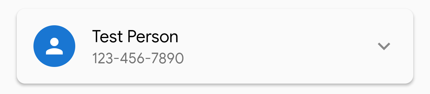
ModalDrawerHandle
ModalDrawerHandle 允许您为模态底部表单添加高度可定制的抽屉手柄小部件。
示例图片


抽屉手柄的每个方面都可以定制
- color
- 高度
- width
- 它所在的 Row 的 MainAxisAlignment
- 所有四个角的 BorderRadius
此小部件的推荐用法是在 showModalBottomSheet 生成器(如果您更喜欢 Gildaswise 的包,也可以使用 showRoundedModalBottomSheet 生成器)中。
在这种情况下,理想的用法是返回一个 Container,该 Container 返回一个 Column,并且 ModalDrawerHandle 小部件应该是 Column 中的第一个小部件。我个人会将 ModalDrawerHandle 包裹在 Padding 中,该 Padding 具有 const EdgeInsets.all(8.0)。下面是一个示例
showRoundedModalBottomSheet(
  context: context,
  builder: (builder) {
    return Container(
	  child: Column(
	    mainAxisSize: MainAxisSize.min,
	    children: <Widget>[
		  Padding(
		    padding: const EdgeInsets.all(8.0),
		    child: ModalDrawerHandle(),
		  ),
	    ],
	  ),
    );
  },
);
默认情况下,ModalDrawerHandle 使用以下属性进行初始化
  ModalDrawerHandle({
    this.handleRowAlignment = MainAxisAlignment.center,
    this.handleHeight = 5.0,
    this.handleWidth = 25.0,
    Color handleColor,
    this.handleBorderRadius = const BorderRadius.all(Radius.circular(10.0))
  }):
     this.handleColor = handleColor ?? Colors.grey[300];
因此,开发人员可以根据自己的选择传入任何或所有自定义值给构造函数。
OutlineDropdownButton
OutlineDropdownButton 是一个标准的 DropdownButton,它有一个额外的功能:可以将其包装在边框中。
您期望自定义 DropdownButton 的所有属性都可以供开发人员使用,并且 InputDecoration
OutlineDropdownButton 使用的 InputDecoration 也可以完全自定义。
默认情况下,OutlineDropdownButton 使用以下属性进行初始化
  OutlineDropdownButton({
    this.inputDecoration = const InputDecoration(
      border: OutlineInputBorder(),
      contentPadding: EdgeInsets.all(8.0),
    ),
    this.disabledHint,
    this.elevation = 8, // the default value per the source
    this.hint,
    this.iconSize = 24.0, // the default value per the source
    this.isDense = false, // the default value per the source
    this.isExpanded = true, // here I deviate from the source because this property is great
    this.items,
    this.onChanged,
    this.style,
    this.value,
  });
默认的 OutlineDropdownButton 看起来像这样

OutlineDropdownButtonFormField
OutlineDropdownButtonFormField 类似于 OutlineDropdownButton,但针对
表单进行了优化。附加属性是
final List<DropdownMenuItem<T>> items;
final ValueChanged<T> onChanged;
final FormFieldValidator<T> validator;
final FormFieldSetter<T> onSaved;
该小部件在小部件中显式构建 InputDecoration,而不是在构造函数中,这是因为
表单验证的限制。但是,装饰可以自定义。
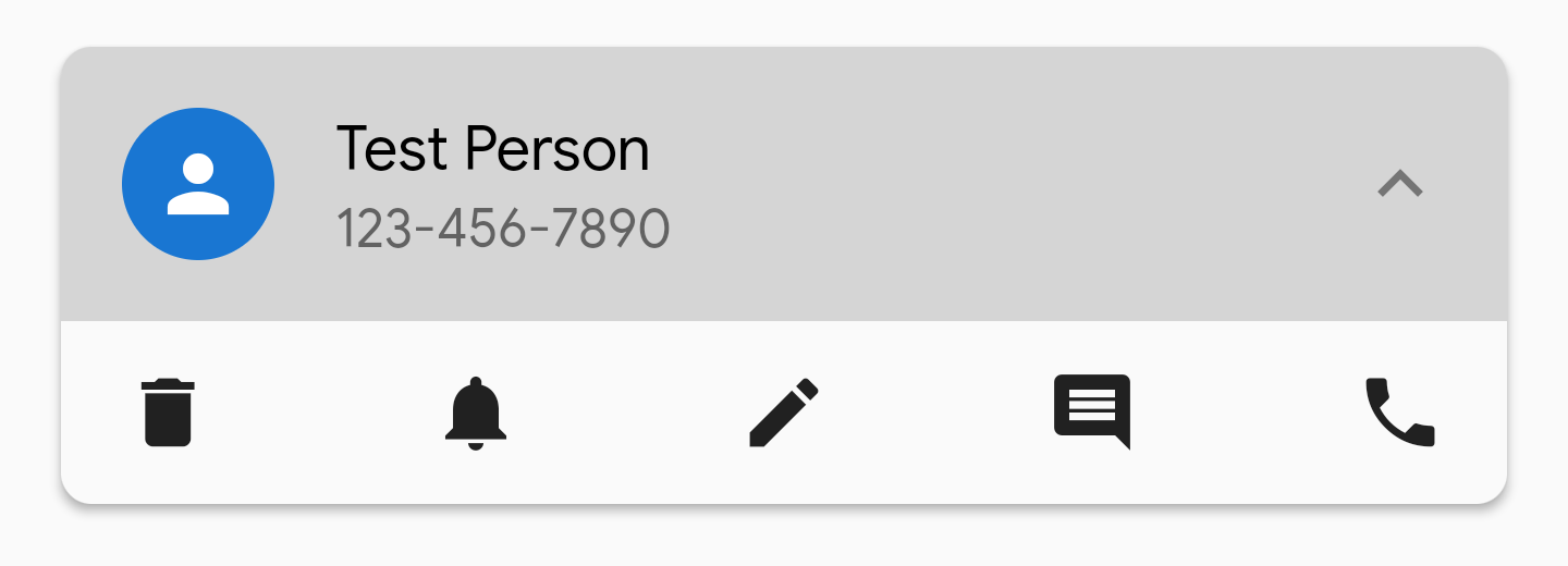
GroovinExpansionTile
此小部件是经过修改的 Expansion tile,允许对其外观进行更多自定义。
您可以自定义 ExpansionTile 的 BoxDecoration,因此您可以移除展开时出现在其上方和下方的线条
等。
ExpansionTile 为用户构建了一个 ListTile 来点击;GroovinExpansionTile 构建了一个自定义
ListTile,以便您可以添加副标题并调整瓷砖所在的 InkWell 的边框半径
内。
在此库的版本 1.2.1 中,此小部件的默认尾部图标的颜色将设置为
Colors.grey。可以通过参数 `defaultTrailingIconColor` 自定义此图标颜色。
示例图片
- 包装在具有 2.0 视差的 Material 中,未展开
- 包装在具有 2.0 视差的 Material 中,已展开

- 包装在具有 2.0 视差的 Material 中,已展开,显示具有右上角和左上角半径的 InkWell
SplitColorBackground
此小部件能够复制 dribbble、uplabs 和其他
设计网站中看到的、显示一个具有一种背景色的标题部分、一个具有
不同背景色的正文部分以及正文部分顶部圆角的页面设计。
下面是一个示例,摘自随附的示例项目
在此存储库中

该小部件作为一个 Scaffold 工作,其主体是一个 Column,带有两个 Flexible 小部件来表示
标题和正文。各种 Scaffold 属性都暴露给开发人员。如果您想要
更多的 Scaffold 属性可以进行自定义,请在 GitHub 上提交一个 issue 并
另外给我发送电子邮件或推文。
该小部件包含以下属性
/// Represents the flex property of the Flexible containing the header widget. Defaults to 1.
final int headerFlex;
/// Represents the Widget that will be used as the header
final Widget header;
/// Represents the color for the header widget
final Color headerColor;
/// Represents the flex property of the Flexible containing the body widget. Defaults to 4.
final int bodyFlex;
/// Represents the Widget that will be used as the body
final Widget body;
/// Represents the corner radius for the top left corner of the body
final double topLeftCornerRadius;
/// Represents the corner radius for the top right corner of the body
final double topRightCornerRadius;
/// Represents the color for the body widget
final Color bodyColor;
/// The Scaffold appBar is available for optional use.
final AppBar appBar;
/// The Scaffold FloatingActionButton is available for optional use.
final FloatingActionButton floatingActionButton;
/// The Scaffold FloatingActionButtonLocation is available for optional use.
final FloatingActionButtonLocation floatingActionButtonLocation;
/// The Scaffold BottomNavigationBar is available for optional use.
final BottomNavigationBar bottomNavigationBar;


