
just_the_tooltip
当你需要一个工具提示时,这是一个小巧实用的包。
入门
将其插入到您的yaml中
just_the_tooltip: <latest_version>
just_the_tooltip 允许您通过设置任意内容来获得比 Flutter 标准 Tooltip 更大的灵活性。它还扩展了其单轴布局算法,以便在垂直和水平方向上都能适应。提示框可以沿任何轴定位,并在溢出时回退到另一侧。

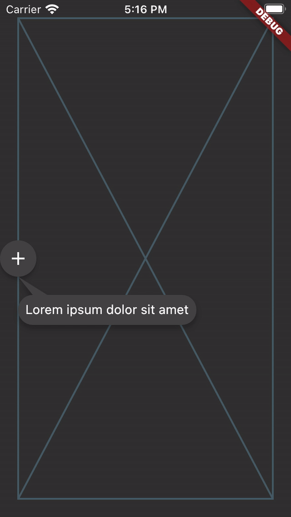
JustTheTooltip(
  child: Material(
    color: Colors.grey.shade800,
    shape: const CircleBorder(),
    elevation: 4.0,
    child: const Padding(
      padding: EdgeInsets.all(8.0),
      child: Icon(
        Icons.add,
        color: Colors.white,
      ),
    ),
  ),
  content: const Padding(
    padding: EdgeInsets.all(8.0),
    child: Text(
      'Bacon ipsum dolor amet kevin turducken brisket pastrami, salami ribeye spare ribs tri-tip sirloin shoulder venison shank burgdoggen chicken pork belly. Short loin filet mignon shoulder rump beef ribs meatball kevin.',
    ),
  ),
)
child 小部件将使用 GestureDetector 或 MouseRegion 进行包装,负责显示和隐藏内容。您可以通过定义 isModal 属性来进一步定义 Tooltip 的显示方式。模态对话框只能通过点击 child 打开,并通过点击背景区域(此处称为 skrim)关闭。非模态(默认)是一种更传统的提示框,在悬停时打开和关闭。
注意,手机模拟器不实现鼠标控件。要测试悬停状态,请使用浏览器。
当没有鼠标区域存在但 isModal 为 false 时,将使用长按打开的回退机制。
如果您想创建一个控制器来管理提示框的状态,可以通过定义 JustTheController 的实例并将其传递给构造函数来实现。
final tooltipController = JustTheController();

child: JustTheTooltip(
  controller: tooltipController,
  // ...
)

void showTooltip() {
  if (controller.isHidden) {
    controller.showTooltip();
  }
}
ListViews
提示框也应该在列表中工作,并通过滚动跟随目标。为了更全面地考虑 ListView 中的可用空间,可以将 ScrollController 传递给 just_the_tooltip,以便布局算法了解滚动轴之前和之后有多少空间。这使得原本会溢出的提示框可以使用滚动方向上屏幕外空间。
对于一些必须成为小部件树一部分而不是覆盖层的情况,有一个 JustTheTooltip.entry
Scaffold(
  appBar: AppBar(title: const Text('It goes under me')),
  body: JustTheTooltipArea(
    builder: (context, tooltip, scrim) {
      return Stack(
        fit: StackFit.passthrough,
        children: [
          ListView.builder(
            itemCount: 30,
            itemBuilder: (context, index) {
              if (index == 15) {
                return JustTheTooltip.entry(
                  tailLength: 10.0,
                  preferredDirection: AxisDirection.down,
                  isModal: true,
                  margin: const EdgeInsets.all(20.0),
                  child: const Material(
                    color: Colors.blue,
                    shape: CircleBorder(),
                    elevation: 4.0,
                    child: Padding(
                      padding: EdgeInsets.all(8.0),
                      child: Icon(
                        Icons.touch_app,
                        color: Colors.white,
                      ),
                    ),
                  ),
                  content: Column(
                    mainAxisSize: MainAxisSize.min,
                    children: [
                      Container(
                        height: 120,
                        color: Colors.blue,
                        width: double.infinity,
                      ),
                      const SizedBox(height: 8),
                      const Text(
                        'Quia ducimus eius magni voluptatibus ut veniam ducimus. Ullam ab qui voluptatibus quos est in. Maiores eos ab magni tempora praesentium libero. Voluptate architecto rerum vel sapiente ducimus aut cumque quibusdam. Consequatur illo et quos vel cupiditate quis dolores at.',
                      ),
                    ],
                  ),
                );
              }

              return ListTile(title: Text('Item $index'));
            },
          ),
          if (scrim != null) scrim,
          if (tooltip != null) tooltip,
        ],
      );
    },
  ),
);
这将为您提供定位的提示框和蒙层(一个捕获点击事件并关闭提示框的空手势检测器),供您以任何您喜欢的方式插入到树中。通过这样做,您可以创建在视觉上“位于”UI 其他部分(例如上面示例中的应用栏)之下的提示框。
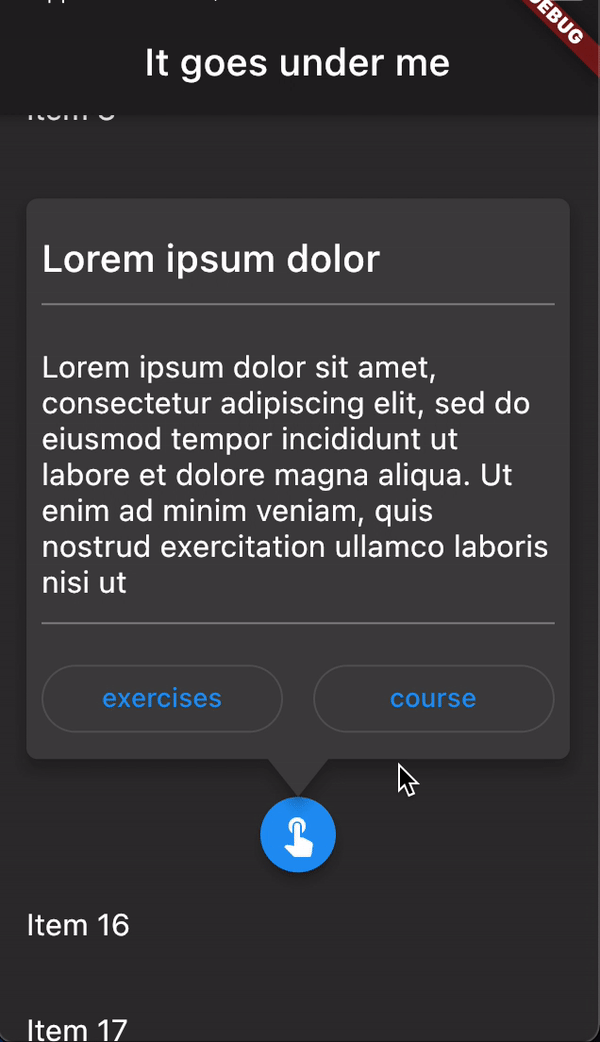
注意 JustTheTooltip.entry 的使用。此工厂确保上方区域负责小部件,并通过该小部件的构建器返回它们。
欢迎提交 issues 和 PR。API 可能发生变化。


