
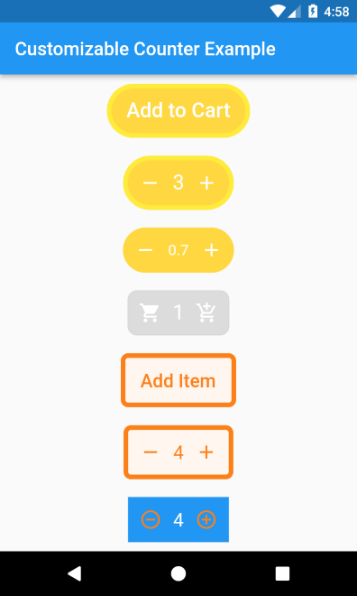
可定制的计数器
一个支持各种定制的计数器小部件。
安装
来自 pubspec.yaml
将以下行添加到pubspec.yaml
dependencies:
  customizable_counter: <last-release>
and
flutter pub get
来自 CLI
运行以下命令
flutter pub add customizable_counter
基本设置
完整示例此处提供。
@override
Widget build(BuildContext context) =>
    CustomizableCounter(
      borderColor: Colors.yellow,
      borderWidth: 5,
      borderRadius: 100,
      backgroundColor: Colors.amberAccent,
      buttonText: "Add Item",
      textColor: Colors.white,
      textSize: 22,
      count: 0,
      step: 1,
      minCount: 0,
      maxCount: 10,
      incrementIcon: const Icon(
        Icons.add,
        color: Colors.white,
      ),
      decrementIcon: const Icon(
        Icons.remove,
        color: Colors.white,
      ),
      onCountChange: (count) {

      },
      onIncrement: (count) {

      },
      onDecrement: (count) {

      },
    );
参数
为了定制小部件的UI,该包支持多种属性
| 属性 | 类型 | 默认值 | 必需 | 描述 |
|---|---|---|---|---|
borderColor |
颜色 |
空 |
否 |
小部件边框的颜色 |
borderWidth |
双精度 |
空 |
否 |
小部件边框的宽度 |
borderRadius |
双精度 |
空 |
否 |
小部件边框的半径 |
backgroundColor |
颜色 |
空 |
否 |
小部件背景的颜色 |
buttonText |
字符串 |
空 |
否 |
当计数器值为零时在小部件上显示的文本。 |
textColor |
颜色 |
空 |
否 |
按钮标题和计数器文本的颜色 |
textSize |
双精度 |
空 |
否 |
按钮标题和计数器文本的大小 |
decrementIcon |
Widget |
空 |
否 |
显示在左侧的小部件,点击该小部件将减少计数器值。 |
incrementIcon |
Widget |
空 |
否 |
显示在右侧的小部件,点击该小部件将增加计数器值。 |
count |
双精度 |
0 |
否 |
计数器的当前值。 |
maxCount |
双精度 |
double.maxFinite |
否 |
计数器支持的最大值 |
minCount |
双精度 |
0 |
否 |
计数器支持的最小值 |
step |
双精度 |
1 |
否 |
点击按钮后增加或减少的数量。 |
showButtonText |
布尔值 |
真 |
否 |
当计数器值为零时是否显示按钮文本。 |
onCountChange |
Function(double c) |
空 |
否 |
当计数器值通过按钮点击而改变时调用。 |
onIncrement |
Function(double c) |
空 |
否 |
通过点击“增加”按钮增加计数器值时调用。 |
onCountChange |
Function(double c) |
空 |
否 |
通过点击“减少”按钮减少计数器值时调用。 |


