
NeoPOP
NeoPOP 是 CRED 内置的库,用于在您的应用程序中使用 NeoPOP 组件。
NeoPOP 到底是什么?
NeoPOP 的创建有一个简单的目标;打造下一代精美、肯定的设计系统。NeoPOP 忠于 CRED 设计所代表的一切。
NeoPOP 支持 Android、iOS、Flutter 和 Web

安装
将 neopop 添加为 pubspec.yaml 文件中的依赖项。
dependencies:
    neopop: ^1.0.1
NeoPopButton

NeoPopButton 渲染 5 个表面:顶部、左侧、右侧、底部和中心。NeoPopButton 小部件为您提供了多个可用于您小部件的配置。
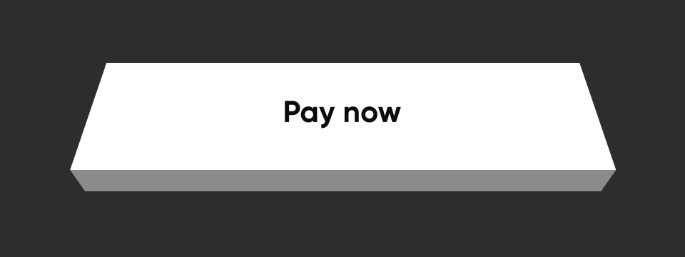
凸起的

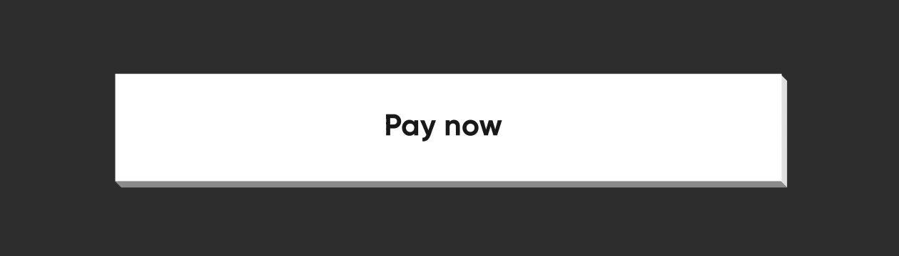
NeoPopButton(
    color: Colors.white,
    onTapUp: () => HapticFeedback.vibrate(),
    onTapDown: () => HapticFeedback.vibrate(),
    child: Padding(
        padding: EdgeInsets.symmetric(horizontal: 20, vertical: 15),
        child: Row(
            mainAxisAlignment: MainAxisAlignment.center,
            children: [
                Text("Pay now"),
            ],
        ),
    ),
),
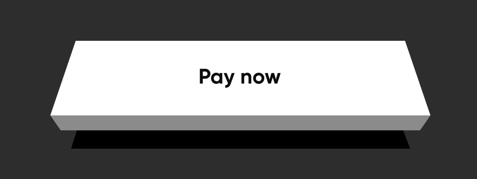
平坦的

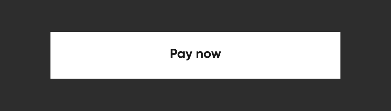
通过将 buttonPosition 指定为 Position.center,NeoPOP 将根据 color 计算右侧和底部表面的颜色。顶部和左侧表面的颜色是根据 parentColor 和 grandparentColor 计算的。
NeoPopButton(
    color: Colors.white,
    onTapUp: () => HapticFeedback.vibrate(),
    onTapDown: () => HapticFeedback.vibrate(),
    parentColor: Colors.transparent,
    buttonPosition: Position.center,
    child: Padding(
        padding: const EdgeInsets.symmetric(horizontal: 20, vertical: 15),
        child: Row(
            mainAxisAlignment: MainAxisAlignment.center,
            children: const [
                Text("Pay Now"),
            ],
        ),
    ),
),
Shimmer
const NeoPopShimmer(
    shimmerColor: Colors.yellow,
    child: Padding(
        padding: const EdgeInsets.symmetric(horizontal: 100, vertical: 15),
        child: Text("Hello"),
    ),
),
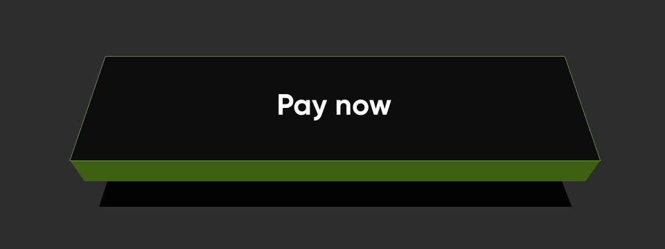
平坦的边框

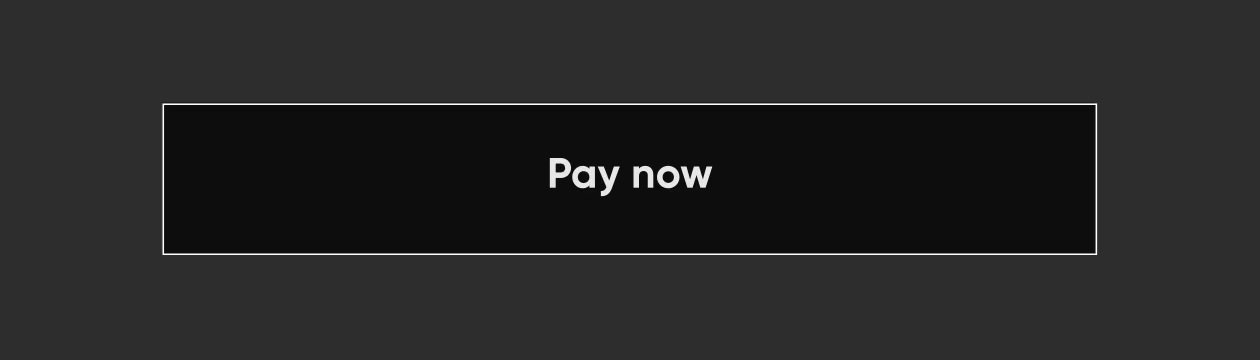
要在平面按钮上添加边框,请添加 border
NeoPopButton(
    color: const Color.fromRGBO(0, 0, 0, 1),
    buttonPosition: Position.center,
    onTapUp: () {},
    border: const Border.fromBorderSide(
        BorderSide(color: kBorderColorWhite, width: kButtonBorderWidth),
    ),
    child: Padding(
        padding: const EdgeInsets.symmetric(horizontal: 20, vertical: 15),
        child: Row(
            mainAxisAlignment: MainAxisAlignment.center,
            children: const [
                Text("Pay Now", style: TextStyle(color: Colors.white)),
            ],
        ),
    ),
),
凸起的边框

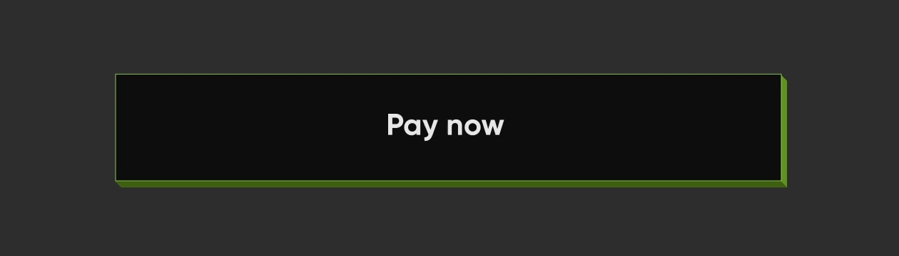
NeoPopButton(
    color: kSecondaryButtonLightColor,
    bottomShadowColor: ColorUtils.getVerticalShadow(kBorderColorGreen).toColor(),
    rightShadowColor: ColorUtils.getHorizontalShadow(kBorderColorGreen).toColor(),
    animationDuration: kButtonAnimationDuration,
    depth: kButtonDepth,
    onTapUp: () {},
    border: Border.all(
        color: kBorderColorGreen,
        width: kButtonBorderWidth,
    ),
    child: Padding(
        padding: const EdgeInsets.symmetric(horizontal: 20, vertical: 15),
        child: Row(
            mainAxisAlignment: MainAxisAlignment.center,
            children: const [
                Text("Scan & Pay", style: TextStyle(color: Colors.white)),
            ],
        ),
    ),
),
相邻的按钮

垂直对齐的按钮
Column(
    mainAxisSize: MainAxisSize.min,
    children: [
        NeoPopButton(
        color: kSecondaryButtonLightColor,
        bottomShadowColor: kShadowColorDarkGreen,
        rightShadowColor: kShadowColorGreen,
        buttonPosition: Position.fullBottom,
        onTapUp: () {},
        border: Border.all(
            color: kBorderColorGreen, width: kButtonBorderWidth,
        ),
        child:  const Padding(
                    padding: EdgeInsets.symmetric(horizontal: 8.0, vertical: 15.0),
                    child: Text(
                    "Button",
                    style: TextStyle(color: Colors.white),
                ),
            ),
        ),
        NeoPopButton(
            color: kPrimaryButtonColor,
            buttonPosition: Position.fullBottom,
            onTapUp: () {},
            child:  const Padding(
                padding: EdgeInsets.symmetric(horizontal: 8.0, vertical: 15.0),
                child: Text("Button"),
            ),
        ),
    ],
),
水平对齐的按钮
Row(
    mainAxisSize: MainAxisSize.min,
    children: [
        Expanded(
        child: NeoPopButton(
            color: kPrimaryButtonColor,
            buttonPosition: Position.fullBottom,
            depth: kButtonDepth,
            onTapUp: () {},
            child: const Center(
            child:  Padding(
                    padding: EdgeInsets.symmetric(
                        horizontal: 8.0, vertical: 15.0),
                    child: Text("Button"),
                    ),
                ),
            ),
        ),
        Expanded(
            child: NeoPopButton(
                color: kSecondaryButtonLightColor,
                bottomShadowColor: kShadowColorDarkGreen,
                rightShadowColor: kShadowColorGreen,
                buttonPosition: Position.fullBottom,
                depth: kButtonDepth,
                onTapUp: () {},
                border: Border.all(
                    color: kBorderColorGreen, width: kButtonBorderWidth,
                ),
                child: const Center(
                child: Padding(
                    padding: EdgeInsets.symmetric( horizontal: 8.0, vertical: 15.0),
                    child: Text(
                            "Button",
                            style: TextStyle(color: Colors.white),
                        ),
                    ),
                ),
            ),
        ),
    ],
),
NeoPopButton 属性
| 属性 | 类型 | 描述 |
|---|---|---|
child |
Widget |
按钮小部件的子元素 |
color |
颜色 |
按钮的颜色 |
深度 |
双精度 |
如果按钮是凸起的,则按钮的深度 |
onTapUp |
VoidCallback? |
按钮正向和反向动画完成后触发的回调 |
onTapDown |
VoidCallback? |
用户点击 enabled 按钮后立即触发的回调 |
onLongPress |
VoidCallback? |
用户长按 CTA 时触发的回调 |
disabledColor |
颜色 |
按钮禁用时的颜色 |
parentColor |
颜色 |
按钮的直接父级的颜色 |
grandparentColor |
颜色 |
按钮的二级父级的颜色 |
buttonPosition |
位置 |
按钮相对于父视图的位置。默认值 - Position.fullBottom |
animationDuration |
持续时间 |
按钮点击的动画持续时间。默认值 - const Duration(milliseconds: 50) |
forwardDuration |
持续时间? |
如果您希望按钮点击有不同的正向持续时间,请使用 forwardDuration |
reverseDuration |
持续时间? |
如果您希望按钮点击有不同的反向持续时间,请使用 reverseDuration |
border |
Border? |
将要围绕按钮绘制的边框 |
enabled |
布尔值 |
如果设置为 false,按钮将被禁用。默认值 - true |
shadowColor |
Color? |
阴影的基础颜色。阴影颜色将由此导出 |
rightShadowColor |
Color? |
右侧阴影的颜色。 |
leftShadowColor |
Color? |
左侧阴影的颜色。 |
topShadowColor |
Color? |
顶部阴影的颜色。 |
bottomShadowColor |
Color? |
底部阴影的颜色。 |
NeoPopTiltedButton

非浮动

 NeoPopTiltedButton(
    color: kPrimaryButtonColor,
    onTapUp: () {},
    child: Padding(
        padding: const EdgeInsets.symmetric(
        horizontal: 80.0,
        vertical: 15,
        ),
        child: SvgPicture.asset('assets/svg/cta_text_view.svg'),
    ),
),
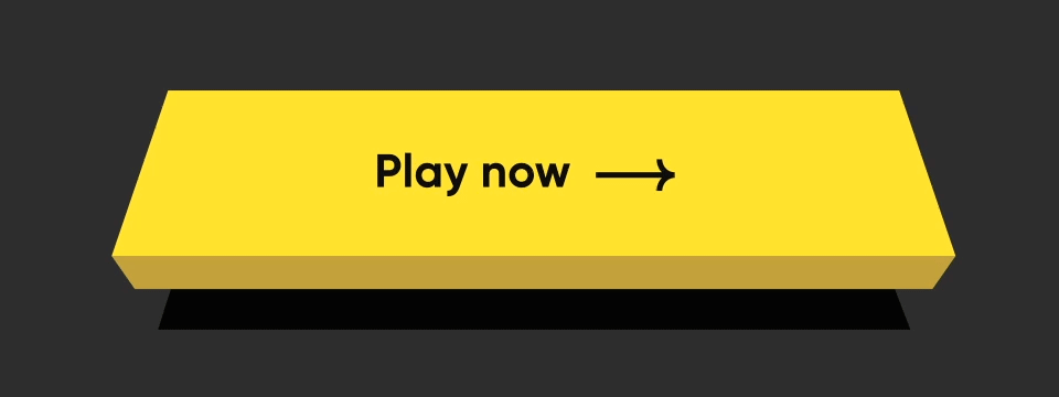
浮动

NeoPopTiltedButton(
    isFloating: true,
    onTapUp: () => HapticFeedback.vibrate(),
    onTapDown: () => HapticFeedback.vibrate(),
    decoration: const NeoPopTiltedButtonDecoration(
        color: kPopYellowColor,
        plunkColor: kPlunkColorYellow,
        shadowColor: kTiltedButtonShadowColor,
    ),
    child: Padding(
        padding: const EdgeInsets.symmetric(
        horizontal: 70.0,
        vertical: 15,
        ),
        child: SvgPicture.asset('assets/svg/cta_text_play_now.svg'),
    ),
),
边框

NeoPopTiltedButton(
    isFloating: true,
    onTapUp: () {},
    decoration: const NeoPopTiltedButtonDecoration(
        color: Color(0xFF0D0D0D),
        plunkColor: Color(0xFF3F6915),
        shadowColor: Colors.black,
        border: Border.fromBorderSide(
        BorderSide(color: Color(0xFF8DD04A), width: 1),
        ),
    ),
    child: const Padding(
        padding: EdgeInsets.symmetric(horizontal: 70.0, vertical: 15),
        child: Text('Play Now', style: TextStyle(color: Colors.white)),
    ),
),
Shimmer
NeoPopTiltedButton(
    isFloating: true,
    onTapUp: () {},
    decoration: const NeoPopTiltedButtonDecoration(
        color: Color.fromRGBO(255, 235, 52, 1),
        plunkColor: Color.fromRGBO(255, 235, 52, 1),
        shadowColor: Color.fromRGBO(36, 36, 36, 1),
        showShimmer: true,
    ),
    child: const Padding(
        padding: EdgeInsets.symmetric(
        horizontal: 70.0,
        vertical: 15,
        ),
        child: Text('Play Now'),
    ),
),
NeoPopTiltedButton 属性
| 属性 | 类型 | 描述 |
|---|---|---|
child |
Widget |
按钮的子元素 |
color |
Color? |
按钮的颜色 |
装饰 |
NeoPopTiltedButtonDecoration? |
用于绘制按钮的装饰。color 和 decoration 参数不能同时提供,因为它们可能会导致装饰覆盖背景颜色。要提供带有颜色的装饰,请使用 decoration。 |
buttonDepth |
double? |
倾斜按钮的深度。默认值: 8.0 |
onTapUp |
VoidCallback? |
当具有按钮的指针停止接触屏幕时触发的回调 |
onTapDown |
VoidCallback? |
当可能导致按钮点击的指针接触屏幕时触发的回调 |
shadowDistance |
double? |
绘制阴影时距离按钮的最大距离。默认值: 20 |
yPosFactor |
double? |
定义按钮和阴影在垂直轴上的浮动位置的因子。默认值: 5 |
isFloating |
布尔值 |
按钮是否浮动。默认值: false |
floatingDuration |
持续时间? |
按钮浮动动画的持续时间。一次完整的浮动周期,即按钮和阴影的来回移动,需要两次浮动时长。默认值: Duration(milliseconds: 1500) |
floatingDelay |
持续时间? |
两次浮动周期之间的延迟。默认值: Duration(milliseconds: 750) |
tapDuration |
持续时间? |
按钮按下或释放时的动画持续时间。默认值: Duration(milliseconds: 100) |
enabled |
布尔值 |
按钮是否启用。默认值: true |
贡献
欢迎提交拉取请求!我们很乐意帮助改进此库。请随意浏览未解决的问题,寻找需要改进的地方。如果您有功能请求或错误,请打开新问题,以便我们跟踪。
许可证
Copyright 2022 Dreamplug Technologies Private Limited.

Licensed under the Apache License, Version 2.0 (the "License");
you may not use this file except in compliance with the License.
You may obtain a copy of the License at

 https://apache.ac.cn/licenses/LICENSE-2.0
Unless required by applicable law or agreed to in writing, software
distributed under the License is distributed on an "AS IS" BASIS,
WITHOUT WARRANTIES OR CONDITIONS OF ANY KIND, either express or implied.
See the License for the specific language governing permissions and
limitations under the License.


